
Drawing Basics
Getting Started
Lines


Shapes
How Perspective Works
Intuitive Perspective
Values
Bonus Content
Course In Progress
Course In Progress


It’s time to switch our brain over to think more three-dimensionally for the Depth and Form method. In this demo I'll show you how you can primarily use one method, but not be strict with it. So, I sprinkle some influence from the light direction method.
Newest


Lucas Santos
19d


@toph
24d
I’ve learned something from this. I HATE line art, the drawing itself I think came out fine. I took the creative liberty and didn’t draw the laces


Noah Myburgh
1mo
Im not to content with how this turned out.
I watched the Demo beforehand so I was still aware of some of the decisions Stan made.
I tried using the overhand grip. Not sure if that was a good decision but il keep practicing nevertheless.
Regarding my line quality it could be much better. I’m unsure if I managed to effectively convey depth and form line weight.
critiques are more than welcome.


@labuge
1mo
here are my today's workout on the lines work. I used this exercise to also practice the anatomy of a human head skull. Here are the draft version, the version with the lines work and i did another pass on it to push more some lines and give some shadow to the drawing to give it a bit of volume. I think i should have push more the difference between the lines of the foreground and the back of the head.

@shadesea
2mo
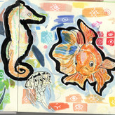
this is what I did for the depth line weight. It took way too much time, but I had no practice with backgrounds for ages. I like how it turned out but I need a comment on how I did and how it turned out.

@dukal
1mo
Very cool ! Great job !


•
2mo
Great work! I like how you've divided the line thickness by section in decreasing order -- Plants and porch, main part of the middle house, background house, and background trees -- to show distance.
@shadesea
2mo
This is the reference

Márta Kovács
2mo
I did two quick sketches while trying to practice line weight. With the bunny I kept the light and shadow in mind, (had to shade it's eye because it looked terrible with just lines) while the shoe is a combination of depth and light... I'm not sure I'm doing this right so I would appriciate any feedback!


@yashimon
2mo
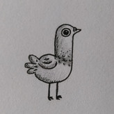
This is my practice of line weight.
@dukal
1mo
Very cool! Your lines are so clean!


Dani Torres
2mo
Does anybody else feel too tired to draw after all day of working and doing things? I wanna draw, pick up my sketchbook and pencil and get to it, but I just stare at the blank page and put the sketchbook away 😓
Also is like I don't feel ready to deal with frustration 😪


•
2mo
That's hard and I think pretty much everyone here has felt it, for sure. If you're in a place with that where you want suggestions for solutions, try starting your drawing session with an easy win. Draw something that has no rules but that you like drawing. Like how the Swordtember drawing challenge worked. There's no anatomy to worry about and some wonky lines are totally okay!
And WHATEVER YOU DO, don't make yourself have to draw your greatest thing ever when you do sit down and feel like drawing., Those of us who can't find the inspiration to really draw something can do that to ourselves and out too much pressure on it.
Make it a habit to draw a little and that stacks over time :D Good luck with finding your way to drawing more often!


Mimir
3mo
Hi guys, here are my attempts to apply some of the rules. I'm not that fond of my toyota supra drawing because I had trouble with the perspective but there is still so much to get better in. The second drawing is screenshot from one of my favourite games on PS "Shadow of the Collosus".


Kayley
3mo
I tried out all of the methods for practice today. I can’t say I’m too happy with the outcome but that’s what practice is for. I started with the hierarchy, light/shadow, and then the depth/form method which was the most difficult for me. I think I could have done more detail on a few parts but I just wanted to keep things simple for this exercise.


@murmur_a
4mo
Got stuck on line variation. The hardest bit so far. I see that I'm not achieving what I set out to do, but I'll keep practising.


Cubee
4mo
Like drawing shoes, hate the laces 😉. Still a bit unsure about my lines. I tried here to prioritise proximity and shadows & lights. Any comment is appreciated 😉
Kayley
3mo
Fire shoe choice 🙏 I'm definitely with you in regards to being unsure about lines. Keep at it, this looks great!
@acorn9
4mo
I realized when I went back to watch the video a second time (after my attempt), that this is a level 2 exercise. So, here’s my level 1 attempt at a level 2 challenge. 😁
Lots of room for improvement.

Tommy Pinedo
4mo
good attempt! Would love to see a second attempt later on! :D
Tommy Pinedo
4mo
I decided to continue practicing lineweight for depth and form. I went back to my previous drawings before I enrolled to proko. I redrew my OC wings with what I learned so far.
Left image: Before I enrolled to proko.
Middle image: Using depth and form, wanted to show the wings are in front.
Right image: reference.
I am ok with it, feedback is always welcome!
@acorn9
4mo
If comparing the two, it seems like on your second go, you captured the proportions of the original more accurately. The variation in the line weight does help add to the depth effect as well.
Tommy Pinedo
4mo
Here is my attempt on drawing the shoes using depth and form. By far the hardest exercise for me right now. I had to think about the sketching, the proportions and the line weight. I got discouraged a bit in the beginning because I wanted it to come out right. I was out of my comfort zone and stuck it through! I am glad that I did my attempt. Let me know what you guys think! :)
Cubee
4mo
Nice work. I really like. Hard for me to say anything negative. Apart maybe from the transparent laces 😉


Gara María Carrillo Alonso
4mo
Hi! Here my attemps. The first one with the shoes and Proko's demo, and the can on my own. I think I still need to improve my line management, but also, I think the paper is not helping me. I feel that it gets very dirty, and that it absorbs a lot of graphite, maybe the problem is mine and I press the mechanical pencil too hard, but personally I think the problem is the paper, I don't feel completely comfortable :')
@kenz
5mo
Is it only for level 2 students
Tommy Pinedo
4mo
I don’t think so. I did level 1 assignments a few times and did an attempt to level 2 after.

Isaiah
5mo
line weight, depth & form practice & study.
Sumit Gupta
6mo
Not sure if this will be helpful but i found building a vocabulary for lines important. Here are some of words i am trying to save in memory for lines:
Sharp: A clear, precise line with defined edges.
Soft: A gentle, less defined line that blends smoothly.
Thick: A heavy, bold line that stands out.
Variety: A mix of different line qualities to create interest.
Heavy: A dark, weighty line that adds emphasis.
Crisp: A clean, sharp line without blur.
Atmospheric: A line that suggests depth or mood, often faint or blended.
Confident: A bold, sure stroke with no hesitation.
Tapered: A line that changes thickness gradually.
Fluid: A smooth, continuous line that flows effortlessly.
Broken: A line with intentional gaps for texture or rhythm.
Dynamic: A line full of movement and energy.
Light: A faint, delicate line suggesting softness or distance.
Bold: A dark, prominent line demanding attention.
Hatched: Closely spaced lines used to create shading or texture.
Calligraphic: A line with varying thickness, often expressive or decorative.

•
6mo
This is WONDERFUL! More of this sort of thinking will bring more mindfulness to your art. Avoid making thoughtless, meaningless marks.
I believe that every line is a thought, so YES it is very helpful to be able to articulate lines with words.
What helps me is to think in “-ing” words… running, jumping, curving, wrapping, standing, laying, ect…
This helps me bring life into whatever subjects I’m drawing.
Here’s something I made a while back explaining this:
Cool stuff. I love this post.
@goobish
6mo
Attempting to go for more of a depth approach. Any critiques or advice would be really appreciated thanks.
Give a gift
Give a gift card for art students to use on anything in the Proko store.
Or gift this course:

About instructor
Founder of Proko, artist and teacher of drawing, painting, and anatomy. I try to make my lessons fun and ultra packed with information.