
Drawing Basics
Getting Started
Lines


Shapes
How Perspective Works
Intuitive Perspective
Values
Bonus Content
Course In Progress
Course In Progress


In this demo, I show the "light and shadow" method for organizing line weight.
Newest


Beth Martin
2d
I’m excited to tinker more with this technique using a brush pen. Love this look - looking forward to leveling up with more practice!


Neo Diamond
26d
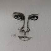
Felt a bit frustrated by this one, I feel like I got the main gist of it right but wasn't able to capture some of the complexities the way Stan does.


@toph
27d
I decided to redo this assignment after watching the demo because I felt like I saw a lot of room for improvement. I think I was a little too timid the first time so I made sure to add more variety in my line value and thickness. If anyone has any critiques I’d really appreciate!


Sabine Anzenhofer
28d
2nd attempt after watching the demo


Rafael Rangel
29d
Maybe is to light?


@harrow
1mo
Before and after watching the demo. It's an improvement but I'm still not sure I quite get it.
I tried to show contrast with line value and shadow with line width but I don't thin I quite succeeded. I'll have to come back to it again at some point


Nicole
2mo
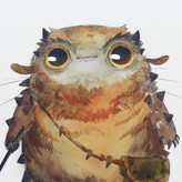
Feeling very proud of this rhino with the light and shadow attempt, might start posting projects using what I learned from here that I’m proud of too!

•
2mo
That texture is pleasing to the eye. Looks great!


Dylan Jagiello
2mo
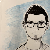
Decided to practice line weight with some additional references
@cloudhopper
2mo
Here’s my attempt with pencil. I usually practice an exercise over and over, which is why I’m only on this lesson after being in the course for close to a year now. But then I start looking elsewhere for details on proportions and time to chug along through this course, I think, despite the fact that every exercise I could spend countless repetitions on and gain so much from each one.


Dominic Statuto
2mo
I feel much better after watching both videos. Helped me understand how to use contrast for line weight in light and shadow! Hoping I made some improvement!


hobodios
2mo
I feel like this might be a bit of a dumb question but I'm confused about this contrast concept. Would this also be okay? (it's the opposite of what Proko did) Idk if that's how it works but I choose to emphasize the shadow of the body in the head. And the light of the background in the leg.

@androida
2mo
I did something similar. After the demo think that's OK. The contrast between the leg and the background was not as striking as the contrast between the head and the body. It looked a bit off to me looking at my version, probably because there's otherwise missing overall shading in the image --- if I understood that right.


Kayley
3mo
This is my light and shadow attempt after watching the demo. This was definitely more challenging than the other one, but it was fun nonetheless :)


Jose Anton
3mo
After demo
@osrour
3mo
Updated
@osrour
3mo
Top, before demo
bottom, After demo
@toph
27d
Wow you can really see improvement!! They are both good but the 2nd one is just so eye catching
Laura Angel
3mo
Light & Shadow before and after demo


Julyana Zelaya
4mo
Struggled with this assignment. Here is my initial attempt. The one on the right is with the demo.


@mwalker
4mo
Tried the light and shadow version again after watching the demo. Using different line values and widths was key. I’m much happier with the result although I’m pretty sure there’s a lot more attention that could be paid.
@acorn9
4mo
Practice makes progress. I can see how the pencil being sharp v. a little dull makes a big difference in the line weight. I have a hard time working from the sharp (dark?) clean lines to the soft (light) squishy lines. I find that I am going back over the same lines a few times to try and ‘clean’ them up and that’s not helping. I have a few more print outs left, so I will do this one a few more times.

Tommy Pinedo
4mo
Good start. I was having a similiar issue with a 6B pencil I was using. I bought a different brand of pencils and it was a major difference. I think the cheaper ones or the ones are poorly made get dull much faster. Like mine was looking waxy almost it was weird so I changed it.
Tommy Pinedo
4mo
Left: before demo
Right: after watching demo light and shadow.
By far the hardest exercise to me compared to the hierarchy of importance. I watched stan demo twice to understand how he is choose his line width and saturation. I tried my best on the second attempt, something just feels off to me, what do you guys think? feedback is always welcome! :)
@acorn9
4mo
I see the shadows on the head coming across much more vividly on the second attempt. Looks great!
Tommy Pinedo
4mo
Here is my attempt for level 2. The light is coming from above this time. This was a bit tough as I had to imagine how the light source will look from above on the rhino and try to indicate the shadows.
Give a gift
Give a gift card for art students to use on anything in the Proko store.
Or gift this course:

About instructor
Founder of Proko, artist and teacher of drawing, painting, and anatomy. I try to make my lessons fun and ultra packed with information.