


Albums

Activity Feed

hobodios
•
7d
added comment inTwo-Point Perspective
I had to try to make a scene with two-point perspective and even though it kinda sucks I had fun and I'll do better next time
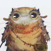
hobodios
•
8d
Asked for help
Anyone else having ideas that are way too complicated to replicate and it just ends up looking worse than in your head xd? Maybe because I need to use more than one point but I don't know how yet.
Any feedback would be appreciated!

•
7d
You could totally make a 1 point perspective drawing with this composition.
If you’re putting the fish in the middle, I would push the perspective on the cat more. Gives it more dimension and space.
Keep up the fun ideas
hobodios
•
11d
Asked for help
I really need to practice straight lines more. Also I tried to make the bed sheet lines shaky so it looks like one but ig that didn't work as intended. I have a question if a painting has perspective in it with a different vanishing point how would that work I tried to do that in my drawing and I'm confused.
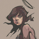
hobodios
•
16d
Asked for help
Sorry for the bad pictures/order
I got carried away and filled almost the entire sketchbook with these but here are some good and bad poses I did. Aside from the bad line quality (because I'm still getting used to the overhand grip :sob:) my main issue is that sometimes I cant tell if my poses are flowy or stiff Idk why its just really hard for me to be able to tell the difference. I would appreciate it if someone gave me feedback thank you!!
hobodios
•
18d
Asked for help
11:57 Does anyone have an example of an artist or strategy on how to capture the gesture without using rhythms? I'm curious :D
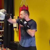
hobodios
•
21d
Asked for help
I had a LOT of fun doing these I'm going to keep practicing because sometimes I feel like my seals arent as alive but yeah any critiques are welcome!

honestly they look great, I love these. The most important thing is that you are having fun.

•
20d
Your seals look great! I think they all look alive, you've done an awesome job finding the line of action in these. I don't have anything to say to correct anything, but you can look for certain things in the poses and try pushing them a bit further to increase the movement in your shapes.
Here's a few notes and drawovers I made for these poses. You've already found these areas, but see if you can push it more. Look specifically for areas where there is a stretch and squish relationship happening, and even if it's minor see what happens when you emphasize it. You can also add complexity to your shapes by using combinations of straights and curves where there is weight being distributed -- the straights will indicate where the weight is being held, and the curves counterbalance the structure with gesture.
You may find that you push it too far that it doesn't work, but then you know where the outer boundaries are!
hobodios
•
21d
the podcast about a pregnant man

if you never experienced something like that, it means one might haven't gone far enough. It's not healthy of course but at same time this is a sign that person is motivated and connected enough that the time they devote matters to them and are looking forward to make great things in life. I am experiencing this, have from day 1, but now when I think about it, those crash outs were important to figure out somethings, I think these things help to face and accept your failures or things you lack in, and all you have to do from there is work on your weaknesses.


Xana Mendonca
•
4mo
It took me more than 2 hours to do this and I had to correct the proportions so many times :/ and it still is off on the right side of the face.
hobodios
•
1mo
Asked for help
I took like 4 hours to finish this and it wasnt even that good omggg. Im gonna have to practice a lot.
•
1mo
You're not off by much at all! Really it's just the width that is slightly too short. Not bad by any means. It takes a while, but the next time you do one of these you'll find easier, and so on and so on :)
hobodios
•
1mo
Asked for help
I tried to do level 2 and found it extremely hard at first but at the end I think I kinda learned how to do it (3rd image). Of course I'm still very bad and I'd like to get some feedback and maybe tips on how I can explore my shapes more.