Project - Value Scales
This lesson is premium only. Join us in the full course!
06:15
2.6K views
lesson video
Project - Value Scales
courseDrawing BasicsFull course (185 lessons)
-20%
$127.20
$159
You save $31.8
assignments 263 submissions
Juice
I did some line control practice But it’s also values so I post it here. I got Peter Hans book Dynamic Bible and do his sketching exercises.
DOWNLOADS
mp4
project-value-scales.mp4
221 MB
txt
project-value-scales-transcript-english.txt
6 kB
txt
project-value-scales-transcript-spanish.txt
7 kB
file
project-value-scales-captions-english.srt
10 kB
file
project-value-scales-captions-spanish.srt
11 kB
ASSIGNMENTS

Creating a value scale teaches you to control the mediums you work with and builds patience. It's a good idea to create a value scale for every medium you want to master, whether it's graphite, markers, ink, or charcoal. For those of you working digitally, I encourage you to try this with a pencil.

Level 1

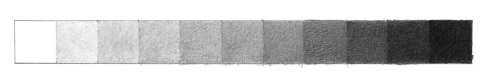
  1. Start by drawing a 1x1 inch rectangle divided into eleven squares. Use a ruler if you like, and draw the lines lightly to avoid dark lines between squares.
  2. Your pencils might not get you to a pure black. So, it might be a good idea to establish your darkest possible value first
  3. The lightest value is the white of the paper, so leave that one empty.
  4. Fill in the squares between, aiming for consistent progression from dark to light. You can start from one end, the middle, or jump around randomly, it's up to you.

Use a range of pencils (2H, HB, 2B, 4B, 6B). Each pencil has a comfortable value range. It is possible to do this with less pencils, like an HB and 6B, it just requires better control of your pencils.

Squint at your value scale  to blur the values together and make it easier to see where the jumps in value are too extreme or where the values are too similar.

Easy Mode - If you want to start a little easier, you can do just 5 squares. Start with the extremes, the middle, and the two between those. Having only 5 squares makes it much easier because the jump in value is more extreme, and so the subtlety isn't as important.

Level 2

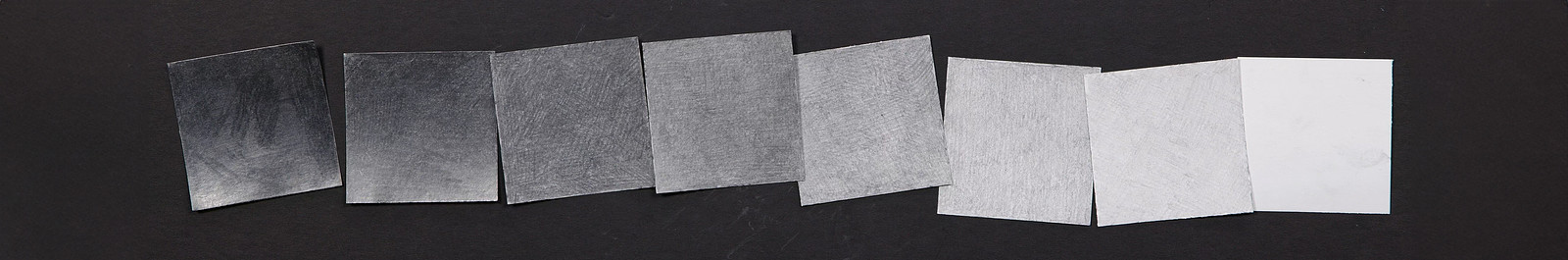
Blind value scales?!? For a greater challenge, shade each square without seeing the others.

  1. Cut out one or two-inch squares and number each on the back.
  2. Shade each square to match its assigned value, without comparing it to the others.
  3. Once all squares are done, turn them over, line them up in order and see how smooth the gradation is.

Adjust the difficulty - Start with fewer squares, like five, to make it easier. For an extra challenge, randomize the order in which you shade the squares.

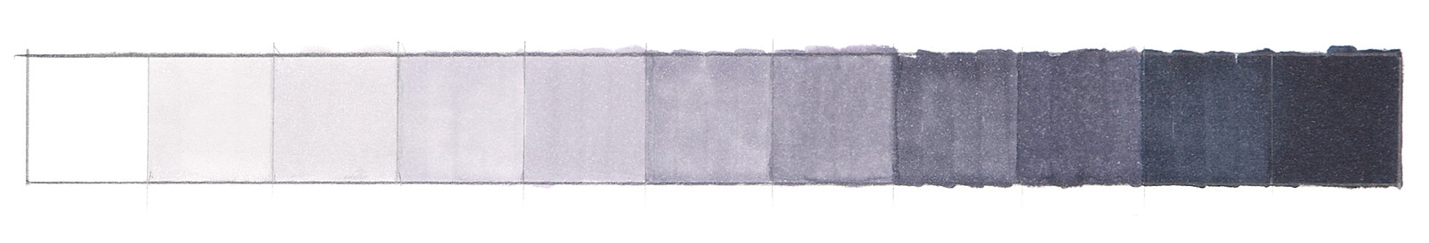
Optional: Marker Value Scale

If you have markers, try making a value scale with them. I have this OLO marker set which includes a range of predefined values of cool, warm, and red greys. Using markers CG1, CG3, CG5, CG7, and CG9 (or Black) on white paper provides six values straight of the box. However, applying the marker evenly in each square takes practice.

Create intermediate shades by layering the same marker or combining different ones, such as adding CG3 to CG5. Experiment with layers to see how they react. And unfortunately with markers to see the true value you might need to wait a few minutes for it to dry. Good paper that takes water can minimize this and prevent paper warping.

IMPORTANT: Take Good Photos

Post your value scales for critiques and please make sure to take good photos. If there was ever a time for you to learn how to take evenly lit, high quality photos of your work, this is the time. As we go into the Shading portion of the course. How you light your work will affect the values in your photos.

I know that these value scales might not seem very useful and you might want to rush through this project. But, approach these value scales with patience and take pride in your work. Practicing accurate values pays off in your drawings.

Deadline - submit by Oct 21, 2024 for a chance to be in the critique video!

Elijah R
10d
It took me a while to get through the pen and the pencil kept on smudging but I think I made my value scale relatively accurate. Any corrections for this is greatly appreciated.
Ronald Moss Jr
I welcome all criticism, but please keep it positive. Thank you!
Rik Steen
I would also work on making a more equal cover. as was mentioned in the clean shading episode. I can see a fair bit of white coming through.
Elijah R
12d
i think something that could help you right now with this value scale could be the squinting method Stan talked about as some of the values near the darker end could be darker to differentiate themselves.
@chrisdzy
27d
Shading is definitely my weakest point, I’m not at all confident with it. Hopefully this section can cure that somewhat. At this time I could only find 4 cool grey markers.
@kotka
29d
First row: did white (0) and black (10), then middle value 5, then 6-9 and 1-4 with Copics Neutral Grey N1, N3, N5, N7 and black. I accidentally made 5 darker than I wanted to because I had not figured out how to minimize the streaks from the broad nib. Second row: did white and black, then 1-9 in order with Copics in Warm Grey N1, N3, N5, N7 and black. Was more careful with the overlapping streaks and this turned out better than the previous. I discovered that my simple printer paper can't take more than two passes with the Copics before it's saturated fully. Third row: I challenged myself to do it with graphite and a random order. I used a random number generator between 0-10. The numbers 4-7 are still hardest. Number 5 turned out lighter than 4, and 7 lighter than 6. Overall a very fun and meditative exercise!
@chrisdzy
27d
Looks great to me, super organised.
@deepanshu12
Simone Couture
@mwno
2mo
good job
Maren
2mo
This is a very relaxing assignment, I really loved just filling in the boxes.
Lane Campbell
had some trouble with this on my first try so i decided to make a 3 step scale first, then a 5 step, until i got myself up to the 10 step scale. I didnt go full dark i think on my 10 but other that i was pretty happy with this
Patrick Bosworth
Nice job working your way up with each of these scales! These look really clean, when I squint I can see a pretty distinct jump between each value. Definitely check out the critique video for this one too!
Aura
2mo
10/10 for effort, 10/10 for enthusiasm, 0/10 for listening comprehension 🫩 I didn’t realize the lines needed to be as light as possible until the second listen. I was just so excited to start 😂 This assignment helped me connect with 6 year old Aura, who prided herself in her coloring technique and judged all the other six-year-old’s coloring for being “too scribbly.” As a 30 year old, I am still as proud of my coloring technique (translates well to value scales) and hopefully a lot less judgy. adding: any tips on the micron value scale or pitt artists pen application would be much appreciated. Onward!!
@na_talie
3mo
Level 2: These cut out pieces mostly made me draw in my desk 🫣 Overall, it seems like I stayed too light
@na_talie
3mo
Level 1: I have only one white pencil and wanted to see how far I would get with it. Then I tried the other value scales. Somehow, the larger one was a little easier for me, than the Limited ones. I gave up wanting to use all pencils for the one with eight values
Travis Rossi
I used 2H HB and 4B for this assignment. I did have to make adjustments after my initial attempt. 4 and 5 were too close to each other along with 6-7. I then needed to adjust neighboring squared to make room for the changes.
Daniel Cho
3mo
I'm finding it difficult keeping the texture consistent with the softer pencils. Even with the HB, I have a lot of visible overlapping strokes.
Rich Acosta
man this is tough!
Caden Y
3mo
I made it a bit harder for myself by not having more than one type of pencil but I still think the values turned out fairly distinct from one another enough
Isaiah
3mo
PRACTICE PAGE: Values & misc. Variations. 😀, Fun excersises 🙌
Pamela D
3mo
I love your octopus with the ink pot, also this is a great layout so good to remember the lesson.
William Montalvo
J M
3mo
The easy mode was simple since I didn’t have to worry about how much pressure I was using - I just let the pencil do the work. The bigger scale was much harder since there is a lot of balancing: how much pressure I’m using, which graphite level I’m using, how the square is looking compared to the ones next to it, etc
Tim
3mo
I'm no expert, but these both look pretty darn good! Certainly way better than my efforts. Great job.
Tim
3mo
Wieke Pierhagen
I turned the sequence around and found out why it is smarter to have the darker colors left when you're right handed. Markers were pretty challenging as was the siberian charcoal stick. I was surprised that my level 2 experiment went pretty good, apart from growing crazy with crumpling paper when drawing on it an trying to hold it down straight.
Help!
Browse the FAQs or our more detailed Documentation. If you still need help or to contact us for any reason, drop us a line and we’ll get back to you as soon as possible!