How to Draw Lips – Step by Step
This lesson has a premium version with extra content. Get it now!
1.4M views
lesson video
How to Draw Lips – Step by Step
coursePortrait Drawing FundamentalsFull course (35 lessons)
-20%
$52
$65
You save $13
assignments 48 submissions
Joseph Osley
I drew 100 Mouths. This was hard. Teeth are weird. I need to learn how to shade and render forms better. Lip textures are labyrinthian. I struggled throughout. Still; worth the practice, especially with some angles and expressions. Consistency evades me. Anyways. Oh, and tongues are aliens that live in our mouths and for some reason we aren't constantly freaking out about that.
LESSON NOTES

You should watch my previous video in which I cover some anatomy and structure of the lips.

Step 1 - The Lay-In

With lips, I start my layins with the landmarks. Find the width and angle of the lips by indicating the corners. Since, she’s looking slightly away from us to the left, the center line will curve out and to the left. This will help me find the placement of the top of the tubercle and bottom of the bottom lip.

With the landmarks in place, lets think about those squishy little pillows. Remember how in the last video I said there are three at the top and 2 at the bottom? On her, the tubercle is flat and you can barely see it.

lay in lips

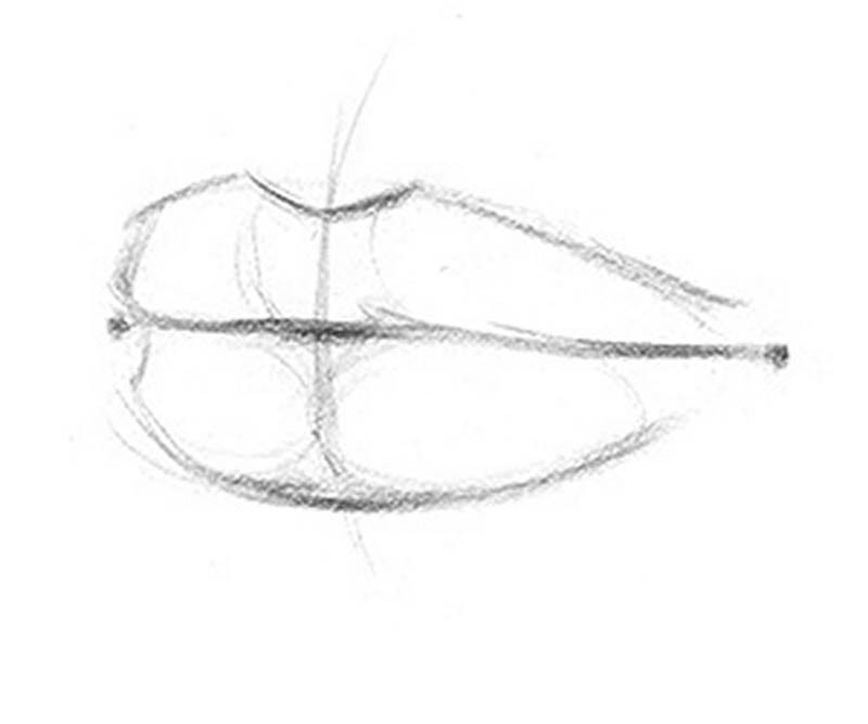
This is actually quite common. The tubercle is just fatty tissue, so its prominence will vary. The wings on the sides of her lips are very round and easy to see. The two pads on the lower lip are subtle, so the separation is kinda hard to see.
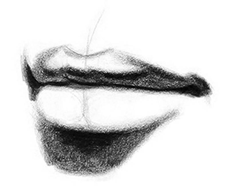
Step 2 – Two-Values

When I start shading a drawing I like to first determine the angle from which the light source is coming from. This will help me visualize what values to make each plane. If the plane is facing the light it will be lighter, if its facing away it will be darker, and everything in between. To figure out the direction of the light source I mainly just look at 2 things. First, the cast shadows. The bottom lip is casting a shadow on to the left side of the chin. So, I know that the light source is at the top right. But it’s not too far to the right, its very close to center. The other indication of the direction of the light source is the highlight. It’s on the right side of the lip, towards the top, same as the light source.

light sourse cast shadows

So, all the planes that are facing down and to the left, are in shadow.

Now, notice how there is actually a second light source coming directly from the left. This secondary light source isn’t as bright as the main light source, and for now I’m going to ignore it. Most of the volume is defined by the main light source, so I’ll focus on that first.

The side of the top lip face down and are in shadow, but as we get closer to the middle, her top lip gets very round and the top portion actually points up at the light source.

two values lips

So, the core shadow in this case is towards the bottom in the middle, and along the top ridge on the sides.

Step 3 – Full Value / Dark Accents

The darkest accents on the lips will almost always be in the corners, along the crease, core shadows, and just under the bottom of the bottom lip. When defining the crease, make sure to think about the overlapping forms and vary your line weight, so it doesn’t just look like an outline.

halftones highlights lips

Step 4 – Halftones and Highlights

The top lip, even though it curves and points up, doesn’t curve enough to point directly at the light source, like the bottom lip. So, the entire lit area of the top lip will all be a darker value halftone. With gradations to define the roundness of the squishy little pillows.

Add some gradations to define the bottom lip. I want the highlight to be bright and sharp, so I need to make sure the halftones around it are dark enough the make the highlight stand out. Once you start making your halftones dark, double check to make sure that the shadows are significantly darker, so that the halftones don’t start looking like shadows.

The corners of the lips have a slight gradation, but the bean shape of the nodes, is not very prominent on her.

I’ll define the plane changes of the region about the top lip. I’m going to take out the cast shadow from the nose. I feel like it would look strange there without a nose casting it. And instead I’ll define the planes of the philtrum.

final charcoal lip drawing

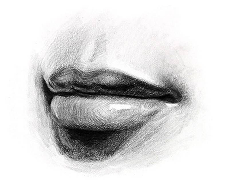
The area under the lips will be mostly halftone since these planes face down.

Now I’ll add that secondary light source and make sure it stays in a supporting role and doesn’t become the main character.

Want to learn more? Check out the next lesson on how to draw the ears!

DOWNLOADS
txt
how-to-draw-lips-step-by-step-transcript.txt
5 kB
mp4
How to Draw Lips - Step by Step.mp4
1 GB
jpeg
Lips-Reference.jpg
1006 kB
ASSIGNMENTS

Draw the Lips

Take a picture of your own lips or find some good photos online (get some with clear light and shadows). Follow my step-by-step lesson to complete the drawing. Rewatch the lesson to review all the anatomical details. Those take a few times to understand.

Newest
Christopher Corbell
Lips sketch. From reference - I liked the somewhat dramatic shadow with the light off to one side.
Rivelle
10mo
Lips studies
Vera Robson
Really struggling with this course. Lips are even harder than noses.
Joseph Osley
I drew 100 Mouths. This was hard. Teeth are weird. I need to learn how to shade and render forms better. Lip textures are labyrinthian. I struggled throughout. Still; worth the practice, especially with some angles and expressions. Consistency evades me. Anyways. Oh, and tongues are aliens that live in our mouths and for some reason we aren't constantly freaking out about that.
@queenbella
11mo
Great job!!!
@thrabchak
2yr
that's amazing, I am in awe. If you say your mouths are failures then what are mine XD
Ash Chung
2yr
Cant believe you even drew all the brackets and wire of the braces. I really enjoy seeing your 100's, looking forward to whats next :)
Account deleted
Feb 7, 2024 Lips Details of the mouth shape.
Blake Pawlikowski
Followed the demo and then one from reference. Will be doing some more, but posting as a personal form of accountability.
Blake Pawlikowski
Did another practice drawing this evening. Used .5mm HB mechanical pencil instead of the 5mm 2B lead holder from the other 2 studies above. Much better control for the size I was working at.
@grugrugru
2yr
I used a mix of Stan's and Marco Bucci's method for drawing the mouth in this lesson.
@queenbella
11mo
Huge THANKS for sharing this!
Martha Muniz
Looks very good! You really captured the structure in these studies. The rendering is also nicely done, with good improvement from the first page to the last. There is a bit of a tendency to go darker in skin tone value, mostly for the light skin tones, which reduces the contrast between skin and lips. I think just lightening the skin tone, with the values for the lips staying the same, would bring back some of the contrast missing. Another rendering tip would be to look for more of a variety of edges, especially more softness as the lips transition into the face around the corners. Hope this helps!
@ern1s
2yr
Hi, so I made an attempt to draw lips since I need a brake from drawing noses.. I also got myself some charcoal pencils for the first time so it's double challenge. Is there a secret in drawing wrinkles? Any overall feedback greatly appreciated
Jesper Axelsson
Hi @ern1s, nice drawings! Charcoal can be a bit harder to control than graphite, but I think you did a good job👍 - I don't know if there is a secret or hack specifically related to wrinkles. I think the important thing is that they are drawn with the same care as the major forms of the lips; that you treat them as forms and shade accordingly, or if your process is more about copying shapes, edges and values accurately, that the shapes and values and edges of the wrinkles match the reference. When drawing details it's important to make sure that they don't disrupt the whole (unless that's the effect you're going for). So you might want to keep the contrast low, not drawing the wrinkles with dark or bright accents, but rather, keep it with in the value of that zone. You tend to go too dark with the wrinkles. Remember that the marks you put down communicate something. Really dark lines could suggest: - a deep crease where no light enters - a cast shadow And if the above doesn't make sense in the context, then it will look like the local value changes, that there are black stripes painted on the lips. - Before adding all the nuances of the shading, it could help to start with dividing the image into two value groups. Then once that's established you may start adding nuances within those groups. I hope this helps :)
S R
2yr
I had trouble capturing the really deep wrinkles/grooves in my lower lip
Pedro Branco
Been studying anatomy this month, specifically how to draw the head. I'm pretty familiar with how the mouth works from a skeletal point but when it comes to lips I have a feeling that I'm not quite getting it. Here's my practice for today. I'm more inclined towards comic art and I'm not confident when it comes to shading which is why you won't see much of it. Any feedback is welcome. Used these as models: https://www.pinterest.ch/pin/485262928615928736/
Derek Adams
Think they all look really good, in that you understand the anatomy. I suppose shading would be an element to bring it to life as well as toning down the lips, for more realism’s…? But that’s just my guess…?
Liandro
2yr
Hey, @pedrobranco, cool work indeed!! I drew over the ones you mentioned you had doubts on (5, 13 and 17) and also added number 21 for a few notes on the tongue. Hopefully this can help you spot possibilities on adjustments you could make. Overall, my main suggestion would be to consider the 5 squishy volumes and the nodes on the corners when you construct the lips, as well as the way these volumes spatially relate to one another in each mouth expression (forms, overlaps, tensions, relaxations). Plus, since you mentioned you’re familiar with the mouth area on the skeleton, remember to consider that the teeth form a cylindrical volume standing solid underneath the lips, and, depending on the expression, the intensity of the curvature between the teeth and the lips could be different as the lips are very pliable and can spread thinner to the sides. Hope this helps!
Patrick Bosworth
These are great! Very expressive, a lot have that mid sentence feel. Fun shape designs too!
Alex S
2yr
Shading is something that I'm still working on. I'm not looking to get photo realistic level of exactness, but I feel like I could do better (if only slightly)......
Martha Muniz
Try pushing your values--I see a couple of areas in the references where there's an almost near black (usually at the separation line between the two lips or underneath the bottom lip). If it helps, map out the light vs shadow areas, and/or you could also convert the references to greyscale for self-assessment. I've also found this lesson on shading to be very useful as well: https://www.proko.com/s/3CWA
hArtMann
2yr
Experimented with different ways on handling the texture and highlights on different lips.
@mogumogu
2yr
I don't like how this turned out, maybe the values are too dark?
@draft_al
2yr
Hi mogu! it's always nice to see your art here. I think what may be happening is that there is no difference in value between your upper and lower lips. The bottom of the upper lip you can try to go a bit darker that'll help the transition in values. Since it's moving away from the light the area should be slightly darker.
Jesper Axelsson
Hi @mogumogu, nice drawing! - I think you're right about the issue being related to values. I think the main problem is that there isn't a clear difference between light and shadow. Some of your halftones are as dark as your shadows. confusing the eye of what's in light and what's in shadow. This is why step two in the demo is so important. You create 2 clear groups, in this case to keep light and shadow separated. Also you might appreciate this video Mind-Blowing Realistic Shading Tricks I hope this helps :)
Account deleted
First Two drawings are my attempt of drawing the whole face. Reference photo from Line of Action.
Jesper Axelsson
Nice study! The drawing feels pretty solid and you seem to have good control of your lines. - In terms of shape design, try to get more variation, thinking big, medium and small for a more dynamic design. Try to not repeat the same lenght of a line for example, especially with lines close to eachother. - I looked through your albums to get a feeling for where you are as an artist. I noticed that your drawings are shape dominant; your strength lies in creating an image by construcing things with graphic shapes that you copy from the reference in front of your, or come up with in your imagination. Focusing on graphic shapes has many advantages, but you might want to combine that way of drawing with a more form and gesture based drawing approach. Instead of focusing on contour and shape, you work inside out; starting with gesture, that you then dress in forms. That way of drawing is a big help when drawing from imagination, and when you try to rotate things in space. Glenn Vilppu is a great example of someone who can draw like that Drawing Demo by Glenn Vilppu. I hope this helps :)
@aeyt
2yr
Here are my lip exercises! In terms of difficulty this was definitely giving noses a run for its money which surprised me since for some reason I thought it would be simpler. Feedback of course appreciated!
Samuel Sanjaya
my lips study. Still having a hard time modifying the shape and form so it fits the references. Can't see the overlap on some. Critiques and feedbacks are welcome.
@elkad
3yr
Few lip drawings with references, any feedback is appreciated :)
Vue Thao
3yr
Jesper Axelsson
Nice! I looked through your other posts of the features as well and they all look really good! One common issue I see though, is the values. The forms feel carefully rendered, but there's something unclear about them all. I think it is because of the value organization. I think it's mainly that you're getting values in the light and values in the dark mixed up. You could make the lights much lighter ( a rule of thumb: Your lightest dark should be darker than your darkest light.) I think I would recommend practicing value studies. Here's a post with some tips on that https://www.proko.com/s/PX9q Hope this helps :)
Lisa L
3yr
Some sketches of mouths after watching the video. :)
Artūras ČIvas
Some sketches after a lesson
Help!
Browse the FAQs or our more detailed Documentation. If you still need help or to contact us for any reason, drop us a line and we’ll get back to you as soon as possible!