


Hey, you made it to Part 2 of the Proko Hand Drawing Master Superclass of Glory and...Awesome. In previous lessons I covered the bones, muscles and tendons of the hand. But even knowing all that anatomy is not enough. The hand has lots of layers and details that we'll cover in this lesson. This will help us get a more realistic result. Fingernails can define the perspective. Skin folds can create realism and enhance the gesture. Fat pads are soft and squishy and they react to the hand's movements. So, let's learn the surface details of the hand and how to use them.
Fat
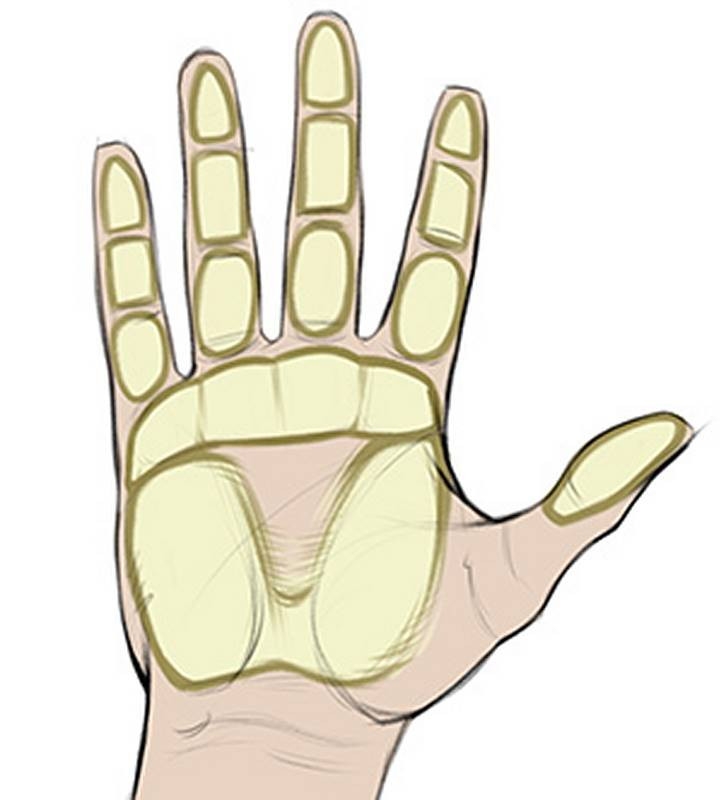
Let's start with the fat. There are numerous fat pads along the palm side of the hand. These pads are soft, round, and add thickness to the hand. They cushion your bones so they aren't grinding into everything you touch. Their malleability helps the hand get a good grip on stuff.
Fat covers pretty much the whole palm, but it's not an even distribution. There are three key fat pads on the palm. Two sit on top of the muscle masses, and blend out their inner edges. With the addition of this horizontal pad at the base of the fingers, we get a donut. A weird square donut with a triangular hole. Ok, bad analogy...Anyway, there's an indent in the center of your palm, which is helpful for gripping stuff and grabbing a soda.
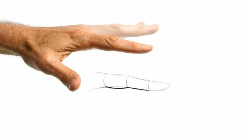
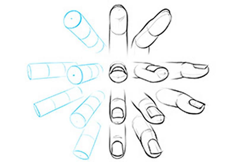
If you want to draw more interesting fingers, this part's for you! First, a hot tip for drawing the overall shape of the finger: contrast straight lines and curved lines. Your fingers are cushioned by soft fat pads on the palm side, so draw this side with convex curves and soft forms that pinch when the knuckles flex. The dorsal side is just bone and tendon. Use straight lines, flatter planes and sharper corners to represent the hard bones. Just by contrasting straights and curves, even a simple cartoon can explain the anatomy of the hand.
In a straight finger, the fat pads on the palm side are stretched out and not as curvy. Yet the skin on the knuckles is compressed and has a lot of wrinkles. When the fingers bend, the fat pads on the palm side compress and get really curvy. Notice how the creases point in the direction of the knuckle. The skin on the knuckles stretches and reveals the boney structures underneath.
Now, let's really look at those fat pads. Each finger segment has a unique shape. In general, you don't want to draw the same kind of shape over and over again. It doesn't look organic and interesting like the human body should; it looks artificial and fake. So, we want to find the nuanced differences between the finger joints, and take advantage of it in our drawings. I'm starting with the gesture of the finger. A subtle s-curve that tapers thinner towards the tip
The proximal segment is the roundest and you can draw it just like that, with a pot belly. The middle section is the flattest of the three, so we can draw it a bit straighter. Imagine you've got three people you have to fit in the back of a car. The middle guy is gonna get squished, so you want someone skinny who can make room for the others. The fingertip is upswept, and we can draw it like a wedge shape. You might even see an upward angle on the top plane as if the joint is bending back a bit. The thumb is an exaggerated version of the upward facing wedge shape. Steve Huston shows it as a dog head.
Skin Creases and Folds
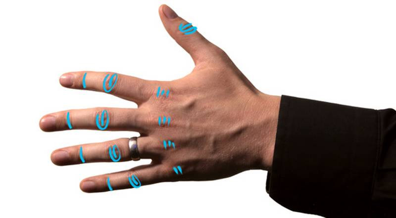
Which brings us to the skin creases and folds. Imagine a piece of paper; when you bend it, you can straighten it out later, but there's still a fold marked on the page. The creases on the hand and wrist tell you its history, and where it bends. Most joints on your body have corresponding creases. Lines wrapping around each finger joint and even "bracelet lines" at the wrist.
The back of the fingers follow this pattern: the distal joint can be simplified to a single, straight line. The middle joint has a spiral pattern. You can usually find 3 main lines to represent it, a mix of straight and round. You'll see really subtle creases on the proximal knuckles, but nothing serious.
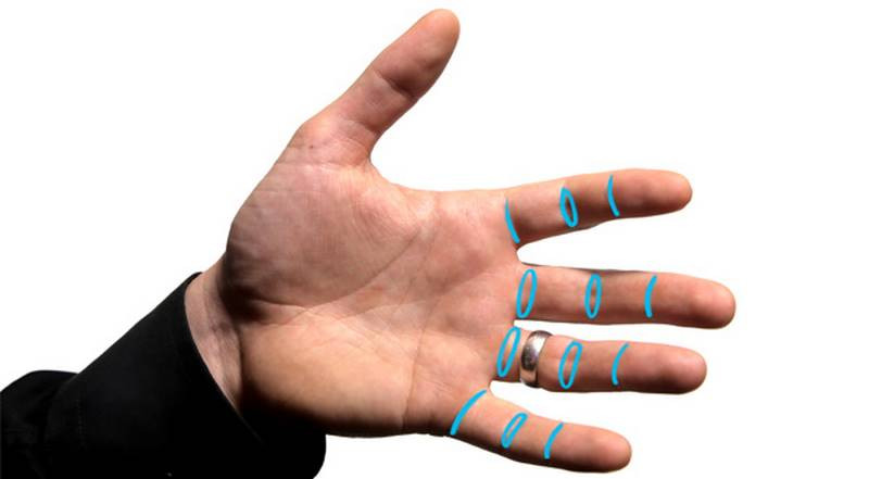
On the palm-side, the distal joint is basically a single, straight crease. The middle joint has an oval shape, with two round creases. Try partially bending your fingers and observe how the skin bunches up. It bunches up the most at this middle joint, so there's a double-fold. You see that same oval design in the proximal joint for the middle and ring fingers, but interestingly, the index and pinky only have a single straight line.
Anyway, you don't have to memorize this stuff. Now that you know what to look for, you can always use your own fingers to refresh your memory.
The thumb might have a little variety. You'll have one or two creases around the first knuckle. And one or two around the base, called the family ring in palm reading.
Perhaps the most famous kind of hand crease, known to predict your future, are the palm folds
This curvey one here is called the life line in palm reading. When the thumb opposes the palm, that thumb muscle mass pinches against the palm and we get a crease along its base. These other two folds, the heart and head lines are caused by the fingers flexing to squeeze the palm. That's some major pinching action in the skin and fat. There's more room for the skin down here at the hypothenar eminence and a lot less room up at the index finger, so these 3 creases will radiate outward. One at the border of the knuckle fat pads, another wrapping around the thumb mass, and one between them. You'll see some vertical folds such as the lines of health and fate, but they'll be more subtle than the first 3.

The exact length and curvature of all these lines varies. You might be missing one; it doesn't mean you don't have a fate if you can't find your fate line.
When you're drawing the hand in motion, instead of focusing on the permanent creases, focus on the folds created by the motion of the pose you're drawing. Skin folds follow the action of the hand, like folds in clothing follow the action of the body. If you arbitrarily copy lots of little lines or try to draw every palm reading crease, it can crowd and stagnate your hand drawing... But if you select lines that show the gesture and the force of the hand, or the movement between the fingers, fold lines can make your drawings stronger!
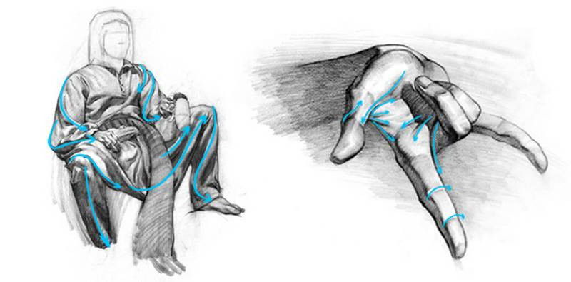
For example, in this drawing (right) I emphasized these creases. The pinky is abducting away from the rest of the fingers. So, the skin is pinching here and stretching here, from the pinky to the other fingers. They echo the gesture of the hand, like action lines in a comic book. If I had focused on just getting the 3 major palm reading lines, it would have detracted from the action (like in the first drawing). You can put other creases in, just keep them secondary and as light as possible.

Fingernails
A common mistake is to draw fingernails flat. They're actually rounded. They follow that cylindrical top plane of the rest of the finger. The nail explains if the finger is coming towards or moving away from the viewer in space, and how much. A nail acts as a natural cross-contour line. Its left-to-right angle also explains how the finger is rotated. If you ever draw a finger that just looks off somehow, try redrawing the fingernail. It might fix your problem.

It's a good habit to compare the orientation of the thumb's nail to the rest of the fingers, since the thumb actually faces away from the other fingers. It's a common mistake to draw the thumb parallel to the others and flatten out the whole hand. As the thumb reaches across the palm to grab something, it rotates to face the opposite angle of the fingers.
Now let's study something I know like the back of my hand.
The Back of the Hand
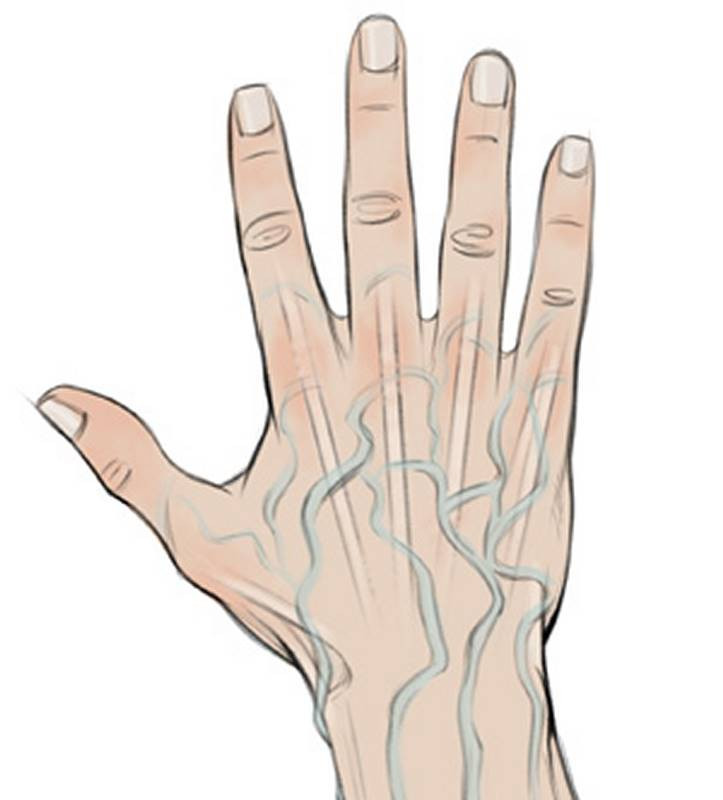
The palm side of the hand is very soft; mostly muscle and fat. But the back of the hand is hard. The only muscles visible are around the thumb. In this whole rectangular section you'll see bones, tendons, and veins.
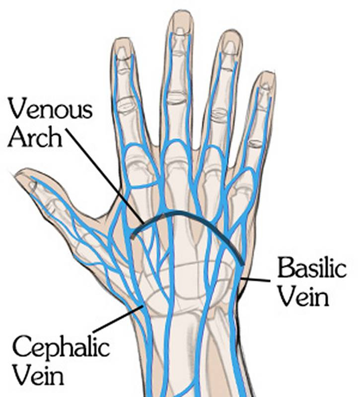
Veins have a tube form, but don't make their shadows stand out as much as the shadows that show the primary forms of the hand. First of all, veins are going to be flat on younger hands, and you can only see them because of the color. As hands age, veins come to the surface more and will stick out. But even then, their forms are small and tertiary. You don't want to shade chasms right in the middle of your hand; it will break up the form and prevent it from feeling like a cohesive whole. Create a hierarchy with your values and edges. The primary forms should be the most obvious. The blockiness or roundness of the large forms. Then the secondary forms, like the bones and groups of muscles. Details like veins are tertiary forms.
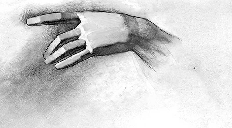
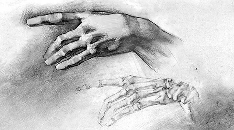
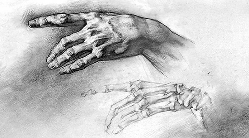
The tendons you'll see on the back of the hand are from the extrinsic muscles of the hand. I explained them in the forearms lesson. There's 4 tendons on the back of the hand that radiate out toward the knuckles. And there's two tendons on the back of the thumb that create that hollow snuff box.
Notice how the tendons are not visible at the wrist. They start a little bit into the metacarpals because they're surrounded by tendinous sheaths for protection. Then a little farther back in the wrist is the retinaculum. You won't see any individual tendons on the back of the wrist.
To prevent tendons from looking like veins, you can contrast their straightness. Tendons are going to be much straighter in their path from wrist to fingertip. Veins will meander down the hand. Veins also have a slightly darker and cooler local color, whereas tendons will match the skin tone or even be a little lighter. You know how when you press on your skin, it turns a lighter tone for a second? The tendons have a similar effect on the color of the skin when they're popping out and putting pressure on the skin.
In general, I recommend that you focus on the details that help your picture. If it doesn't serve a purpose, it shouldn't be there. And add variety of shape, value, or edge in areas that tend to repeat. Tendons, segments of the fingers, positioning of the fingers, wrinkles... All these things will look static and boring if they repeat too much. Let the gesture of the pose guide your decisions as to how to add variety.
Variations in Characters
In the premium version of this lesson I'll show you how to use all these characteristics to draw young, old, masculine and feminine hands.
In the next lesson we're gonna get really hands-on with some drawing demos. I'll show you a drawing process that will make it easier for you to draw hands from reference and even from imagination. You don't want to miss these new lessons, go create your free account to sign up for the Proko newsletter!
Assignment
Your homework for this lesson is to find your assignment from the hand bones lesson. With the bone drawings, you already figured out the positioning, proportions, and skeletal forms. Now, you'll draw on top, using a piece of tracing paper traditionally or in a new layer digitally, and turn your drawings into fully-fleshed hands. You'll have to add all the muscles you learned in part 1, and all the surface details you learned in this lesson. This exercise will help you connect your understanding of the skeleton with the surface details. You're inventing this stuff from your imagination, but don't be afraid to look at your own hand, or photos as inspiration.


