
Ideacraft: How To Draw Pictures That Speak Louder Than Words
Part 1 - Ideation Fundamentals(44 Lessons )
Week 1: Orientation & Priming


Week 2: Narrative Illustration
Week 3: Conceptual Illustraiton
Week 4: Conceptual Narrative
Week 5: Major Project, part 1
Week 6: Major Project, part 2
Part 2 - Step-by-step Demonstrations(11 Lessons )
3B: Minor Assignment 3
163
3B: Minor Assignment 3
163
Newest

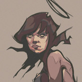
Gannon Beck
2d
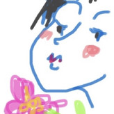
Here is my study:


Yuli Levy
5d
this is mine, hope i did it right :)


Nicolò Bongiovanni
6d
Ain't did it in 1.5h, little more.

•
5d
The delicate mark making and value control looks great here.


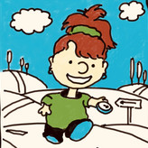
Mandy Valin
15d
done in black acryli- gouache, 6x4. Love the reference image !


Gwynn
15d
There we go! Fun exercise. I'm more of a high key guy though (good pick up line?)

•
15d
Nice work here @gwynn, bad pick up line;) I like the horses out of focus in the foreground as a counterpoint on the sharp edges found in the figure.

@lucat
16d
In order to stay within the limited working time I had to switch from traditional to digital. I use infinite painter on a tablet. The tight time forced me to simplify a lot but I'm happy because I like to subtract


Alberto González
16d
This was fun, as always I have the most difficulty with laying the drawing at the beginning, specially with proportions. After that I have more fun with putting more definition into the drawing and then playing with the shapes and values. It took me way more than 1.5 hr but it was worth it.


@ahood
17d
Used Procreate to do this digital drawing. I have no idea if there is a lasso tool in procreate, but I will be looking that up to study.

•
17d
There is! The selection tool has a freehand function.

Pamela D
21d
I kept my thumbnails small and created them in Procreate so that I could keep track of the values, along with the process. During the first stage using 4, 6 and 8 values I noticed how there were more shapes around the old lady, then associated it with representing the complicated, checkered past, contained within the framed door. In contrast to the the boys simple light structure of purity and newness. He pulls a heavy mass effortless accepting the challenge without fear of what he was doing or how he looks. These thoughts helped in the second stage using vales 9, 7 and 5. I restrained them more keeping the ground uncomplicated not to distract with the boy and the old lady.
@edel82
21d
I used markers and started with washing everything with a 4. Then I chipped away at the shadows as i saw them. I tend to stay in a high key when I draw so this was a good exercise.

Taylor Starnes
22d
This was a fun exercise! I need to work on not trying to get details in straightaway. I had to go back a few times to reign myself in and be more broad.


Basak
23d
Should I learn digital? That would save me so much time to correct anything.
I attach this as it is. I'm not correcting it. (by saying that I fail, cause the point was to simplify, I can't unsee the details)
![Viacheslav [ki-Vi] Polianskii](https://img-resizer.proko.com/resize/user/avatar/40x40x2/eyJwYXRoIjoidXNlcnMvYXZhdGFycy92dm9wb2wvaW1nXzM0MTYtMzc0MDYxMTMuanBlZyIsIm5hbWUiOiJpbWdfMzQxNiIsIm1pbWUiOiJpbWFnZS9qcGVnIiwid2lkdGgiOjMwMjQsImhlaWdodCI6NDAzMiwiY3JvcCI6WzUzOCw3NjEsMjI0MSwyMjQxXSwiY29sIjoidXNlci9hdmF0YXIifQ--adee2040857cc32ed4e303b24396148e1d987823)
Viacheslav [ki-Vi] Polianskii
23d
I’ve tried to push highlights to drag attention to the guy
In the original idea, I wanted highlights on horses and lady to be kinda arrows that pointed toward him
but not sure if I’ve accomplished it well enough)
Most of the canvas is covered in values above 5 and high lights are 4 and 3 according to the scale
Also a question!)
At some point I've decided that leaving sketchy legs on horses - is a good idea, so eye would only be carried towards the subject.. how wrong was I? And have you noticed it straight away?👀
Edit: the difference in styles started bothering me [even though it's a thumbnail] and I went back in, but tried to keep contrast down - so there wouldn't be much reason to look that way anyway
+ killed contrast on the closest horse

Sita Rabeling
24d
First I chose swatches between 4-9 to limit myself and then wanted to find a simple version, but it became more detailed than I thought.
•
24d
You could pop a few lighter values in there somewhere around the focal points.
This is a cool study. Love the motion across the frame.


Eduardo Rubio
25d
I want to do more… great exercise!


Fran Turner
26d
This was not easy. I found it difficult to stay in the midtones and shadows range. I kept wanting to use white! This was painted quickly and roughly with acrylics on paper. I loved painting the woman in the doorway - such an interesting character.
•
24d
I love the brush quality in the painting @Fran Turner I did a quick digital painter to show what happens when you put a darker wash over the entire painting. Value are relative and this manipulation of how we see always amazes me. In a painting such as this, you can put down a darker wash over the entire painting (watered down acrylic), to push the overall values darker. Then you can reintroduce midtown, which will feel like "light". Note pure white in the bottom left of my paintover next to the midtown beside it. The midtown is what I used to paint the "white" of the boys costume.

@shayy02
27d
Hand drawn, then digitally darkened it to try to see if I could push the darkness.
•
24d
Nice! When you digitally darkened it, what were you using? A burn tool, or something similar? In Photoshop, I'll use a dark value on a multiply layer to approximate a dark wash in traditional media. In traditional painting, we often work from dark to light, cool to warm and transparent to opaque all at the same time. This leaves the highlights "thicker" with paint quality, and can give the shadows the appearance of tranparency. The effect can be very strong. I painted a few opaque marks over your lights to try to demonstrate this. I hope it helps!


Dax Hansen
27d
When I think darker range, I think charcoal.
Basak
24d
I like this, charcoal's texture is so cool
Sita Rabeling
24d
Love it!
•
24d
Hey @Dax Hansen that study really has a mood to it! Very nicely done.

C P
27d
I skipped gradients…(a trigger for me to get rendering)… kept thumbnail simple😁
•
24d
Always the best bet @C P - especially in thumbnails!

Course by Patrick Jones
Give a gift
Give a gift card for art students to use on anything in the Proko store.
Or gift this course:

About instructor
From rocket ships to rock stars, NASA to Rolling Stone; I draw pictures that speak louder than words. Artist & Professor