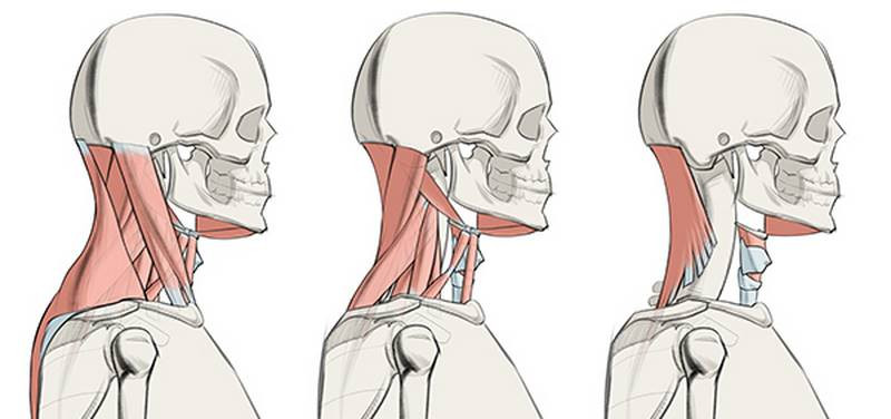
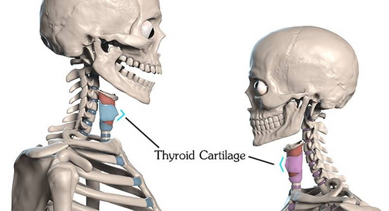
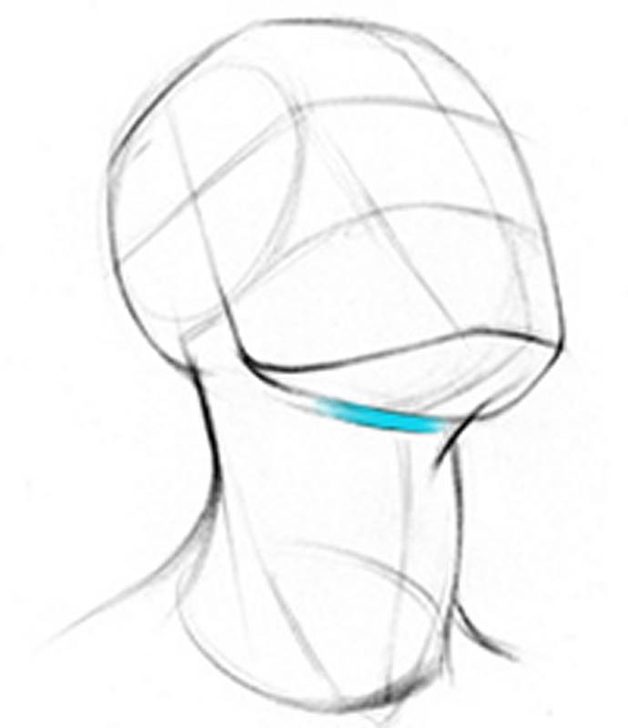
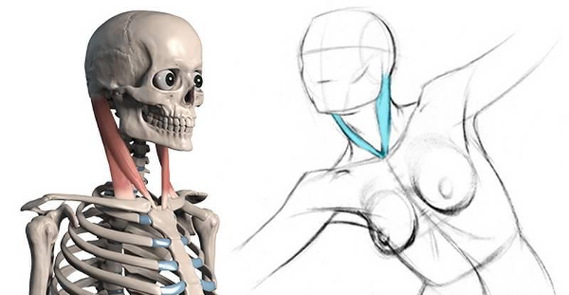
How to Draw Neck Muscles – Anatomy and Motion
This lesson has a premium version with extra content. Get it now!

How to Draw Neck Muscles – Anatomy and Motion

238K
Mark as Completed

How to Draw Neck Muscles – Anatomy and Motion

238K
Mark as Completed
Newest
@j4e8a16n
10mo
Rachel Dawn Owens
Its a clavicle!
Charlie Nicholson
That would be the clavicle bone
michael gilbert
@palyo
1yr
Hi everyone! These drawings are for this lesson's assignment. I couldn't find all the reference that i drew unfortunately but at least i have these two. I guess i have made some prospective errors on the fifth drawing and i also had some problems with two muscles in particular which are the ones between the clavicle section of the sternocleidomastoid and the trapezius(i don't know their names). Anyway, i would greatly appreciate any kind of critique/advice.
Holly Laing
Here are my assignments for the neck muscles. I tried to do a few anatomy tracings along with my quick sketches. Any feedback is welcome! :)
@ethanhostetler
Beautiful drawings. Your line quality is really nice too.
@abrahan13
2yr
Any feedback is appreciated
Datief
2yr
Hi Abraham. I see you have been doing studies on the anatomy course by Stan Prokopenko continuously. What is good for the rhythm. You would find useful to give some more time to the section-lesson you are in. But I am guessing. In general a week could work. You will see about it after experimenting some time. The goal is to learn the understanding of the muscle, its shape, mass, and movement more than just its knowledge. So going slow would help for that. And coming back to previous lessons from time to time, too. Another thing that would empower your representation is to get back, whenever you see it purposeful, to practice the basics of drawing. It would go deeper more or less each time, on things like perspective or lightning on itself, for example. That will affect how you work with the rest of things. Hope it helps. Keep up the practice!
Ria Kumo
3yr
All critiques welcomed!
Thieum
3yr
Neck Muscles assignment attempts
@sharkhead
3yr
Jesper Axelsson
Hi @sharkhead, great job with these! The drawings are easier to read, you're finding the attachments and the crosscontours are better! Nice work! - Assuming these are digital, one thing that could make the drawings cleaner would be to switch to a different brush. You seem to be using a brush that mimics ink. Inking is hard, since the line is always black. I like to use a brush that allows me to draw both light and dark, mimicking a graphite or charcoal pencil. Your line quality is good for the most part, but in som places you have gaps, wobbles or scratchy lines. Using a tool that allows you to build up to a dark line might yield cleaner results. On the other hand practicing with ink could be good too, since it forces you to be more carful and decisive about your lines. Just wanted to make you aware of the possibility. - You did a good job with crosscontours in these. I did a picky paintover and fixed the crosscontours that I think might have been a little off. - In the 1st image, bottom right drawing, I think we're missing the levator scapulae. - In the 2nd image, bottom right drawing, what's happening under the jaw could have been clearer. I would recommend drawing the digastricus all the way to it's origin. Hope this helps :) Keep up the good work!
@sharkhead
3yr
Only four this time. I might do more later
Jesper Axelsson
Hi @sharkhead, cool studies! -I did some paintovers: In the 2 top ones, the crosscontours on the sternomastoid don't seem right to me. One thing that helps me when I'm unsure of the angle of an object, is to imagine touching it. I don't know what reference you used but I think that if I were to lay my hand flat on top of the sternomastoid in the top right image, my hand would be going away from me --> we're looking up at the cylinder. In the top right one I think you got the hyoid bone a little small and a little too high up In the bottom right one I think the crosscontours on the sternomastoid should be different. However if the intention of the crosscontours were to show the major cylindrical form of the neck, then it's correct. Just wanted to let you know in case that wasn't your intention. - I would recommend working larger. The studies became a little too crammed with lines, so it was hard for me to pick out certain things. - I don't know how much time you spent on these, but they look like they were done pretty fast. I would recommend to slow down a little, to give yourself time to analyze and be clear, (the neck muscles aren't easy ). I like to lightly indicate all important stuff even if it's not visible. By important I mainly mean muscle attachments, like the scaleneus medius on the 1st rib, or levator scapula on the medial ridge of the scapula. A simple "trick" to give your drawings better read is the make outlines darker and the interior lines thinner. This applies on a smaller scale too, like individual muscle forms. You might have a very dark thick line for the silhouette of the figure and a lighter thinner line for the outlines of muscle forms (make sure you get the overlaps right), and even thinner and lighter lines, for muscle crosscontours and details. Hope this helps :) Keep up the good work!
Rob Montgomery
Heres my attempt at the neck muscles. Always been an area I;ve struggled with, especially the area of the thraot between the Sternomastoids. Did a few extra from reference and from imagination to practice. Any feedback welcome.
@grimmal72
4yr
That's awesome. I'm a beginner so my word doesn't hold much weight though. Of course, it's diagram-like in it's details. But the people have good directional gesture and it's great looking to me.
Ryan Gromek
Olha Nevecheria
Maria J Venegas-Spadafora
would love to hear comments if anything looks off. Thank you!
Liandro
4yr
@Maria J Nice job! I think the one at the bottom and the one on the right look pretty good. I also like the one on the left, especially how you structured the shading, although the left side of his forehead looks a tiny bit skewed to me. I also think his brows look way too dark compared to the other features, so maybe you could also increase the contrast on the eyelids, pupils, nostrils and corners of the lips. On the one at the top, I notice a few issues: the chin feels a little bit skewed towards the right of the page; the ears don't seems to align at their heights; and the eyes and brows look too different compared to one another: his right eye (to the left of the page) looks more tilted and seems to have thicker lashes than the other one, and its respective brow looks thinner and curvier. It's not that everything needs to be perfectly symmetrical (hardly any human face is), but in this case, I'd make some adjustments to make them a bit more alike. Hope this helps!
Richard Barkman
Hi there, glad to be part of the beta testing! Could you please critique the following sketches and tracings? In particular, one tracing below has a number of question marks on it that I hope are clear. There's that bulge above the clavicle in front of the deltoid which makes no sense to me (just skin fold?) The back area of the neck has distinct lines, which I have indicated, but can't identify. The area under the chin has several long indications which I have identified, perhaps incorrectly, as separate muscles. So anyway, if you could provide some guidance I would appreciate it. Thanks!
Liandro
4yr
@Richard Barkman I think you have correctly identified the elements on the back of the neck and on the bottom of the chin. As for the bump near the Deltoid, it's certainly not skin fold because there's no pinch and not enough skin to fold on that area - I THINK that's the clavicular portion of the Pecs (and I think the clavicle tracing you did is a bit off-place...) But perhaps @Stan Prokopenko could help you better than me! :D
Paul Olsen
4yr
Stan Prokopenko
I agree with Liandro. When I looked at them, my first thought was they were probably drawn too small. I also noticed you are bringing the sternocleidomastoids and clavicles to a central point. There is actually a little gap in there.
Liandro
4yr
Good job, @Paul Olsen! I think you're showing nice forms in your drawings. In 4 and 5, things seem to have gotten a bit cluttered, maybe you drew these in too small sizes? By the way, when you're posting assignments for feedback, it's always better if you contextualize it with a message, maybe explain your process, the difficulties you faced or anything else specific you might need help with. Keep it up!
parth kapadia
Liandro
4yr
Great job, @parth kapadia! Construction is nicely described. If I recall it well, I made some comments about these drawings via e-mail, did I? Anyway, when you're posting assignments for feedback here, it's always better if you contextualize it with a message, maybe explain your process, the difficulties you faced or anything else specific you might need help with. Other than that, just keep up the good work!
Course in Parts
View course details
Give a gift
Give a gift card for art students to use on anything in the Proko store.
Or gift this course:
About instructor
Founder of Proko, artist and teacher of drawing, painting, and anatomy. I try to make my lessons fun and ultra packed with information.
Help!
Browse the FAQs or our more detailed Documentation. If you still need help or to contact us for any reason, drop us a line and we’ll get back to you as soon as possible!