Premium Version
Check out the extended premium video to learn about ab physique variations, 10-pack abs, belly buttons, transversus abdominis, the pyramidalis and more. All the anatomy premium lessons have 3d models and ebooks.
Every action hero needs a good set of abs. Let's learn the anatomy so we know how to invent and idealize them.
Attachments & Function
You might know them as “abs” and depending on your physique, you can call it a “6-pack”! …or a “keg”.
Chances are you know something about the six-pack, but let's go over basics anyway. The rectus abdominis is a long, flat, rectangular muscle that sits on the front of your torso. It originates off the pubic crest and travels all the way up to your chest. It inserts onto the anterior costal cartilage of your 5th, 6th, and 7th ribs, and the xiphoid process.

The rectus abdominis is 1 of the 4 muscle layers of the abdominal wall. Each muscle pulls at a different angle, allowing the torso to move in any direction. The function of the rectus abdominis is to flex the spine or bend the torso forward. So, as the abs compress, the insertion point at the rib cage moves closer to the origin at the pelvis. However, if the rib cage is fixed in place, the pelvis will move up toward the rib cage. When neither is fixed, they can be brought together.
Tendons
The rectus abdominis is nicely outlined for us by tendons. There's the linea semilunaris on the outside, the linea alba, aka "centerline", and the horizontal tendinous intersections. These tendons appear as shallow grooves on the form. When you work out, the muscle tissue will grow and the tendons will stay the same size. This makes the furrows of the tendons deeper and more obvious in muscular people.
The linea alba acts as the centerline of the rectus abdominis, dividing the abs into left and right halves. During lateral bending the linea alba only bends above the navel, because it's matching the curve of the lumbar vertebrae in the back. Fat is quick to cover up the linea alba so it's not visible on everyone.

The linea semilunaris is a tendon that defines the lateral border, dividing the rectus abdominis from the external obliques. It's just a bit narrower than the distance between the nipples.
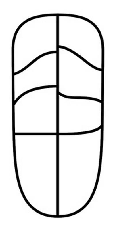
As you may remember, tendinous intersections are where tendons are embedded inside a muscle. This happens three times in the rectus abdominis, creating the horizontal-ish divisions.
The highest division is diagonal, roughly following the downward angle of the thoracic arch. The lowest division is horizontal across the navel, and is usually the most visible furrow.
Above the belly button these intersections create 6 rectangular forms known as the 6 pack. But there’s more. There’s also this whole section below the belly button.
Scott Eaton calls this the 40-oz, which is a big bottle of beer. The vertical centerline on this 40 oz isn’t as clear as on the 6 pack. Usually you’ll see a separation only on the top, just below the belly button.
You may see a 4th tendinous intersection below the navel, but that requires an uncommon gene and a very lean physique.


Usually the intersections won’t be symmetrical. The angles and separations tend to be slightly different on the two sides. And they’re not always clean straight lines. They can also be C curves or S curves.
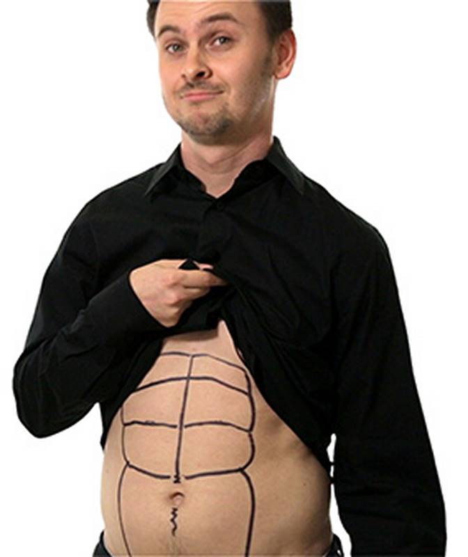
The ab sections vary greatly. So, it’s totally normal to have an asymmetrical abdomen or genetically underdeveloped portions. So you don’t need to be embarrassed about your 6-pack anymore. I know I’m not (see above image).
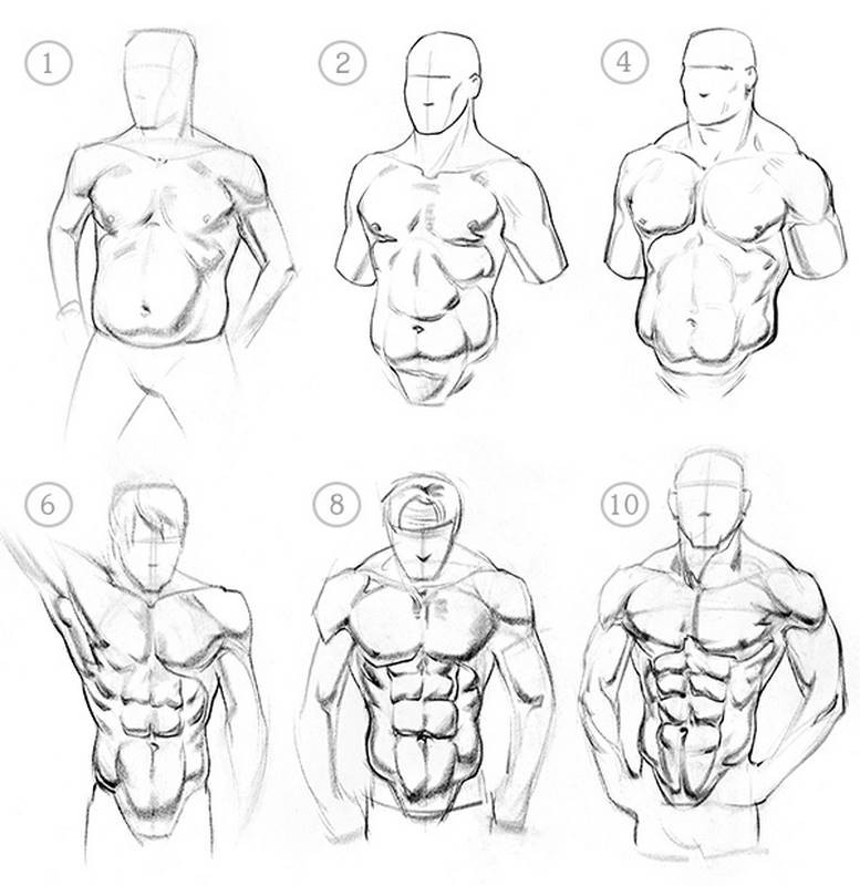
Depending on genetics, diet, and exercise, the rectus abdominis may appear as a 1-pack, Tupac, 4-pack, 6-pack, 8-pack or 10-pack.

So, we have a premium section for students that want to learn more. The premium section has extended lessons with more information about the topic. It also has additional drawing demonstrations. If you do the assignments for each lesson, these demos serve as the answers for the assignment, so you can check your work. There’s an ebook version of each lesson that you can download as a PDF. Print them out or keep them on your device so you can quickly review the lessons. And finally the Premium section has 3d models that you can spin around, study, and draw from any angle. Get Premium now!
Assignment: Draw the Abs
Your assignment for this week is to do some quick sketches of models in various poses. Make sure to focus on the motion and form of the abs.
Sometimes to show the forms, it might make sense to indicate some tone. But don’t go overboard. The assignment is not to spend hours rendering a single pose. It’s to do a lot of quick studies. Sometimes an indication of a core shadow with the right shape and edge will be enough to indicate the form. If you’re new to shading, don’t shade for this exercise since it will be a distraction.


