I like mangas, anime, drawing, philosophy, knitting, hiking and metal music
Albums
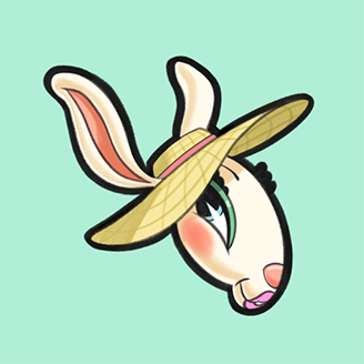
141. Assigment on Proko's art basics cours
9Default album
Activity Feed
Help!
Browse the FAQs or our more detailed Documentation. If you still need help or to contact us for any reason, drop us a line and we’ll get back to you as soon as possible!