


Albums

Activity Feed

D
•
3d
added comment inProject - Shade a Sphere
Asked for help
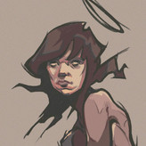
I did 3 attempts at the level 1. I used graphite pencils: B for the layout and 6B for shading. I do think because I was using paper primarily used for charcoal, that may have affected the shading because I feel I've done good as representing the darkest tones but as I try to get to lighter tones it gets tougher to differentiate between them. Especially on attempt 3 which I think is the best attempt but the reflected light and the halftone look too similar and I can't bring enough emphasis on the highlight. I do have other types of paper so I'll see what that produces.
D
•
7d
Asked for help


Simplicity is much more challenging than first seems. This looks really fantastic! https://elifesimulation.io

•
6d
The faces are awesome. Looks like you had fun :)
D
•
11d
Asked for help
Started learning here in the middle of last year but I allowed myself to get complacent. Finally attempting to get out of my comfort zone and take my skills higher.
D
•
6mo
Asked for help
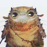
I really liked this project. It allowed me to satisfy my itch to draw details. Let me know if the image can be seen.

•
6mo
Looks awesome! The wasp especially!
D
•
7mo
Asked for help
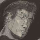
Only did the lvl2. The issues I seem to have is perspective and proportions, I'll definitely be doing this project again.
•
7mo
I think you nailed the perspective, and you captured a very good likeness in #6 + #11. There are a couple of areas where the proportion of the facial features is a bit off, such as in #4 (his eyes are too large) and the angle of the eyes in #6, but overall, nice work!
D
•
8mo
Asked for help
Measurements are difficult for me to understand. I've been eyeballing life drawings for so long that actually making measurements using tools is a alien concept to me, but maybe that's a blessing disguised as a curse. A habit that I'm seeing is I tend to make proportions too wide, like the distance of the ear to the eye, and the wide width of the jaw.
D
•
9mo
My attempts at using CSI for the second lessons projects. The snail looks botched due to the fact I didn't warm prior to starting it but I feel like I started getting comfortable by the time I started on the camel which is my favorite of the three, the proportions look off but what I like the most about what I did is how smooth lines curve and how dark their values are. For the skull I allowed my self to get bored and impatient which is why it looks incomplete but despite that, I think it still communicates well what it represents

Interesting, the skull is my favorite out of the three, because I felt that the skull image contained so much information that it had higher chances of mistakes. You tackled it well despite not finishing it. it contained enough lines that it looks good despite not completed. Great job :)
I also like the camel too hehe

D
•
9mo
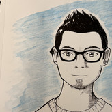
Hi everyone, this is my first time learning from Proko and it felt good drawing this project.
This is my first attempt. Critiques are much appreciated. Good luck drawing