


Albums

Activity Feed

Julia
•
2d
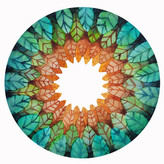
added comment inDemo - Light and Shadow Line Weight
Personally, I found this way of designating line weight way more challenging compared to hierarchy of importance. But I thought it was such a useful practice! Feedback is always welcome, thank you! :)
Julia
•
2d
I think some of the line weight decisions I made are somewhat random and could probably be more consistent/thoughtful.
Julia
•
2d
I was surprised at how difficult it was to include a variety of line weights. Also, I think my line quality still needs some work, that's for sure!
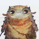
Julia
•
8d
I was a bit worried and intimidated by the hand, but I ended up having the most fun drawing it!

@brimarie
•
24d
New version after demo
Although I was satisfied with my first attempt, I have the feeling that I am getting too lost in the details. So my goal in this exercise was to make the lines as simple as possible. It's amazing what simplifying can do :-)
Julia
•
16d
Did my best to try and keep myself from getting lost in the details with the “After Demo” attempts.


Nancy Larson
•
26d
Feeling a bit dissatisfied with my process of doing the boots the first time (left pic), I re-did them a second time after watching the demo (right pic). They both look like boots but...
Hi Nancy! I see so much improvement in your second attempt. Your lines flow better and look more confident. Just by looking at these images I can tell that a lot of learning is happening, keep up the great work!


Shane Cruise
•
17d
The wood was the hardest part. Lol. The boots were much harder than the snail. Criticism is welcome. I’ll do the lvl 2 tomorrow.
I also found the boots to be challenging. But I definitely see some confident lines in your drawings, especially in the curves and laces of the right boot!
Julia
•
16d
Somehow I feel like my “After Demo” attempts got a little worse? With my second attempts, I tried to shift my focus more towards line quality and making confident lines.
Feedback is welcome! Thank you :)

•
14d
You’re learning a new skill. It’s normal to drop in level a touch to learn the new way to draw. Practicing the longer lines will make your drawings better over time.

Tanjiro Hisana
•
23d
Here's a before and after drawing of the pear. I feel my tones are more proportionate, but I believe more practice will make each shadow shape less ambiguous. Especially the halftone
I definitely see an improvement in your after demo pear—I see more care with the way you designed your shapes. Your consistent and clear use of tones really make the pear appear three dimensional and clean. Great job!