
Portrait Painting in Oil Without a Brain
Getting Started
Grid Method
Observational Drawing
Color Mixing and Values


Squinting
Separating Lights and Shadows
Edges And Planes
Painting with Color
Intermediate Portrait
Advanced Portrait
Drawing
Pastel Portrait
Digital Portrait
Digital Portrait Part Two
Additional Content

An overview of using a limited pallet to create a skin ton chart.
Newest


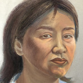
Madhu Girish
13d
Hi Morgan,
This is my submission for Skin mixing chart assignment. I also have two questions.
Q.1: How do you decide the intensity of skin tones ? When I try to mix realistic looking skin tones, the chroma gets too low and if I try to mix skin tones with a little more chroma, it starts looking cartoonish.
Q.2: I'm not sure if it is discussed later in the course or not but in your example, you did a little hue shifting in case of halftone. I came across this term not too long ago but I have seen that it makes the transition of a color from light to dark more natural. Like in your example, the halftone leans towards Red and your average light leans towards Yellow. When I try doing this, my halftone either starts looking too Red (Not in the same hue family as average skin tone) or if I don't add Red, the transition from Average light to Halftone doesn't look natural (I think due to lack of hue shifting). I tried shifting hue but your's look way more natural and correct.
p.s. Please tell me what I should add to my current mixtures to make them better. Please help, if I get this, I'll be able to color properly.
•
13d
These mixtures look great I see no problem

Niklas Nilsson
19d
Premixing for Ethan done! Soon I will start to put in the average darks. 🥳
•
19d
you may find out that your average light is too light and too high in chroma. i would add a touch of black and the other two colors to tone it down in value too.

Salem M
2mo
Attempt #2 : I can't seem to stop making orange flesh tones, I even follow your exact steps. Going to try again. I feel as if mixing colors is a bigger battle than the actual painting.
Salem M
2mo
Hmm, I'm not sure how I feel about these. I think my light family has become a spray tan family. Seems very orange compared to your example. Will try again!
•
2mo
Agreed


Shawn Laughlin
2mo
These are the skin tones I came up with. I don't know if its my monitor, but the light looks a little cool to me. I went from warm shadows to cooler lights. I tried to keep the colors close to what you are mixing with your limited palette. The lightest light is probably way to light, but I think the rest is ok.
•
2mo
should work. I think.


Christina Michaels
3mo
late coming!
Christina Michaels
3mo
You are simply a genius at what you do11


@dargretchen
3mo
Morgan - you are absolutely brilliant and your sense of humor makes my day! These videos are pure gems! Thank you so much for your generosity in sharing your amazing talent!
•
3mo
Thanks! I didn't feel like I was being my funny self. I looked at the footage and seemed to serious.

Ignacio Nicholson
3mo
Really helpful lessons! I've always struggled with knowing how to adjust my colors but only being able to go "up or down, left or right" with a limited palette helped a lot. That said, this was still a lot of work and I feel I need to give the cool palette another go. Thanks,

@mnk
3mo
Good exercise to get familiar with the palette. I think everything might be a tad too cool on mine and the split between shadow and light slightly too big, or is it good enough to start the painting?
•
3mo
sorry, haven't had power for days. should be okay but your reflected light could be slightly lighter.

@micheledavisart
4mo
Fun exercise! I had to keep checking my color values with my grayscale chart — turning my photo into black and white helped me see where I was off.
•
4mo
looks job!

Gaye Sekula
4mo

Debra Rank
4mo
•
4mo
great job!

@mahatsu
4mo
Thank you for introducing Ketchup and Mustard method. Simpler method for complicated matters.
•
4mo
great job!


@jsheffie
4mo
Hi Morgan, what is in the white bucket that you occasionally dip your brush into? I assume its a mineral spirit or a medium. At first I thought it might be water, but the internet suggests otherwise. I bought the stuff off of your materials list. I have Gamsol Mineral Spirits, Walnet Oil Medium, and Walnut Alkyd Medium.... Whats in the bucket?
( I think I remember you saying that you did not like Spirits as much )
Thanks, Morgan ( I am enjoying the lessons )
•
4mo
It's the plain walnut oil. I buy it off amazon in gallon jug.


@andreat
4mo
Well this was a challenge but a good challenge. So glad I only have 4 colors to mix with. Now I know why I was overwhelmed with a full palette. Totally a much better approach to work with a limited palette. I am willing to remix if needed. Thanks SOOOO much for your help!
@andreat
4mo
Here is my second attempt at the warm flesh tones. I think the first set is too warm and too dark in value.
Susan Pennington
4mo
Oh my, I found this difficult as my first mix of alizarin crimson and white ended up too pink and stayed that way when I added the ochre light to it. Reworked my several of the light values in the attached to try and get rid of the reddish hue. This photograph is a bit misleading as to color as it's taken under a yellowish light. The background was actually grey mixed media paper but it and the colors appear more yellow. So I learned its important to get the initial mixture right tending to orange instead of red.
Susan Pennington
4mo
Here's a new picture taken in natural light

Shelly England
4mo
I was going for tight on the B&W but might be a little too tight between shadow and light
•
4mo
On the black and white scale your halftone and reflective light are too close. You need a little more contrast between the two to have proper shadow-light separation.


@szokebarnabas
4mo
Skin mixing chart practice
Michèle Girard
4mo
I'm learning so much! Thanks in advance for your input.

Course by Patrick Jones
Give a gift
Give a gift card for art students to use on anything in the Proko store.
Or gift this course:

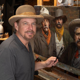
About instructor
Award winning fine artist represented by @legacygalleryart in Scottsdale AZ