
$127.20
$159
You save $31.8


Bundle discount Each additional course part in your cart adds 3% off all courses, up to 15% off.
Full course
You’ll learn the most important foundational concepts for drawing anything and soon you’ll be drawing pictures out of your imagination or from reference.
$127.20
$159
Give a gift
Give a gift card for art students to use on anything in the Proko store.
Or gift this course:


Founder of Proko, artist and teacher of drawing, painting, and anatomy. I try to make my lessons fun and ultra packed with information.

LESSON NOTES![]()
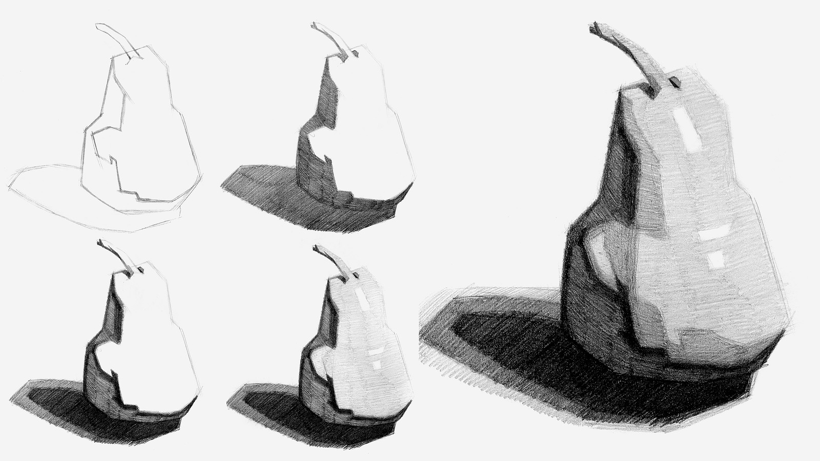
Now that you’ve all had some time to try the first project on your own, you can watch how I do it and figure out what areas you are exceeding and struggling with.
To watch this step-by-step demo on how to properly execute the first project for level 1 students, join the premium course!
DOWNLOADS
COMMENTS![]()
![Stan Prokopenko]()
![]()
![@maiatatita27]()
![]()
![Zenny Deer]()
![]()
![Ayu_33]()
![]()
![@sullysarmywife]()
![]()
![Nadira Anjum]()
![]()
![Ayu_33]()
![]()
![Bell]()
![]()
![@sketchenstein]()
![]()
![Henri Wirth]()
![]()
![@sketchenstein]()
![]()
![Josue]()
![]()
![Josue]()
![]()
![@sketchenstein]()
![]()
![José Ramon]()
![]()
![@sketchenstein]()
![]()
![@jwoz]()
![]()
![@ctellez]()
![]()
![@wonkbunny]()
![]()
![Josue]()
![]()
![Alessio Rossi]()
![]()
![Kristina]()
![]()
![@sketchenstein]()
![]()
![Argyrios Ramandanis]()
![]()
![@sketchenstein]()
![]()
![@cmolholm]()
![]()
![@sketchenstein]()
![]()
![@hannahfathi]()
![]()
![@sketchenstein]()


Now that you’ve all had some time to try the first project on your own, you can watch how I do it and figure out what areas you are exceeding and struggling with.
Here is my step-by-step demo on how to properly execute the first project for level 1 students.

i forgot some stuff or messed a bit so a made sure to make note of them on the drawing xD
feel free to tell me anything else i might of gotten wrong


Think my shading was a bit rough, and I need to work on it but pretty happy with this as a first atempt


I think shape are the problem here to me shading doesn't look that bad and good attempt
Inspiration, first attempt, and second attempt. Using this course to help my painting. Trying to figure out how to really simplify first into big planes and values.


I think the shape are mixing together but it looks really nice (i am a noob too so i am just saying what i felt)


I think it is an improvement! The After has more 3D feel, particularly around the "two highlights boxes" area, and also b/c of the new left side highlight. Overall I guess the improvement is the combo of the extra shading differentiation and the angle of your shading lines (Total noob here).


It's a start. I can see from looking at some others that this pear lacks dimension b/c I didn't do the 3D panel work. Now I've learned to come look at the postings before I get started, very helpful.

It really is a good start, something that made it easier for me to get my values correct was start with the lightest value after white and cover the whole pear and slowly build up to the darker areas, that way you’re getting an even shade of value all throughout the drawing. Don’t be afraid to go even darker for the shadows. In his demo he talks about the transition from shadow to light values, I see there that you go straight from darkest to lightest. Maybe try out an in between those two values to help it read more like a rounder object but keeping those straight lines.
Hi guys! These are my pears, I kinda tried out different things before watching the demo and I feel I got to where I wanted to get. Hope to hear some critiques and hopefully get better and get to know my peers!
Wow, nice job. Seems like your 4th attempt was using the method given, and quite on point, but your 2nd attempt, where you abandoned the straight lines and defined edges, really good and more natural. Also liked in the middle pic how you indeed made the whole surface of the pear into seemingly 3D panels. I didn't do that part and just went 2D feel.


Looks good. Feels like a Picasso! I failed to do the 3D blocking you did and think that the technique succeeded to give the pear its dimension. I may have to try again.
The natural light was after this video, the LED light is before. Criticism is more than welcome, I believe I needed to define the lines a bit better as asked for simplification sake (Working on using elbow to make the lines still shy about it); along with blending the tones a little more to make it seamless. The tones I tried to restrict myself to a 2B along with the composition notepad to get a feel of what the pencil by itself could do. Also experimented with the lighting on the paper as well which also changed the effect to what details could pop.
Thanks and hope to hear from you,

My first attempt, my second attempt after the demo, and the lemon in front of me. I think I have a lot to improve, but this was a lot of fun.
Before and after the demo and critique. I realized while watching it I drew the wrong pear the first time, but I still can see an improvement.
That difference is insanely good, it shows so much depth in the second one. Awesome job! What pencils did you use?

Hi everyone, just starting this course, would love a art buddy if anyone wants. these 2 pics are my before and after the lesson, before i didnt do it with straight lines so they look a lot different, i still like more my first but lets see where it goes doing it blocky ish :)
if anyone has tips pls say it i want to get better <3


Hey everyone, just want to share my progress. I've drawn the same pear twice. First one before Stan's demo, turned out to be not simplified enough, but I think I've got pretty accurate proportions. The second attempt was after the demo. I've also added it a few comments on the photo after watching the critique video. And I think that maybe the darkest shade of the light looks better on the first one, because it gives the pear more volume.
Feel free to share your opinion, what else could be potentially improved if you notice something, that I've missed :)
You noted 'use less planes' but as one who did zero planes, i now see how using the planes could really lead, in the future, to better shading control to create the 3D feel. Nice work.

Ok, I had stopped the course for a while so I started again the projects. This is my pear
Nice job. I'm a noob but from one noob to another will offer a comment: I feel like maybe it would be better to have made the shading work a bit more consistent, uniform, within its boundary?
Can't resist to comment that this pear looks like its sitting on the sofa watching TV with a beer!

I struggled the first time with an apple i tried ti draw bc it was unclear what was shadow and what was darker parts of the apple. This is my second attempt with the pear. I added a sixth darker value in the shadow.
This is excellent. Great shading work. Can also really feel the "panels" giving shape to this pear. Also like what you did with the background - I didn't do anything there.