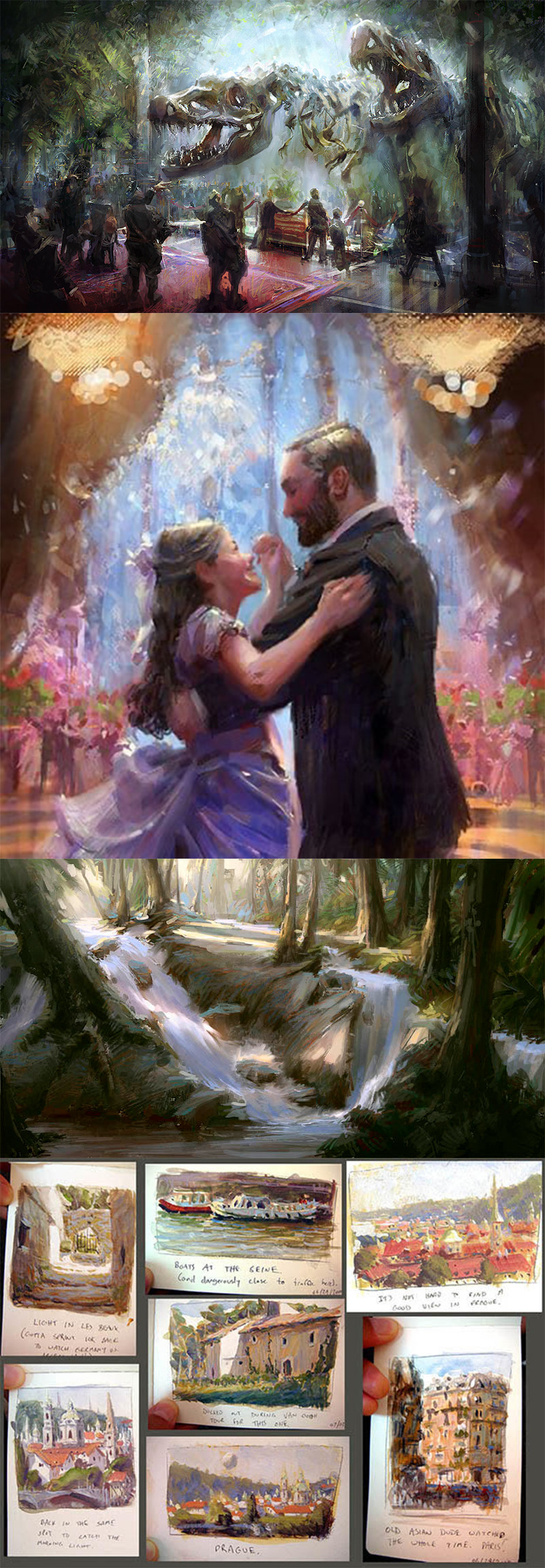
I'm a beginner when it comes to color but the minute I saw this challenge I knew I had to try. Aquariums have such a nice atmosphere and soft light and the variety of fish are rent interesting to look at. However it feels a bit flat so I'm open to criticism on how to fix that
Hey all! Question.. are multiple submissions allowed? I see some people posting multiple submissions. I'm just curious to know so I can decide on whether to post another or not. Thanks (:
This is a pretty good way to study light and shadow on a model I feel like I should try this exercise sometime. To be honest I don't really have any critiques I think these look cool.
Hi, is there a limit to how much you can submit? like can you submit like 5 paintings? I am in like a hyper productive state right now and therefor has a lot of ideas for things I'd like to make and submit.
So I wanted to make something for this challenge. Problem is i hate myself and decided to try a color gamut for the first time, and also painted wet on wet which I hate.
The gamut was a problem because i picked a unfamiliar color gamut and I messed up mixing my color strings or whatever they're called.
Any suggestions for this? Also the photo is a quick one, the colors are pretty subtle, but I didn't make it so colorful as Marco Bucci does his.
Hi there. I'm thinking of trying to illustrate a black cat walking to the orange street light but struggling with the colours and lighting. Any thoughts or constructive criticisms will be appreciated.
a second version of the picture I finished a few days ago. Much much happier with this one. I uploaded the previous one too for reference. (The new one is the one with the reeds)
The reeds do add something to it in terms of realistic detail although I think it's a bit of a shame they obscure some of the details in the scales of its face. I like the texture of your brushes.
Hello! I'm new to the community and I really want to participate in this challange. I'm a huge fan of Stan and Marco and I saw this as an opporutinty to push myself.
I may change a few details for the final submission but I'm happy with the current painting. I tried some different things to push the colors and the light and I think it really payed off.
Feedback is very appreciated!
wanted to do a mur-person design in a backlit swamp. there is a shoreline I wanted to add and i want more texture. idk about this one, I feel there is some good stuff but I think Im either going to redo this one or start anew on a different design
Hi everyone, I am trying to sketch a tiny inchworm happily moving towards a (distant) apple on a table. But I am having a bit of trouble framing the scene. To make the inchworm look small, I have to make the apple look big - but the inchworm is the main character. Below are some ideas so far - my favorite is #6 but because it is flat it will be more difficult to apply lighting. I will color the scene, so if I crop the apple, I think it will still read as an apple, but I am not being able to make it look like the apple is far away. Any advice?
Something that might be worth trying is putting the apple in the foreground so that way the perspective will push the size difference between the worm and the apple, and you'll be able to see the worm's happy little face.
Play around with it and mess with where you put the horizon line and see how it goes :)
Hello Ana, I think this is a really cute concept for a picture. I wanted to try my hand at helping you solve your problem with respect to the feeling of distance. I attached a quick sketch to show how I would try to solve it. I basically just remixed solutions you already explored in your own iterations.
First thing I wanted to do was to get on the inchworm's level, as you did in #3 & #4. We're used to seeing a creature like this from above. To it, we are a bit like a spy satellite with a zoom lens. But maybe we can empathize more with its struggle, if we see the world from its point of view.
I used 1-point perspective to geometrically establish distance. (Like you did in #4)
However, I also made my version more like #3, in that I cropped out the top of the apple. From the inchworm's perspective, the apple is like a mountain. So, I wanted to treat the apple like it was too big to fit into the frame, to establish a sense of scale.
I also wanted to use a little atmospheric perspective to further exaggerate the feeling of distance. This is not realistic for objects on this scale from a physics standpoint, but the effect should still read. Actually, I am not sure if I succeeded at this, but the aim was to try to make distant objects lighter in value and to reduce their contrast.
I liked your lighting scheme from #8, so I tried to mimic that.
There are probably other ways to show distance or to improve on the solutions I attempted here. Either way, I am confident you will make a lovely picture out of this scenario. I look forward to seeing the end-result!
Hello, First time participating in a Proko challenge. Here is some WIP and few thumbnails for light scenario I also added the Sketch. I'm inspired by Patrick J Jones (since I got the pdf books) and trying to combine his style with my own and try to achieve an interesting light and color.
The second Thumbnail is the most attractive to me, but I still wanted to try and see if I could come up with something better.
I'm hoping for any type of criticism and guidance.
Thank you :)
I like the challenge you have for yourself with the window bars. Each scene has a different vibe giving her a different context. The second and third one look like she could be lounging around sexily, maybe near a fire place on the third one whereas the fourth one looks like a potential prison cell. I think the second or third one is the best.
Hello I made this,I would like some critism specifically if the sense of light is believeable and if you can still see the characters and their structure.I was looking at Sorolla and was trying to c apture his sense of looseness if that helps.(specifically his "lighthouse walk at the biarritz")Would also love to know if anything else isn't working for this piece.
Also @Liandro@Christopher Beaven any thoughts on this?
(P.s. I forgot to mention it but this is technically a touhou fanart,so here are the references I used.)
Anyway,thank you very much for replying :D
Hey, @paper, thanks for reaching out! I think @Christopher Beaven has given you a very solid critique already and I agree with pretty much all the aspects he brought up.
I think it’s great that you’re regularly creating your art pieces by studying from masters you admire, but, more than that, make sure to also save enough regular time for taking structured art courses (such as the ones recommended by Christopher) if your goal really is to tell stories through figurative art. Good lessons plus deliberate practice is the combination that will really help you strengthen your fundamental skills.
Hope this helps. Best of luck!
Hi Paper great to see your post and work again. I took some time on this one because I know you're working hard and I want to try and help you as best as you can.
The biggest issue I see with your paintings is the lack of organization in the elements in the painting. I've done a draw over on the Sorolla painting as well as yours and you will see that Sorolla and every other pro you've posted here has very clear graphical shapes to all the elements in their piece. I would suggest planning your paintings first by doing many thumbnails with just three values and organize your shapes so that the story is clear.
While drawing over your painting I've also noticed that you don't have a clear light source. If you do, it's really hard to tell. Maybe the figures are lit from behind but it's not clear.
Also, the figure lack any structure. Even though Sorolla has loose brush work they still build a believable structure in the human form. For this I'm going to suggest you go back to the basics of drawing the figure. Take Prokos fundamentals of figure drawing that will help you a ton with finding the structure you need so you can tell the stories you want to tell.
Lastly, story. If you want your viewers to understand what your trying to say your composition needs to be organized so that it reads quickly and easily. Study all the artists you love and see how they structure their compositions with basic shapes.
I hope that helps. Above all else don't be discouraged. Keep doing your best and taking it one day at a time.
I prepared faster this time to work on this challenge.
I started with the first two frames, which of course I did not like either of them, but I am going to share the full direction of pieces here even the failed ones. I will definitely share better frames in this time.
Failure is not always bad
I am digging this sci-fi concept of the roboticist's laboratory. It seems as though you really hit on a compelling color and lighting scenario with your second image as well. You've got a good complementary palette going with the oranges and blues. I also like how low the overall light levels are; very moody, like a noir film.
I think it is working as-is. However, in this study, you forgot the shadow of the window frames against the wall. When you add this, it'll look even more like a noir film! Also, I don't know if this is really an issue, but it appears that your secondary light source, the computer monitors, is shining onto the scene from the same general direction as the primary light source, the window. If you had a monitor positioned somewhere on the other side of the room, it would give you an excuse to push more cool tones into the shadows.
I want to ask for feedback while the major attributes of the piece are still malleable. These WIP images are attempts to "study" the painting before diving hard into it. These images should show where I am at in terms of composition, values, and colors.
I will begin refining (i.e., redrawing) the sketch over the work week: mapping the 3-point perspective, nailing proportions, and indicating mechanical details. I hope to complete the refined sketch by next Sunday at the latest. So, feedback regarding composition is the most time critical. Though, in the long view, I believe I will need the most help with color and light.
____________
I think I like where the composition is currently; however, there could be danger in falling too in love with one's first draft. My starting idea was that I wanted to show a pilot's viewpoint while banking through a turn, with a companion craft leading the turn. Then I remembered that I have been meaning to do a tribute piece for an esports team I flew with last year in a Star Wars flight simulator. A super group of guys! Each rebel starfighter in the image will represent one of the remaining team members. (Note: I am not fully done with the background scene. Need 2 Y-Wings to fill out the team, and generally more battlefield chaos.)
I grabbed the base reference by going into the sim and trying to replicate the scene I had in mind, screenshoting my view from the VR headset.
From a storytelling perspective, I want to convey the maneuver being performed, that an attack on the Star Destroyer is underway, and that the bridge/superstructure is the focal point of the attack (particularly, the Shield Generators, which are the orb-like structures).
Another objective I had was to practice cropping closely for sake of immersion. I wanted to avoid the temptation to pull back and show the full Star Destroyer or push the X-Wing away, so its wings were no longer clipped by the cockpit frame.
Potential problems I see with the composition have to do with rule-of-3rds, big-medium-small, and my decision thus far not to crop the cockpit more.
So, the bridge/superstructure, which is the focal point, is vertically centered. And, even if I treat the window as a "frame-within-a-frame", the bridge/superstructure is still vertically centered. Counterpoint!? Maybe I am the Wes Anderson of the vertical axis?
In terms of big-medium-small, the foreground X-Wing is similar in size to the bridge/superstructure.
I may be able to minimize these first 2 issues if I push the perspective slightly. The bridge/superstructure shrinks and gets pushed farther into the corner of the windscreen. The X-Wing grows slightly bigger.
Lastly, in terms of the cropping, the image could be claustrophobic. We are immersed in cockpit more so than in scene going on outside it. But I think there are some visual and storytelling benefits to being pulled back like this, too.
I like this composition. But these are potential shortcomings, as I see them. If someone with more experience is like, "Yeah, you should really fix these (or some other things) to take it to the next level," then that is what I got to do.
____________
I think the value study came out well. This battle is taking place in a sort of nebula called "The Zavian Abyss." In game, the colors of the Abyss look unpleasant, in my opinion. So, I want to reimagine the colors and lighting scenario to be more evocative of an underwater scene.
I found an underwater photograph I liked, grayscaled it, and used its values as a guide.
____________
I have the least amount of practice with color. My objective with this color study was to make sure that there was some sort of hue shift in the shadows. I aimed for a shift toward turquoise. Although, physically speaking, there isn't anything in this environment that is scattering turquoise fill light. The nebula color implies merely a deeper shade of blue for the fill light. This was a small aesthetic experiment on my part, but I am not committed to it.
In the light, I tried for a very small hue shift towards cyan. But I wanted to keep the source light relatively white, so that I am not completely washing everything out with blue.
The most awkward area in the color study, I think, is the X-Wing. The paint scheme is supposed to be yellow and black. It looks army-toy green. I may have done the hue shift in the shadows incorrectly. Or I did it just fine, but there are not enough lit areas from this angle to give the shadows context. If the latter is the case, I can shift the overhead light slightly to the left to light more surfaces of the starfighter.
____________
Later in the process, there will be many color and lighting effects I will be eager to explore, especially with various local sources of light, such as the explosion, blaster bolts, and indicator lights. However, these studies have not attempted to account for these effects.
Here is my progress at the conclusion of the weekend. I am happy with the composition that is taking shape. I feel there is a lot of potential here.
I am still plugging away at the line art. It took quite a lot of effort to construct the X-Wing and the Star Destroyer. I am not using a 3-D Program. Just old-fashioned perspective, with some guesswork thrown in on occasion.
I will not have much time to do the "painting" before the deadline, yet I remain committed to submitting this piece for the challenge. Hopefully, running up against the deadline will help me imbue some "sketchiness" into the painting stage of the process.
I believe, though, that I will want to revisit this line art, after the challenge, and try to make a proper illustration out of it.
Hi @Isaiah! I have just seen your post. I think the interior of what would be the ship is taking a really close amount of space in comparison with the windows. May be the roof is not nedeed. Or it could be higher.
Anyway, it depends how you trait the illusion of light at the end. Guessing you will work on the outside of the ship, it would need more space. But the action feeling is there. So that´s something to look for if you change it.
Hope it helps. Keep up the work!
Apologies for the lengthy posts. Longwindedness in writing is a compulsion of mine, which I consciously try to minimize, but do not always succeed at doing.
Anyway, my intention is to catalog my progress with the piece here by self-replying.
My work tonight was mostly mental. I attempted to work through my self-critique regarding the composition, by making some simple, slight transformations, and then nervously comparing them. I've attached the variations to this post, but I am probably the only one who will readily see the differences. (I may not have been bold enough.)
#1 is the original value study. #2 is the same but with the Bridge/Superstructure pushed back (slightly), this was to push it a little more towards the lower left rule-of-thirds intersection and to reduce its visual size in comparison to the X-wing, for greater visual interest. #3 increases the size of the X-Wing and pulls it slightly closer to the upper right rule-of-thirds intersection. #4 rotates the image by 1.5 degrees. This moves both the Bridge and the X-Wing slightly closer to their respective rule-of-thirds intersections. #4 is slightly cropped, on account of the rotation, and for the reason specified in my previous post.
Currently I am leaning toward variation #2, which is hardly any change at all from the original. But, when I initially sketched this composition, I felt really good about it. I thought it looked cool and dynamic. However, there is supposed to be something that needs fixed, right!? So, I identified some potential rule-violations I saw in it. Of course, there are times where it is okay to break rules, and I daresay this one might be one of those times. I believe this has to do with the unique visual situation created by the POV being from the interior of the cockpit.
____________
I went ahead and purchased Marco Bucci's "Color Survival Guide" so that I would have the tools to self-critique and self-analyze, in addition to any feedback I receive in this thread. After watching the first 4 lessons, I am eager to do another color study. But, I need to begin work on the refined sketch.
My next update on this piece will be the refined sketch, which I will complete by Sunday.
Marco Bucci began serious study of art when he was 19. He began with drawing fundamentals for 3 years before discovering a love for painting.
Help!
Browse the FAQs or our more detailed Documentation. If you still need help or to contact us for any reason, drop us a line and we’ll get back to you as soon as possible!
Works in Progress
Post your process sketches and works in progress for the challenge here if you want feedback from the community.
This challenge is closed for new submissions. Congrats to all the winners!
View all submissions
View judging video and all winners