Hey everybody! Are you ready to shape up? If you said yes, that's good! Cause in this lesson we’re gonna start learning about shapes!!
So, what’s a shape? Well, it’s hard to define shape, without using the word shape. You start drawing a line, and when you enclose it, the area inside is a shape.
It’s a fundamental element of the visual language. It’s impossible to draw something without using shapes. We already learned that even lines have a shape to them.
So, we’ve already been using shapes in this whole course. Now we're going to focus on it.
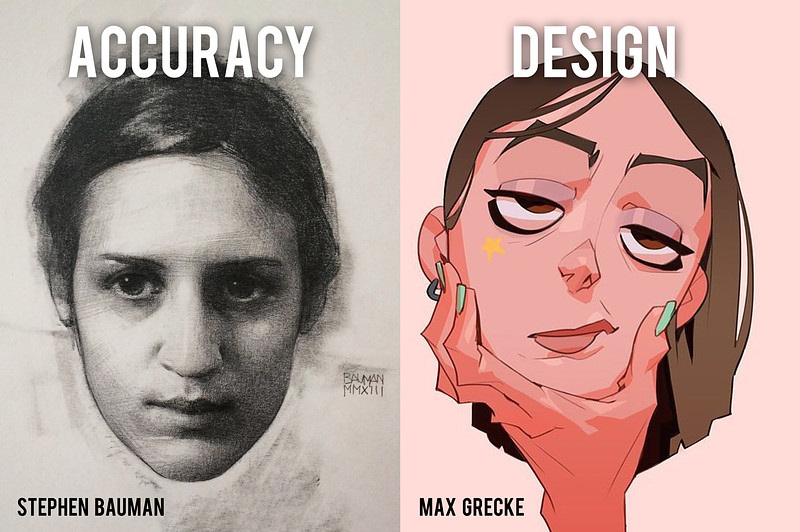
I think that learning about shapes can be broken up into two focuses: Shape Accuracy and Shape Design.
- Shape Accuracy - is training your eyes to see accurate proportions. You have a reference, whether it’s something right in front of you, or a photo, and you focus on capturing what you’re seeing.
- Shape Design - is about making shapes look interesting, or.. awesome looking. Doesn’t matter if it’s true to reality or not, as long as it looks awesome.
Most of the time, artists are balancing both of these concepts. The way you balance them really depends on what you’re doing. Your style might lean towards one of the two, but also the industry you work in might dictate the requirements of the job.
If you’re early in your journey to art mastery, you probably don’t know what your style will be or what job you’re gonna have. And actually that doesn't matter, because we should practice both. We should train our eyes to see accurately and we should be able to break from reality to design our own shapes that we see with our head, not our eyes.
So, coming up we’re going to have some lessons that focus on accuracy and some that focus on design.
In this lesson we’re going to learn about simplifying shapes and constructing complex shapes out of simple shapes. Because that’s a very important skill for both accuracy and design.
Shape Language
We learned how lines have emotions and can communicate ideas. Shapes are the same, but on steroids. Shapes are the primary way that we communicate with pictures. People can have an emotional response just looking at some shapes.
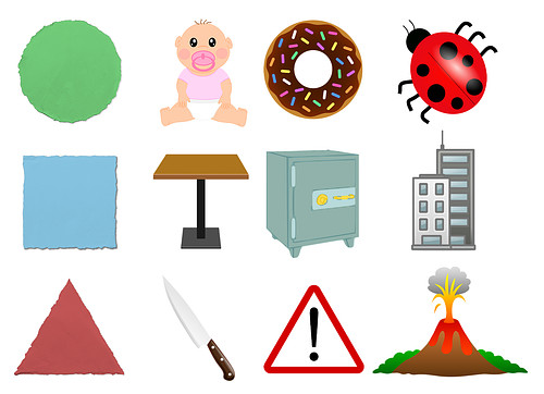
The basic shapes that are traditionally taught in shape language are circles, squares, and triangles. Of course that in itself is a simplification, but let’s just stick to that. Each of these shapes has a personality!
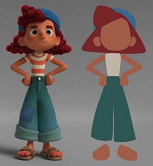
Circles are soft, safe, friendly, and cute. Squares are stable, reliable, strong, and stubborn. Triangles are energetic, dangerous and aggressive. Triangles are directional, so the way they point has an effect.
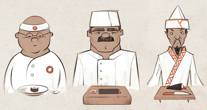
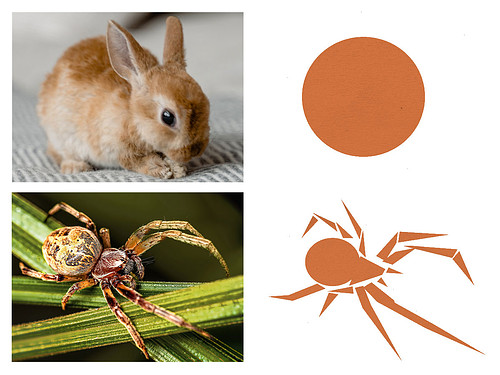
Look at how this shape language can be applied to a character. The character inherits the personality of the shape. Which one looks the most friendly? Strong? agressive?
This bunny is cute. It’s round and soft, and that’s psychologically and scientifically guaranteed to be cute!
Now, what’s the opposite of a round shape containing the mass? I think of an explosion of triangles. Well that kinda reminds me of BUGS! The scary types of bugs. Most people have an instinctual reaction to the shape of a scary bug, even if they know that it's harmless. So, using shape language to our advantage when we’re drawing can be very powerful.
Start Simple
Keeping things simple is NOT easy. It’s actually really difficult. You have to learn how to simplify a complex object into a simple shape. When we’re drawing from reference, simplifying means we can’t just copy what we’re seeing. We have to process it and make a bunch of decisions. What’s important about this thing? What can we remove? What would it look like if we remove a bunch of stuff? Drawing from imagination usually involves learning about the world and breaking it down. So, don’t go into it thinking simplifying is the easy route. Getting good at breaking things down takes practice and constant observation.
There’s actually a lot of reasons why it’s useful to start our drawings with simple shapes. My animation teacher in high school had a sign up on the wall that said "KISS", Keep It Simple Stupid. And he constantly reminded us of it when we complicated things. We have a tendency to over complicate and that can make it harder to get a good drawing.
Simplifying Makes it Easier to Judge Proportions
If we’re drawing from reference, breaking down your subject into simple shapes makes it easier to judge proportions, leading to better accuracy.
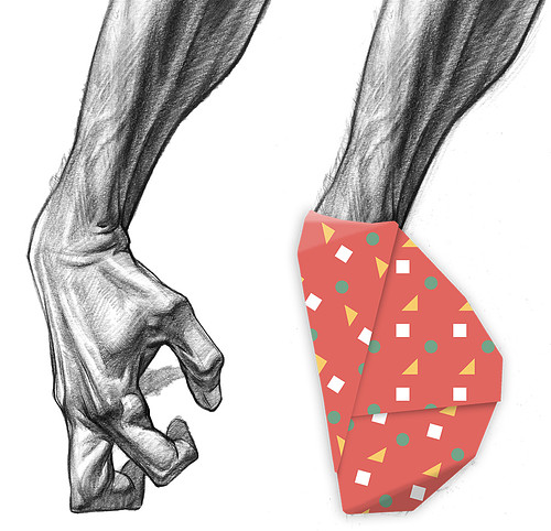
A really common way to start a drawing is with an envelope. A big shape that contains everything. This hand has so many small shapes that it would be difficult to jump right in. Imagine it gift wrapped. By doing this I can look at the big angle changes, and rhythms where things line up. I can measure the width to height relationship of this big shape. Once I’m confident that it’s accurate, it’s much easier to break it up into smaller shapes. Keep It Simple Stupid.
Simplifying Makes it Easier to Fix Mistakes
When we start our drawings, the main things we’re focused on are proportion, composition on the page, gesture and interesting shape design. It’s pretty common to make a mistake and have to move something. It’s a lot easier to move a simple shape than a complicated shape. And usually what happens when you complicate too early, is you try to convince yourself that it’s good enough. It’s not fun having to redo something. You end up not fixing mistakes that take too much effort, making your drawing worse. Keep It Simple Stupid!
Simplifying Allows us to Focus on one Thing at a Time
In those early stages ignoring the details, all the bumps of the secondary forms, lets us focus on those important things that we’re trying to achieve in the early stages, like proportions. And we get through the first stage faster. Afterwards we can focus on designing all those smaller shapes. It’s good to build your drawing in stages. You end up doing a better job than if you tried to do everything at the same time. Keep It Simple Stupid…
Simplifying Allows Quick Iteration
Simplifying allows for quick concepts to explore ideas. A big rule for concept designers is not to fall in love with your first ideas. It’s good to spend a lot of time exploring, iterating, and trying things when you have no idea if they’ll work. If you’re going to do a hundred concepts for a character line up, you want to keep it simple. And again, you’re a lot more likely to stick to your first idea if you put a lot of time and effort adding detail. Keep It Simple Stupid.
Simplifying Makes it Easier to Understand and Remember
If you’ll be drawing something many times, like a character for your comic or graphic novel, or animation...especially animation.
Then you need to seriously understand the shapes of that character so you can remember them. It’s a lot easier to keep your characters consistent if you can simplify them.
Keep It Simple Stupid.
Simplifying Makes it Easier to Invent Different Angles and Poses
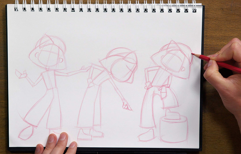
So you have your character. You understand the big simple shapes. You remember them. Now it becomes easier to pose them - move and deform all the parts. It’s much easier to draw something from a different angle, if it’s simple. Keep It Simple Stupid.
Simple Shapes are Iconic, Instantly Recognizable, and Clear
We can simplify the shape of something, and if we keep the important parts that make that thing unique, it’s still very recognizable. It becomes an icon.
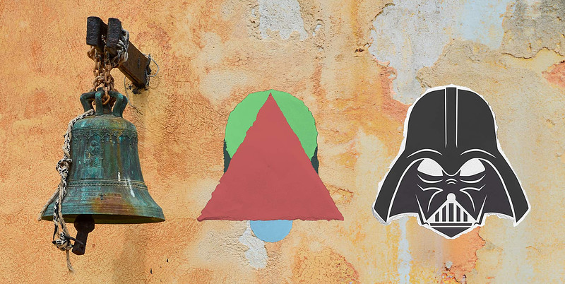
A bell is this oval on top, transitioning to this flat triangle on bottom, and a small circle underneath. This communicates the idea of a bell.. or Darth Vader.
The most famous logos usually have simple shapes at the heart of their design. You know in a heartbeat what each of these logos represents, and they read from a mile away.
We start simple so that we can design the major elements first. Big shapes are easier to exaggerate, stylize, and work with to determine the shape language. We start with simple shapes and we try to maintain them as we add detail throughout the drawing.
Build Complexity
Alright, so we got our simple shapes. We’ve determined our main actors. When you’re writing a story, those big acts are like your simple shapes. And you have your main characters. Now, as we add details, as we add complexity, we should try to make those details support the main ideas. They are like supporting characters.
But those details should be interesting on their own too. It’s a balancing act of making things interesting but part of the whole. The viewer sees an image from a distance, it all works together, capturing their attention. They walk up to get a closer look, and the details are exciting and keep the viewer engaged. Everywhere they look they discover something new.
Super inspiring. That’s the goal, but let’s get back to the basics.
Combining and Deforming
We build complexity by combining simple shapes. By adding and subtracting shapes from other shapes we can build complexity one step at a time, and ease into it.
Build a star by adding a bunch of triangles. Subtract a circle from another circle and you get a crescent moon... or a banana. This is kinda geometric, getting into math territory.. ew.
But, when you apply that same concept to more organic shapes, shapes that are bloated, or stretched, or punched, now the game changes.
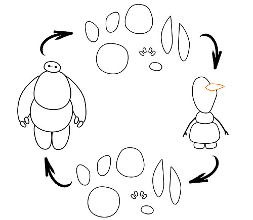
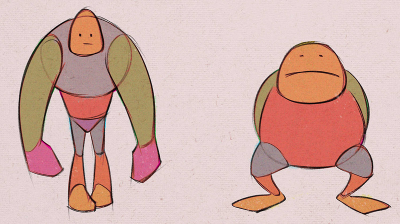
Here’s a bunch of simple organic shapes. Now look! Recognize this guy?
What about now? Change up the proportions a little bit. Or a lotta bit.. And you get a totally different, very recognizable character!
With simple shapes we can build a framework for any body type, for any character, or anything. It’s the way in which we combine the shapes that really matters.
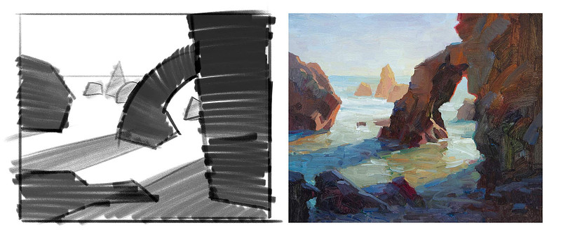
When I go out plein air painting, I always start with a small thumbnail, exploring the major elements that makeup the composition. Individually these shapes don’t mean much, but together, they're an afternoon in Malibu. You don’t have to draw complicated details to have a complex message. You just have to combine simple shapes in meaningful ways.
Try to keep your simple shapes strong and solid, not squiggly messy shapes. Don’t think of mashed potatoes, just think of potatoes.
How Do We Know How to Put Shapes Together?
At this point you might be thinking “but how do I know HOW to put shapes together?” That’s the hard part..
Many concepts influence how you decide to put shapes together. Composition, anatomy, perspective, design, gesture..There’s a lot!
There are a lot of concepts that DRIVE your shape decisions. That’s why art can look so different. There can be so many different styles. Even more styles we haven't seen yet. Perhaps yours?
This can be intimidating. Especially if you think you need to learn and master all these things, NOW. Maybe eventually you will be a master of all these concepts. But right now it’s about prioritizing. In this course I’ll introduce and guide you through the things that I think are important as a good base for all visual artists, but after that it’s up to you. If you love learning, then it can be kind of exciting to know that there’s so much waiting for us.
If you’re enjoying this course, don't be selfish! Tell your friends about it. Alright, I’ll see you next time!


