


Albums

Activity Feed


Steve Lenze
•
1yr
added comment inSearching for feedbacks on a work in progress
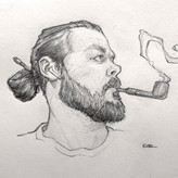
Focusing on the clothing, I feel like you have too much complication, it's too over done.
Wrinkles and folds need to follow the concept of stretch and pinch/tension. One side needs to be simple and the other side complex, because when everything is complex, it confuses the eye.
I did a quick sketch that I hope helps :)

Francesco Crobu
1yr
Thank you very much, Steve! Yes, maybe I should study drapery better. I will try to make the adjustments you suggested.
I'm working on this character design. The intention was to create a slightly distorted perspective in order to give the character more grotesque shapes, but I'm not sure if it's working. What am I doing wrong?
The character still needs to be rendered, but I want to make sure the shape is functional first.
The prompt for this character is a Crazy Bluesman who could fit well in a Southern Gothic context.
Thank you for your attention and any advice.
You did so much right with this, especially the pose.
The tilt of the head creates a nice "S" curve through the body.
The tilt of the shoulders working against the tilt of the hips makes the pose more dynamic.
The only thing I would say about the pose is that the legs stiffen the pose a little. The forward leg is at a right, 90 degree angle which is always going to feel stiff. The other leg looks broken and is missing the swing of the gesture.
Other then that, I think you did a pretty good job :)
Thanks so much Steve! Your advice is always great. I'll try to make the changes.
Francesco Crobu
•
1yr
added a new topic
[Looking for a critique] The Mandalorian Fan Art IllustrationHi!
I made this illustration about a month ago with the intention of putting it in my portfolio. I think it has lost some of its freshness and fluidity after a few corrections, especially to the pose. The pose has definitely become very rigid. What do you think?
Any advice is welcome!
Qualunque consiglio è ben accetto!
Steve Lenze
•
2yr
I really like the way you kept the pallet to subdued reds blues and greens throughout the whole presentation.
For a portfolio, you could add more sketches and iterations of character and props to show your thinking and design explorations. Overall though, I think this would look good in a portfolio.

Wow, great interpretation! This feels really on point for Lovecraftian horror. Great narrative in the props and environment, and your character feels right at home in the world you've created! I would love to see your take on what The Deep Ones look like in your story! Do you have any creature designs for them?
Hi Patrick! I'm really happy you liked my project. Unfortunately, I wasn't able to make the deep ones as well by the project deadline. However, it would be a shame to leave this project without exploring the creatures. So I'll do it!
As for the presentation, do you think I should have included more sketches or exploratory phases to make it more effective for a portfolio piece?
Thank you again!
These works were created for a school project based on H.P. Lovecraft's story "The Shadow over Innsmouth." The main objective of this project is to create an engaging visual interpretation of the story that captures the dark and unsettling atmosphere of the original narrative.
comments and criticisms of all kinds can be helpful!


Hey, @krow! I love these! The paintings definitely have each one their own mood, and their distinct intentions feel clear. Nice job! And it reminds me of this project by Asia Gondek: https://www.artstation.com/artwork/59K6O
I see @Steve Lenze and @paper have already given some helpful comments!
I think Steve’s argument to focus on composition is certainly the most fundamental point in all this: using value to create intentional constrasts and, through it, lead the eye across the image. If you needed a subject for the next steps in your studies, it could be it.
On that, as a suggestion, I think this series at CtrlPaint, even though it’s about rendering, also has some insightful tips about how to approach value: https://ctrlpaint.myshopify.com/products/basic-rendering-3-realism
And if you’d like something more in-depth, I’d recommend looking up lessons by Bill Perkins at New Masters Academy: http://www.nma.art
Hope this helps!
Thank you very much Liandro, both for the advice and for the resources you have provided me!
Steve Lenze
•
3yr
Hey Krow,
I like what your doing here, creating different moods. As I look at these, some things become apparent that could be done to make these stronger.
#1 Making the opening in the door is good, it creates contrast to draw the eye there. The problem is that your lightest elements are concentrated on the left of the image causing me to want to look there.
#2 The only place my eye goes is to the ground in front of the door. I didn't even realize there was a figure in the doorway.
#3 There isn't enough contrast to draw my eye anywhere in the image. It becomes about the light rays (which are cool)
#4 The last image is the most successful. The area of greatest contrast always attracts our eye first, this one does that well. Even the shadow on the ground leads the eye to the figure in the doorway.
Mood is important, but it doesn't do any good if people aren't looking where you want them too. Always thing composition first.
Thank you so much for these valuable advices Steve!
For the second image we can say that that was the intention!! Let's say I was trying to make the ambiance illuminated by a flashlight pointing at the ground.
in such a way that the eye first sees the door then sees the legs and understands that in the darkness there is a monster. (This for a Horror mood)
Anyway, I thank you again for the time you dedicated to me giving me some important advice.
I will definitely make corrections with these things in mind!


@paper
•
3yr
Pretty good!I think you have a healthy balance of soft and hard edge in all this painting.I guess if I have to give a critique is that the painting on the bottom left,the one with the stone road,I think the perspective is a bit skewed.The rocks feel like it should be a bit more flat,like it shouldn't feel that titled down (if that make sense)
And I guess the second would be the bottom right,particulary how the shadow of the person is a bit too hard edge and it feels like it's distracting from the man in the hallway.
Well that's all I got,I don't think I have more in me,sorry