


Albums

Activity Feed

@fraxls
•
3mo
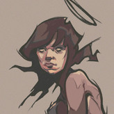
added comment inDemo - Dynamic Shapes from Reference
Here are my after demo attempts. Overall I'm pretty happy with them.
@fraxls
•
4mo
Asked for help
Here is my level 1 submission. I'm quite happy with 11 and 24, but not so much with 3 and definitely not 14. That position for 14 is really hard to draw.
@fraxls
•
5mo
Asked for help
Here is my attempt. I feel sorry for the person in the picture to be portrayed as I have portrayed them. The proportions are off, and it's a lazy attempt. I will probably do another go after the demo, but I feel that this is really only something that someone would do if they are doing realism, not any other style but correct me if I'm wrong. This process is way too tedious for me and I much prefer to either just eyeball it or I will just basic shapes to block out the subject or I will put them in an envelope as stan says. But that's the extent. It ruins the fun for me to go to this extent. Spending an hour just laying out proportions c'mon. Anyway here it is.

•
5mo
The way I interpret this exercise is as a way to train your eyes so that you can more accurately eyeball proportions. It is very tedious! But by taking your time to visually see the comparison of these different reference points, and by doing it repeatedly, over time you develop that intuitive skill that translates to eyeballing more accurately. I think this is a very fundamental skill that all artists should develop regardless of style :)
@fraxls
•
5mo
Here are my before and afters. The wolf is worse somehow. It was the last one I did anyway. I guess I got sloppy. I labeled them before and after to make it easier.

•
5mo
Nice improvements!
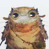
@fraxls
•
5mo
Asked for help
Here is my attempt. I did the level 1. I did 7 in total. I'd say that the best one is the buck. But i think i added too much. But all in all. I think it was a not that bad of a first attempt. For some reason i just simplified the chickens comb to a simple outline. I'm not sure why but I'll change it after I watch the demo. I'm normally bad at drawing cats so I'm pretty happy with how it turned out. And the wolf was a bold attempt. Also I couldn't include the original hippo image.
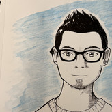
@fraxls
•
5mo
Asked for help
I did a master study of manga artist Yusuke Murata. I know that some of the line weight isn't the best, but it was my first proper attempt. Plus it was pretty difficult trying to replicate this drawing with accurate proportions.

@fraxls
•
5mo
Here is my before and after. In my opinion i made a big improvement. I made it darker and thicker at the feet to give it more weight and made the horn darker to show it as a more significant part of the image. Also i might have pressed too hard with the pencil i'm not sure. It's a 6B I used in the after.
Before: After:
@fraxls
•
5mo
Asked for help
Here are my attempts for the level 1 assignment:
Heavier on Contours: Identifying the shadows:
@fraxls
•
6mo
Asked for help
Here are my attempts. I named them because why not. Also i know the spider man hand's index finger is off, just don't look at it upside down....