


Albums

Activity Feed

@fluffybuttss
•
10d
added comment inProject - Blob to Box
Asked for help
One thing I struggled to understand was this: Am I supposed to draw a blob then wrap it tight in a box? Or should I cut away from the blob to create a box?
and did I vary my boxes ok? I’m afraid I might have made them all the same having followed step by step instructions on how to go about constructing them

•
10d
The blob is more of a reference to build a box on -- don't think that it has to be so exact. In Stan's demo of the concept, he adjusted his box to be wider and shorter on top of the blob that he drew because it wasn't quite the right shape. Feel free to do the same!
Your boxes are looking good. Give level 2 a try and keep in mind that the blobs are just there to help you visualize the boxes.
@fluffybuttss
•
16d
Asked for help
This was pretty damn difficult. It was really hard to get all criteria for a good cylinder to be met, maybe it was impossible for some shapes
@fluffybuttss
•
1mo
Asked for help
I feel like I did better by the third one (curled in fingers). I struggled with the proportions of the fingers in the first two and the fingers ended up being very thin and small

•
1mo
I think you’re right. The 3rd one turned out the best. Maybe lean more towards making the fingers too large next time if you tend to make them too small.
@fluffybuttss
•
4mo
Asked for help
I think I've gotten better over time, with the standing one in red being the last one. Though after watching the critique video, I do feel like I'm forgetting to look for the rhythms between the forms, and have instead drawn..."dynamic contours"
•
4mo
You are definitely warmed up by that last drawing! Did you do any quick studies before jumping in? If not, it may help you loosen up and be ready to go by the first drawing. Little 30 second gesture drawings can prime you for finding the rhythms in these poses as well.
@fluffybuttss
•
4mo
I'm not sure what it is, but sometimes I don't "see" the gesture that Stan is trying to indicate. And what normally looks like a basic straight line for the gesture, Stan sort of just...makes it S shaped anyways, because that's more interesting. Like the spine on the last drawing, it's head or top portion of the body is going straight for me, but Stan made it an S shape


Gesture is mostly about energy and movement. So although a straight line can be part of a gesture, you’re often looking for more flowy lines. In your example the animal is moving away from us and in doing so it’s shifting its weight to the right. Making the weight or energy move that way. So the gesture is not a representation of the spine but of the movement.
@fluffybuttss
•
4mo
Asked for help
This took me about 5 hours over the course of a very long time. I feel like I could have finished this a lot sooner had I just "let go" but I also felt like that would have disregarded the point of the exercise
@fluffybuttss
•
4mo
Asked for help
I spent 2 hours so far and I’m still not done, yet I’m SEVERELY bored, I would rather do everything by eyeballing it but I’m pushing through it
•
4mo
Push through! These exercises will help you eyeball better down the road, it's worth it :)
@fluffybuttss
•
5mo
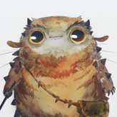
Asked for help
I got very sick and it messed up my whole streak, but I’m finally back! It was INCREDIBLY difficult to narrow down the shapes for me.
•
5mo
Welcome back! The shapes in your rooster are super cool.
@fluffybuttss
•
8mo
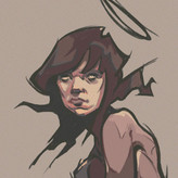
Asked for help
The artist I used for my master study is Nagabe. 1st image: Reference. 2nd image: 1st attempt, it was bad and I was rushing it. 3rd image: I traced over the original to fully understand his decision making without getting caught up in the proportions. 4th image: 2nd attempt, came out a lot better than the first

I got a bad habit of rushing it too. Talking through my lines really has helped me (though I might look like a lunatic, oh well), telling myself to slow down and things like "yes that angle is sharp, and that one shorter than that, it tapers off here and gets darker there".
I agree with Melanie. Tracing can help a lot with proportional work. The eyes, for me, are always smaller than they seem.
Anyways, great work. Really interesting illustration there. Kinda freaky.
•
8mo
I think tracing is a good tool to include in the toolkit. It can be used incorrectly of course, but in this case you had a goal (understanding decision-making for line/shapes), executed it, and then redrew another on your own to apply what you learned. Great process and I think your study looks great!
@fluffybuttss
•
8mo
Asked for help
1st image: Hierarchy of importance. (Learned: I should vary my line weight even on the thick lines just to make them more interesting). 2nd image: Light and Shadow. (Learned: I can give higher line weight to the lines that are in light, just to make the contrast clear, as long as it’s lighter than the shadows). 3rd image: Another attempt on the 2nd image using what I learned, I stopped once I thought I understood it.
My favorite of yours is the second. I love the contrast. But I wouldn't use such a long line to suggest the head on the right side. I think I really thin line which runs parallel to the horns would suffice. Having it go all the way up to the ear seems strange.
Anyways, great work!