Bird - Looking for critique
24d


Michael de Graaf
Any feedback would be greatly appreciated.


Asked for help
Hi Michael, looks pretty good.
First things I noticed:
-Your values are really well designed the texture on the black wings looks beautiful
-I think it represents the photo very well and looks like a seagull at least to me.
Improvements
- Comparing the 2 directly I can see the bird is tilted more to the left.
- The wings on the reference is bigger on the photo respect to the body
- Making maybe a previous study would be better to make consturction
- I personally thing the background done with pencil is unnecessary
Look amzing tbh, I'm jelous
Thank you for your feedback.
The reason I added the background behind the bird was to make sure the white is shown, or else it would look flat because of the white paper as well.
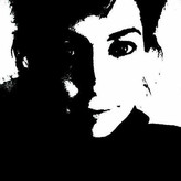

Hi Michael. I think you show good care in applying the values, even without adding some of the trickier texture. If you are practicing accuracy, I would recommend making some loose sketches to explore the relationship of the bird's wings to the rest of the body and to each other. The reference is more diagonal and the proportions of the wings are slightly different. For example, the bottom wing's black section is never thicker than the part where the wing attaches to the body. By widening it in the drawing, it gives the appearance of being shorter, even though the length in the drawing looks quite close to the reference picture. Hope you find this helpful.
Thank you for your great feedback.
Do you mean with loose sketches on a different paper from the final result? Just to get a feel for the form?


I love this. The shape of the wings is lovely and I really like the subtle contouring to give shape to the body. The only area I might adjust is the tail. It's accurate to the reference, but it would be nice to see a bit more definition to separate it from the background. Well done.
Thank you very much. Yes I agree with the tail haha, looks a bit blended with the background.

•
23d
This is a very beautiful illustration! I love the details in the wings. There's not much to critique, but I do have a couple of tips.
To design realistic shadows it could help to simplify the bird to simple shapes. Glancing at anatomy can help you in this stage to make informed decisions. You also want to pay attention to the rhythms of the bird and how each part relates to each other.
I really love the reflection of the wing in the water. Maybe adding some kind of indication of that can help place the bird into an environment rather than just in space.
These are just ideas to explore here. This is a fantastic piece!
Thank you for taking the time to give some feedback.
Anatomy study before hand would help, I agree.
Good tip on the environment, even a hint of the water like your example makes a big difference, I keep that in mind from now on.
I like your shapes, I can improve on that.