


Albums

Activity Feed

Alexottovi Otto
•
1d
added a new topic
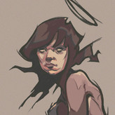
Tips for Illustration idea?Hello prokoers ;)
I will do an illustration traditionally and then digitally, I want to do a knight with a big sword, breastplate and shoulder plates standing in front of an entrance.
Wich of these poses do you think is best? Should I explore more, any tips?

These are great studies! It seems like you got the hang of it. The only thing I would say is I would avoid outlining the value shape in ink (referring to your pear drawing). I feel like it's too harsh of a transition from a highlight to a halftone there.
Alexottovi Otto
•
28d
Asked for help
Hi Michael, looks pretty good.
First things I noticed:
-Your values are really well designed the texture on the black wings looks beautiful
-I think it represents the photo very well and looks like a seagull at least to me.
Improvements
- Comparing the 2 directly I can see the bird is tilted more to the left.
- The wings on the reference is bigger on the photo respect to the body
- Making maybe a previous study would be better to make consturction
- I personally thing the background done with pencil is unnecessary
Look amzing tbh, I'm jelous


Thank you for your feedback.
The reason I added the background behind the bird was to make sure the white is shown, or else it would look flat because of the white paper as well.
Hello fellow artist I'm doing the solo artist curriculum and its shading unit. My main medium is ink and I've done this studies, any tips on doing spheres on ink?