Ink and inkwash
5mo

Yoshi Oda
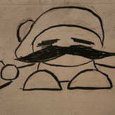
Im still practicing how to be better at ink and inkwash but sometimes is looks muddy or not as good as I wanted it to be so I was wondering if I can get some feedback on what to do or recommendations on how to go about it
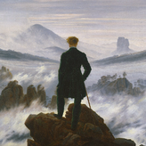

I'm drawn to the minion the most - it gives an illusion of shine, as if you pointed a headlight right at me.
I also get the impression that you were in a somehow different mental state when you channeled it
Thank you for sharing! Gives food for thought

•
5mo
Hey Yoshi, these are looking pretty good! The Minion especially has very dramatic lighting, you have lots of contrast between your subject and the background causing it to have a clear separation of value, looks great!. If you're getting a muddy look to your Ink/Wash drawings, you might want to study a value scale, and practice mixing ink washes to match each stage of the gradation between light to dark. If your values are too close together, or all pushed to one end of the scale, it can start to make an image look muddy. The values on Toothless are pretty close together, compared to the Minion where you have a greater jump between your values. Also look into the watercolor technique called "The Bead." It's all about creating an even value with your washes so you don't get splotchy patches of ink. Liron Yanconski has a great tutorial on it.
https://youtu.be/3sXgoiGHWc0?si=ZKV9QPlGW5--tvkK
You might also want to start your ink washes much lighter in the beginning, and build up your values more gradually in layers after each wash dries. Hope this helps, keep up the good work!