

Activity Feed

@turncoda
•
20d
added comment inProject - Simple Animal Portraits
Asked for help
Struggled to produce interesting shapes that worked well together and conveyed useful visual information at first but after a number of attempts (not shown) I found myself drawing less obvious shapes to represent things other than contour; most notably facial features like eye sockets, nose bridges and cheek bones. I also started to draw complete shapes to represent things that weren't strictly visible, like with cross-contour lines and gestural lines. It was fun to experiment with corners and curves and observe how it added or took away structure. I enjoyed trying a few different ways of simplifying a shape. All in all, really enjoyed this exercise and I feel like I improved a lot!

•
19d
Sounds like you got a lot out of this assignment.I love how you drew the simple forms.
Maybe try pushing the forms and proportions if you wanted to continue with these.
I took a flatter approach to keep the idea simple. I like your 3d forms more though.
It would be interesting to see how you could push the forms even more. Hope this demo is helpful.
@turncoda
•
25d
Asked for help
Claire Wendling's style really caught my eye and I tried to replicate a small fraction of the things I saw. Definitely fell short but that's to be expected. Nevertheless, forcing myself to try to replicate the techniques I saw made me notice more things about it, and heightened my appreciation of the master's craft.
@turncoda
•
1mo
Asked for help
I've come back to take another stab at this project, now that I have a pencil set. I used HB for the lines and light halftones, 2B for the dark halftones, and 4B for the shadows. It was much easier this time and I'm pretty happy with the improvement over my first attempt!
@turncoda
•
1mo
Asked for help
For hierarchy of importance, I chose to highlight the facial features, and then the feet, since those are what draws my eye when I look at the photo.
For the light and shadow, I tried my best to follow instructions. I think it looks a bit silly, probably because there's no shading so the thick heavy shadowed lines really stand out more than they should.
@turncoda
•
1mo
Asked for help
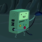
Retried the penguin because I realized way too late that the proportions were way off. Retried the hand because I feel like I didn't capture the energy of the pose and it just felt flat. Second try has more confident lines I feel. Don't know how I feel about the robot girl.
watched the demo and critiques and now I think I wasn't exploring with my lines enough. Here's another try.
@turncoda
•
1mo
I really appreciated the challenge of both the messy boot laces and the striations of the snail's shell. Felt really daunting at first but I'm glad I kept at it.
@turncoda
•
1mo
Asked for help
Was feeling confident so I started with two fruits. That confidence quickly disappeared and I simplified to one fruit (maybe two fruits was too complicated), then a photograph (maybe my lighting is not great). But in the end, all of my attempts look similarly odd. I think it's because my values aren't accurate. What do you think?
Did all of these with a single pencil. That might have been a mistake, because I found it hard to fill in 5 distinct values. Will get a pencil set for the next assignment.