

Albums

Activity Feed


added comment inProko Challenge BETA - Cartoon Anatomy
Congratulations to the winners! This ended up being one of my favorite challenges so far. We definitely need to do this prompt again once we launch to the public. Every submission was really good and choosing winners was difficult. Here they are:
1st - @Tarek Khazendar
2nd - @Steffen Anzivino
3rd - @fyll
Community Choice - @Joe Watson
Team Choice - @Mathieu Dufour
Science Award - @Side Shave Laura Gingrich

Tarek Khazendar
4yr
WOW!! That's amazing! Thank you!
Tarek Khazendar
•
4yr
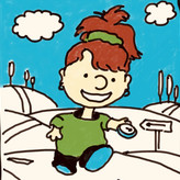
Hi guys!
Here is my entry for the challenge. Had a lot of fun with these characters.
Foster's Home for Imaginary Friends is a great place to find really extreme anatomy distortions.
Hope you enjoy it!
Tarek


•
4yr
@Tarek Khazendar This is awesome! There’s a lot of things I like about your piece: the line-up composition; the posing of the characters; how the bone anatomy maintains the uniqueness of each character design (the little guy with a floating ribcage is so fun); the X-Ray look, which is eye-catching and nicely painted. Very good job adapting the 2D-flat original designs into this 3D anatomy-focused take. Really cool work, Tarek. Thank you for joining and congrats!


This rocks! Not sure how you did this but it looks like quality level of a Pixar movie screen capture! Excelsior!


Whoa, Tarek, this looks so professional, I love the x-ray style, and the characters look great!


Asked for help
Ya such great atmosphere and incredibly simple value composition. I'm working on a figure study right now. I'm in the early phases of figuring out the simple value composition. What do you think of this?
•
5yr
Thanks for the suggestion @Stephen Bauman. I took your advice and darkened the background a tad more and it definitely made the lights on the torso pop more. Here's the final.


•
5yr
If I consider that you would like to emphasize the sweeping top-left to bottom-right gesture of the torso/front leg I would experiment with darkening 4 areas/shapes. The background behind the face, the arm (furthest back), and the leg (also furthest back) and also the light shape of the face/head. The bright light behind the face draws attention to the high contrast edge between the beard/face and the light in the background. Also, I think it's really cool to take your artistic license to frame the figure best by changing the value of the background in a few places- with that in mind I would also darken slightly the back arm & leg so that the highest key shape is a literal diagonal from top left shoulder the bottom right knee. This, of course, is just in the spirit of optimization and while it might improve the attention to the focal point it also has the potential to over-streamline the composition.


Hmmm. Thank you for the question and being a great role model, Stan!
I’ve only been doing the value comp studies since that wonderful recent episode of Draftsmen, and since I’m new at it, I’ve only been doing 2 value, only black or white. I haven’t been looking at three values yet at all, so please take this with a pinch of salt 😅.
You definitely got a sweeping feel directing the eye along the torso with that curvy diagonal black, and I think it’s really interesting how you’ve brought the light in behind your figure. In your reference photo, I’m feeling a lot of force in the model's right arm, without it he falls over. In your final abstracted study far right, that arm disappears into the darkness completely, and so my brain is trying to stabilize the figure, and thinks the long white swoop is his right arm resting on his leg in a very stable, static pose.
Really looking forward to seeing how you develop this and where you go with it!
Very interesting! I looked immediately at the more abstract study first. Next, Comparing that abstract literally to photo and I didn’t see a match of the large lights and dark background areas framing his face and limbs. Then i looked at painterly grayscale study and realized you are planning (composing!) some creative invented lighting in background. Now comparing the abstract study to the painterly grayscale, the abstract version makes perfect sense, very cool
This is beautiful Stan, it almost looks like you're flagging (or moving) the light source in your studies to deliberately push the model's right arm into the shadows and illuminate directly behind him. If the light is a bit more ambient, it's possible the chin wouldn't completely fall into the shadows, and you'd have a bit more clarity there.
That said, there is a neat repeating shape with the torso and the chin, so it looks rad.
Anyway, this appeared as a notification on my desktop, which is great to know the site is working! So, hope I'm not stepping on toes. Good luck with the value comps today!


•
5yr
Looks great! I really like how you handles the gesture of the arms and legs.
Tarek Khazendar
•
5yr
Great! I'm really loving this platform. The only thing that I miss is an option to download everything at once that is related to the theme your are studying. For an example: In the anatomy course, let´s say I want to download the PDF, the assigment images, the 3d images of the Spine lessons. I would have to do it one by one. It would be really usefull if we had an option of downloading everything related to that theme at once (except the videos, or we could have an option for all the videos too)
•
5yr
Thank you for the suggestion :)
Hi guys, lately I got back to bones studies. I started with the torso area and here are some of my practice. I'm really trying to think in 3D and make the drawings get away from looking flat. Critiques are welcome!
Tarek Khazendar
•
5yr
I think you are doing great, especially considering your conditions of time and energy. Everyone has a different life, different time and we can all do our best with what we got, and that is enough! Keep it up
Tarek Khazendar
•
5yr
One thing that I'm learning to do is to study aspects of the masterworks separetly. Studying everything at the same time (line, composition, structure, color etc) will overwealm you and make your job harder. Another interesting thing is that we most likely don't want to study and "steal" every single aspect of the master, so why bother studying everything ? For an example, if you love the gesture of Alphonse Mucha's drawings, you can make pencil studies with rough line just indicating the rityms he used.
Those are just some recent things I have been thinking about and wanted to share and know what you, Stan and Marshall think. Thank you!!

I like this approach @Tarek Khazendar . I get a lot more out of studying something when I shift my focus from an entire image to some basic part that I want to absorb.
Follow up question, are you more interested in the boldness and simplicity of a portrait by Sargent or the subtle rendering of an early Rembrandt?