


Steve Lenze
USA
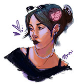
Professional artist from the animation industry.
traditional 2D animation.
storyboard.
character design.
Albums


Activity Feed

Steve Lenze
•
10d
added comment inManga /I need improvements
The reason it feels stiff is because it lacks gesture. You should always start with a gesture drawing to work out your pose, then add structure and anatomy. I did a quick sketch to show you what I mean.
Steve Lenze
•
20d
The reason it looks wrong is because all the forms are flat. this is because you haven't established the separation of light and dark, or light and shadow.
I did a quick sketch to show you how you can think about shading to reveal form. I don't have the reference you used, so I just made it up, but I think it will help :)
Steve Lenze
•
2mo
Find the gesture, then build the structure for your figure. Muscular figures can look kind of stiff if you don't create gesture first.
Steve Lenze
•
2mo
You need to try and find a gesture line that describes the pose from top to bottom, then find the gesture of each limb. I did a quick sketch to show you what I mean.


Oh wow thank you. I think I see it. In this reference, would the arrows for the left leg flow downward though? I was thinking it was sort of an upward flow.
Steve Lenze
•
3mo
When drawing clothing, we have to remember the effects of gravity. Also keep in mind that one side of the clothing should be complex and bunched up, and the other side is simple. I did some quick sketches to show you what I mean, I hope it helps :)
The shape in front of the strap is the anterior deltoid, and because the deltoid is rotated forward, the second shape in the back is the shoulder blade or scapula pushing up.
Steve Lenze
•
5mo
Nice design Nicolette.
There are a few things that I think could help you with your drawing. To start with, the torso is too long which makes the legs and arms look way too short. Also make sure you think about gravity and the way it will effect her clothing, especially the tears in the pants. I did a quick sketch to show you what I mean, I hope it helps :)

Steve Lenze
•
5mo
Nice drawing.
What I noticed is that you are using parallel lines along the front of the blouse. Also, the shape of the breasts would effect the the shape of the opening in the front of the blouse.
Steve Lenze
•
5mo
You are making the reflected light too light. Nothing in the shadow should be as light as anything in the light side.


Steve Lenze
•
5mo
If you think about the underlying form, it will help to add details that will help give the eye some dimension.