Check out the follow-up Premium lesson showing how to exaggerate a pose: How to Draw Exaggerated Poses - Figure Drawing
Let's talk about balance!
Center of Gravity
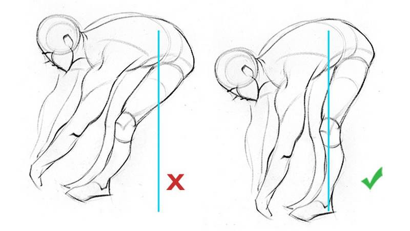
To balance a pose you need to think of what's known as the center of gravity. When you take the mass of the figure and drop a line down to the ground, the support (commonly the feet) need to be on that point or evenly spread around that point If the weight is evenly distributed among the feet.
If most of the weight is on the left leg and some on the right, the center of gravity will be closer to the left foot. As the weight shifts over to the other foot, the torso will follow that line.
A lot of sources say to drop a line from pit of neck, nose, eyes, ears.. I think it's better to imagine the large mass (hips and rib cage) and drop a line from the center of that mass. Usually you'll see it somewhere in the midsection depending on the pose.
Dropping a vertical line down from the midsection shows that this drawing is unbalanced. We can rotate it until the vertical line falls between the two feet.
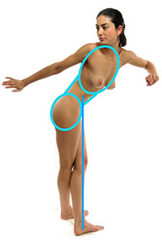
Supports Types
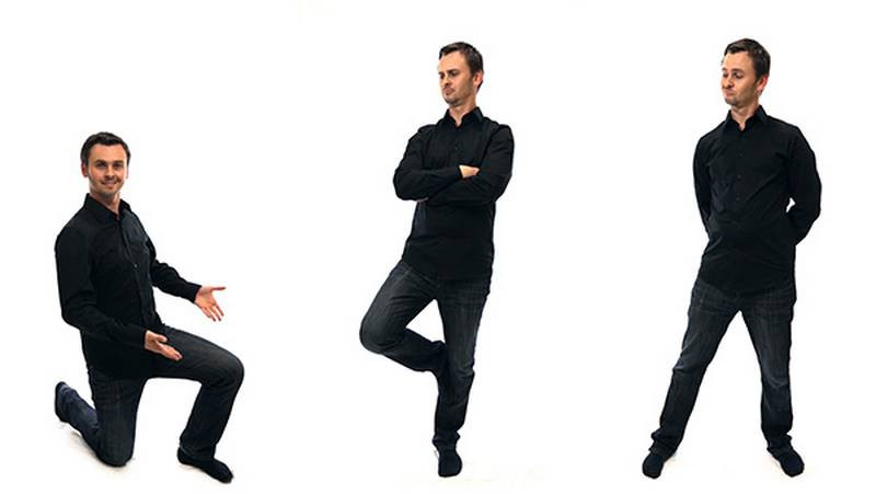
In a balanced pose, the weight of the body needs to be balanced and supported by either one leg or distributed evenly or unevenly between both legs.
Or distributed among any combination of body parts like a foot and a knee. Or both knees and both hands. Even lying down with the weight on hips and elbow. Leaning against a wall or sitting down on a chair or couch.
Action Poses
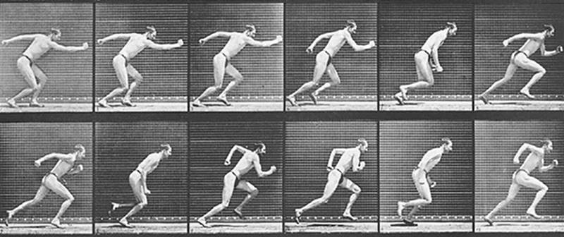
Not all poses you draw will be balanced though. Only static poses will be balanced. An active pose, a pose in motion, is not balanced. Walking for example is just a series of controlled falls. With each step we catch ourselves and push forward for the next fall.
Someone pretending to run by holding a running position is different from a real running position. In a real run the center of gravity is not supported by the bottom leg.
The center of gravity is in front of the legs. This momentum is pushing the body forward.
In a fake running pose the person needs to be balanced and so the center of gravity is directly above the supporting foot.
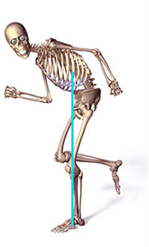
When drawing from a live model, all the poses will be balanced because they have to hold the pose. This might be one advantage of adding drawing from a photo to your list of exercises. Photos can capture a figure in motion. Practicing these types of poses along with balanced poses from a model will help you to develop a sense for motion and momentum. Breaking balance can be used to tell a different story. Storyboarders, comic artists, illustrators, all need to know how to draw interesting, dynamic poses which are very difficult for a model to hold for a long time.
Another great exercise would be to take a balanced pose and use it as inspiration to create an action pose - a pose that is in the middle of an action. This one for example. I'll rotate the body a little more as if she's diving and change the limbs a little to show she's diving for the ball.
If it feels wrong, its wrong...
In the end though it really comes down to making it feel balanced. If you did all the measuring and thought about 20 percent here, 80 percent here and you planned as much as you could, but it doesn't look balanced. Well then it needs to be fixed. If it looks wrong, it's wrong! It's so hard to confidently say that you measured everything and took all the parts into consideration because it's all an illusion and there are way too many things to consider. You can't think of everything. There might be another element in the drawing that makes the illusion seem a little more like this or like that. So, planning and measuring will get you only so far. Then you have to trust your best judgment. Train your mind to be able to see those kinds of mistakes and be able to catch mistakes using your intuition. You look at a drawing and instantly know what should be changed. It's a feeling. It's not math. But, you develop that intuition by studying the math.
You can call this "designing". You're changing things for the purpose of making it look better, more pleasing to the eye. Whether you're changing things about a photo, live model, or a sketch you did from your imagination, you're designing.
A great example of making something feel balanced by making it less accurate is the font Helvetica. Look at the letter T. It's designed to feel as though the horizontal and vertical lines are the same thickness. But when you compare the two, you'll see that the horizontal is actually thinner. If they were both the same, the top would feel too thick and heavy. I suppose the "Designers" of the Helvetica font decided to go against precision to make it feel better.
Alternating Angles of Masses
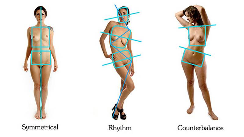
In a static "soldier alert" pose the body is symmetrical. Unless you're drawing a soldier, the body won't be in a symmetrical state like that though. Usually you'll see alternating angles of the masses stacked one on top of the other, following a rhythm. In a relaxed standing pose, the weight isn't evenly distributed between the feet and the leg that supports most of the weight pushes that side of the pelvis up and the other side drops. To counterbalance this, the rib cage rotates the other way creating the opposite angle in the shoulders. Think of these as stacked blocks that balance each other out.
If you're good at Jenga, you might be good at drawing a balanced pose.
Premium Figure Drawing Lessons
I have an additional premium lesson showing how to exaggerate a pose. I introduce a step by step method that makes it easier to take a rigid pose and develop into something more dynamic. Or you could use the same approach to create your own poses based on poses from photos.
In the next lesson, I go over the Human Figure Proportions for Average Figures from Dr. Paul Richer's book Artistic Anatomy.
Do some more quicksketch drawings and use all the principles you learned so far. Gesture, bean, robo bean, landmarks, mannequinization… But, find poses that will help you practice the concept of balance.
Another great exercise would be to take a balanced pose and use it as inspiration to invent an action pose – a pose that is in the middle of an action. This one is a bit tougher since you’re inventing some elements from imagination. This is a good challenge. You’re ready for it.
Post your work and participate.


