In the previous lessons, I covered the [theory of exaggeration] and the practical steps of creating caricature portraits. I demonstrated going from concept to finish using several different celebrity faces. In this lesson, we’ll review the whole process using actor Benedict Cumberbatch as our subject.
In order to draw Benadryl Cumbersnatch, I’m going quickly walk through the four basic steps of creating and refining a caricature: Thumbnail Sketch, Rough Sketch, the Abstraction, and Final Drawing. The purpose of breaking the caricature process into separate steps is so you can manage all the variables more easily, focusing on one goal at a time. But before putting pencil to paper, selecting good photos is going to be your first task. Once you decide who to draw, look for photos that are large, crisp, have good lighting that reveal the forms and capture your subject’s likeness. I have a few different angles of Bevelhead Cabbagepatch to work from, but I will be primarily referring to this one.
And while sketching, keep in mind that the primary goal in caricature is to draw a likeness that exaggerates the characteristics that make a person look unique, or different from the average.
Step 1: The Thumbnail Sketch
What we call a “[thumbnail sketch]“, is a quick small drawing that explores the core concept of your exaggeration. It’s best to do several thumbnail sketches. Even if you think your first thumbnail sketch looks good, keep trying new iterations where you exaggerate the head in different or more extreme ways.
The thumbnail sketch typically takes two to three minutes. But don’t spend more than five minutes on any one sketch. If you do, you might get too attached to it and feel like you have to stick with that one concept rather than explore new original shapes. This stage is all about exaggeration and experimentation. Likeness and structure are not a priority yet. If you think too much about getting a perfect likeness in a thumbnail sketch, it will hold you back from making bold exaggeration choices. At this stage, go crazy. Stay loose and let the subject’s face and persona inspire you. If you think their head looks like an object or an animal, try to put some of that into your sketch. And if you get tired of drawing from one photo, try another photo or head angle. Sometimes a person’s likeness is more obvious from a particular angle or with a certain facial expression. In the case of Bellicose Camelback here, I opted for a look of intensity that almost borders on anger.
 Photo by Fat Les
The Two sketches in the upper left are my favorite. So they will be my inspiration when I move to the next step and create a more refined rough sketch.
Step 2: The Rough Sketch
Select your favorite thumbnail concept sketch and use it to inspire the design of your rough sketch. But now, you need to focus on resolving the likeness and anatomy as best you can. You want to take from your thumbnail sketch what works, and leave behind what doesn’t. And if you feel you can exaggerate even more at this stage, go ahead and try. You can use some simple guidelines in your rough sketch to help align the shapes. But don’t worry too much about that just yet. We will fix any alignment or perspective errors in the next stage. For now, try to keep your [rough sketch] feeling organic and natural. Remember, you still need to explore and be creative at this stage. The abstraction that we’ll do in the next step is where we really lock down the shapes and think more like a structural engineer designing the framework of a bridge or a house.

During this rough sketch of Bendystick Crabbyhatch, I want to still think more like a caricaturist and not get too uptight. Also, feel free to shade or cross hatch your drawing, but don’t spend too much time on it. If the likeness and exaggeration look good and are working, move on to the next step. If not, try to figure out what’s not working and fix it or even start a new rough sketch. Don’t move on until you’re totally satisfied. You don’t want to invest a lot of time refining a flawed design.
I’m very happy with the likeness and exaggeration here. But there’s probably areas that could be improved.So I’ll take care of that in the next stage of the caricature process.
Step 3: The Abstraction
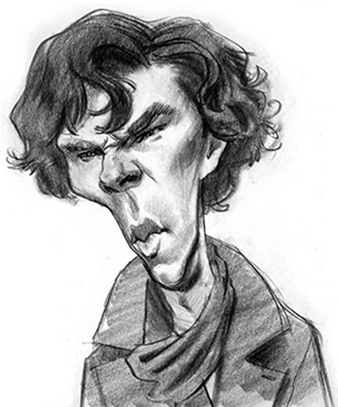
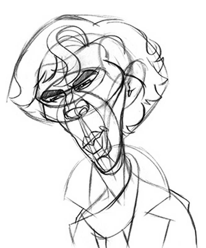
For this step, place a sheet of tracing paper over your rough sketch. The abstraction helps you determine where you made structural errors and where you can make additional improvements to the flow of the shapes. The reasoning behind this is that the simple lines of the [Abstractio]n make it easier to see those errors than just looking at your rough sketch. The abstraction is a wireframe grid that represents your organic drawing. It was originally taught by [illustrator Frank Reilly], at The Art Students League in New York to teach students how to construct complex shapes out of simple abstract lines and curves. The lines of the abstraction not only indicate the features and planes of the head in a simplified fashion, but also how they connect and relate to one another in three dimensions.

The individual lines of the abstraction are called “rhythms” because they trace the landmarks of the face and body along a path – sort of like how rhythm in music establishes the structure and pace of the melody. I originally learned to use the abstraction in art school to start my portrait drawings or to make corrections to poorly constructed anatomy. But it works really well to help develop and fix caricatures too.
You can study and memorize the abstraction diagram provided in the premium section of this course when you do your own caricatures, or just try to follow along as best you can with what I do here. But remember, I don’t always use all of the rhythm lines in every caricature. And sometimes I even invent new rhythms if the design calls for it. The important thing is to just have some sort of template you follow to simplify and abstract the anatomy. A centerline down the middle of the head is critical to help place symmetrical features like the eyes and cheekbones. Be sure you draw those rhythms in continuous arcing lines, from one side of the head to the other. Doing so will help you draw the features in correct relationship to one another. Here, I drew the eyes and eyebrows independently of each other. I used the surrounding rhythms to help place those features. I’m very comfortable doing stuff like that, but when you’re beginning, I would recommend you stick to the proper procedure of connecting EVERY abstracted shape with rhythm lines.
And if your subject or your personal style requires that you draw some features asymmetrically, that’s okay too. Just be sure you control when you do that and that you have a good reason to do so. On Benecio Shnitzelstick here, there’s no major asymmetries except for his mouth, which I made a little crooked to give him more of a smile.
As you work, it’s always good to flip the drawing over or look at it in a mirror to see if there are any unplanned problems with symmetry or structure. When you look at something for too long, it’s very easy to become blind to things like that.
In the end, your abstraction drawing should be exactly what it sounds like: an abstract drawing! It won’t have much personality. Sometimes, you won’t see much of a likeness in the Abstraction. And other times you may. Either way, don’t worry. We’ll pull the likeness back out in the next step of the final drawing.
Step 4: The Final Drawing
For [the final drawing], place another sheet of paper over your abstraction. If you want to draw on something sturdier and thicker than tracing paper, you can trace using a light box, as I’m doing here. And for this stage, I like to keep my rough sketch in view, along with my reference photo. They help keep me on track when tracing over the geometric rhythm lines. For my personal tastes, I like to think of my goal here to be a realistically rendered and anatomically correct portrait which just happens to be caricatured. You may prefer to render in a more simple graphic or cartoony style. And that’s great. Be your own artist. But I like to include all the anatomical traits present in the photo, including bone structure, musculature, fat pads and the same realistic light and shadow. The only thing to have changed on Bandicoot Denimpatch here is the proportions and relationships of [the features]. When creating caricatures, my ultimate goal is usually to paint it either in oils, watercolors, or even digitally. So I don’t typically bring my pencil and charcoal drawings to an extremely high degree of finish or photo realism. I put just enough information in there to inform how to arrange my light and dark values in the painting. But if you want to create a highly finished looking pencil or charcoal drawing for yourself, you can invest as much time in it as you want, confident that you’re rendering a well-designed caricature.
Now, I’ve said this before, in previous lessons, but I don’t always go through this entire step by step process when creating a caricature for a fine art piece or for illustration jobs. But it’s good to have a process to fall back on when you’re challenged with a difficult subject, find yourself lacking in inspiration or need help developing the exaggeration. There are some caricature artists out there who seem to be able to draw a fantastic sketch on the very first step. And sometimes, I even get lucky on my first sketch. But more often than not, I need to spend time refining the anatomy to get a better likeness and exaggeration. And that’s where these fundamental skills come into play.

Wrap Up
So, that’s it for the fundamental section of this caricature course! I hope you all have been able to follow along with the drawing assignments at home. Remember, you won’t automatically be a better caricaturist just because you listened to me saying words and watched me drawing in front of you. Doing caricatures is all about improving your own decision-making abilities. Every face will be different.The only thing that can make you better at that is you…practicing your fundamentals a LOT. I’ve shown you some examples of how I go about making my own exaggeration decisions. And there are several more examples in the Premium Section of this course. So, now you have some guidance on how to practice for yourself. So put these simple lessons into use – day after day, allowing yourself to do lots of bad drawings. Eventually, you will get better.
What's Next
Don’t go away! We’re not nearly done yet. Coming up is the second half of this series on the [art of caricature]. The lessons will cover more advanced caricature techniques. There will be exercises on how to push your exaggerations, how to be a better observer, how to solve difficult faces and even how to improve your style of drawing in general.


