


Albums

Activity Feed

@sadbonez
•
3yr
added a new topic
Critique pleasethe unfinished one is something im working on rn after not doing much but doodling here and there and the other one is something i finished in January but forgot to update and just wondering if there was anything that i could improve in the future and how i could apply that to the one im working on currently. Any help is welcome.

Hey @sadbonez, nice work! I did a paintover focused on design. I think if we could better design a moment and compose the image around it that would improve your piece more than just rendering better. That said if you want a better painting- learn about value structure and creating a focal point with it.
If you notice in the paintover the brightest values highlight points of interest. But this all goes back to design and how the painter can best compose an image and then render it.
The rest of the notes are in the image below!
Thanks for sharing!
Thanks this helped a lot i seen your critiques in other peoples peices and was hoping i could get help on mine from you and this is just beyond helpful i see that i should make the focus more on the worm and have a clear conflict and i really like paint over it helped me understand your points more


Steve Lenze
•
3yr
Hey sadbonez,
I think the reason your painting looks flat is due to the drawing, not the painting. I did a quick sketch to show you how you can add some dimension to the drawing. Then when you paint, it will already have a 3D feel.
Hope it helps :)
Wow thanks this helps a lot I’ll definitely try this out with my next peice and try and incorporate this into the one im eorking on rn this makes a lot of sense
Ive been trying to make my art a little more refined without having the lineart with it and i was wondering what i can do to make the limbs and body pop more and not look as “flat” i guess
p.s.-i still haven’t finished rendering the painting yet
This was for a school project I did and I couldn’t really render it well and I’m still not very experienced with adding color to my art work any tips?

Jonas Wenzel
•
3yr
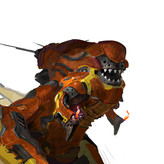
realy cool designs, I can't help with the anatomy, cause I couldn't have done this any better. But here is how I would try to make them look even cooler, try to get in a bit more shadow to indicate more volume. I did a couple of rough sketches to get the idea across a little better :)
Wow thank you so much for the help and I’ll try defining the shadows more I really like how you made the hydra look so much smoother and I also liked the colors used on the other creature
These are some creature designs I did a while ago and I was wonder if there was anything I could fix to make them look better and if there was any anatomy changed I could make
@sadbonez
•
3yr
Asked for help
These are some creature designs I did a while back and I was wondif there was any advice I could get to make them better


Complete beginner here, so please don't put too much weight on my opinion.
I think you were going for disturbing H P Lovecraft-ish creatures here, and I think you succeeded there. They are very creepy looking. Good job.
I don't know enough anatomy to have an informed opinion, but I have some impressions. In the first picture, the attachment area of the tentacle heads and the body could be smoother. Also the weight of figure falls on the slug body and you don't see it squished down flatter. I also feel it could come forward a bit to balance the weight of the ball out better.
The second picture is nice. I think it is flying, so I feel like the wings could be spread out more as if in flight. But you may have been thinking of a different action, such as landing.
The third picture is cool. I like the twist in the body which really shows off the worm like nature. I like the position of the back rear leg, but the front leg's position in the background is a little unclear. Given the shape of the one in the foreground, would you be able to see more of the one in the background? What if it was raised in a striking position.
Please take whatever helps you from my reply and throw the rest away.