French artist Anthony Geoffroy does amazing caricature illustrations that have their own unique style. I see a strong influence of Krüger in his work. But there’s more than that. Anthony’s caricatures have a distinctive angular design. And he rearranges the geometry of the head in ways that are totally unpredictable and dynamic.
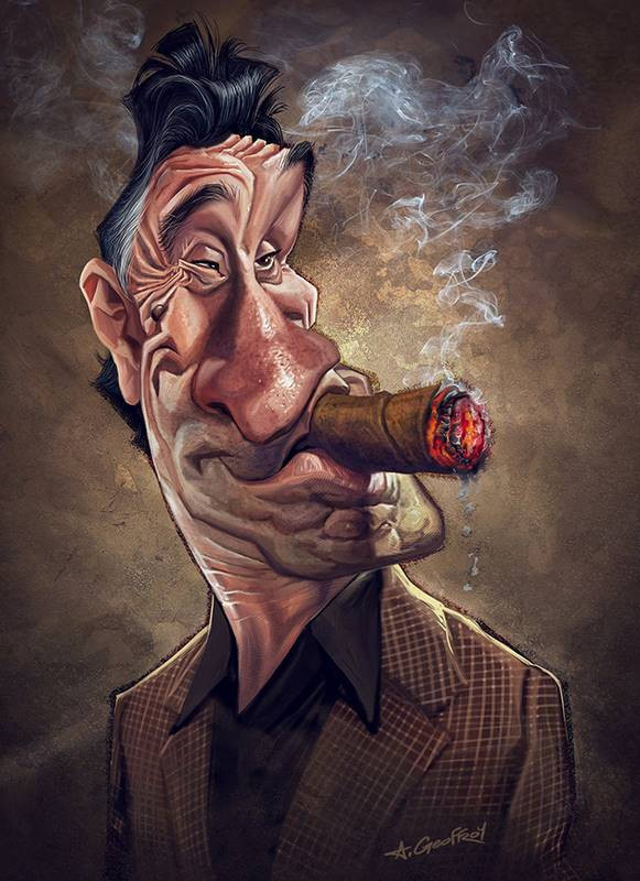
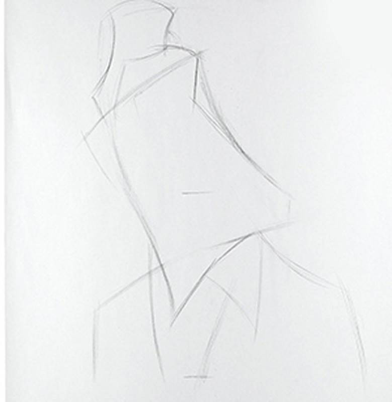
Today, I’m doing a study of his Robert De Niro portrait in charcoal on smooth newsprint. Anthony’s original is a digital painting, done in Photoshop. To begin my study, I mark off the top bottom and middle of my paper. Then I find the middle of the De Niro portrait, which turns out to be De Niro’s bottom lip. So I will make sure in my study, that the bottom lip sits on that middle mark.
The next thing I take care of is drawing the outline of the head, with it’s curved banana-like structure. Then I carve away at the next biggest feature and so on down the line.
What attracted me to this particular caricature portrait is the strong exaggeration and solid feeling of structure he achieved. When deciding on which caricature from an artist’s portfolio to make a study of, be sure to pick one that exhibits all of the qualities that you would like to incorporate into your own skill set. After you do a number of artist studies and then look back on them all, you may start to notice common traits that you find appealing. It could be the artist’s style of [exaggeration] or even his rendering style or color palette. This is a way you can start to learn more about yourself and your own inclinations and tastes. Studying other artists’ work can help you find yourself and reveal your artist’s soul. And you’ll move forward with more focus and know which way you’re headed.
At this point, most of the big outlines are in place, and now, I’m mapping, or outlining the smaller plane changes. I’m trying to focus on making sure my lines reflect Anthony’s contours, which are rigid and straight, for the most part. Whenever necessary, I use light rhythm lines to help me connect features and align them properly with the rest of the head.
Now is when it gets tricky as I move into even smaller shapes like the wrinkles on the face and their corresponding form and cast shadows. I want to get them all mapped before I start shading in values. But it’s easy to lose track of where you are when drawing these type of small repetitive shapes. And it basically just feels like work. We’ll get to the fun stuff later. For now, I have to establish the framework. One of the things doing these types of studies teaches me is how to stay disciplined and focused when working on a caricature. Because while I’m copying, it becomes immediately obvious if I start to rush through it or lose my focus. Doing a master’s study like this is essentially forcing you to develop good drawing habits. Because when you use a bad technique or sloppy and rushed pencil work, you can see it as it happens. The more master’s studies you do, the more you’ll reinforce good techniques and self-discipline. Good techniques and self-discipline are what made these artists great in the first place.
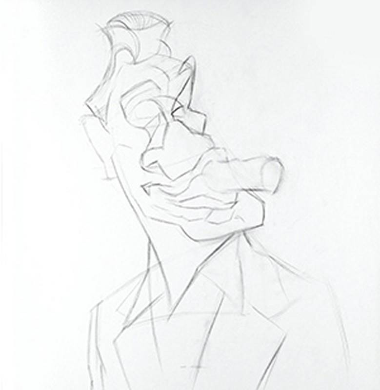
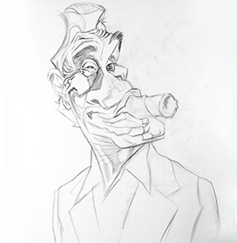
So now, I’m just about ready to get into the rendering phase. There are a few patchwork values on the face because I got a little ahead of myself. But that’s okay. They just look a little out of place without any other values for context.
Out of all the dry art mediums, charcoal pencil is my favorite because you can get a full range of values rather easily. But they’re cleaner to work with and easier to sharpen than charcoal sticks because of the wood around them. If [they’re sharpened properly], you can easily get a hard or soft edge with a small adjustment in the angle. You can shade in large areas quickly and evenly, and smudge an area to blend without much fuss. The longer you spend on a charcoal drawing the more subtlety and complexity you can show. This is a fairly quick study – less than an hour – so it won’t be highly realistic or delicately rendered.
Don’t forget that with charcoal or graphite, the eraser is also an important drawing tool. It’s not just to fix mistakes. Kneaded erasers can be shaped to a fine wedge or point to carve out small light shapes in the drawing.
The rest of the time here is spent going back and forth between charcoal pencil and eraser.
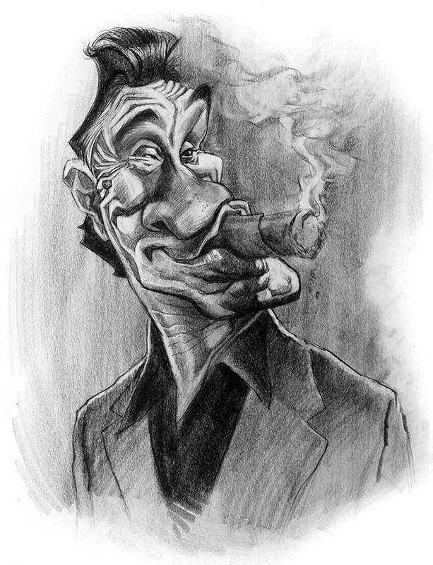
So in taking a look at what I’ve done, one thing really stands out to me now. In my drawing, the head is a lot shorter than it should be. I feel like the likeness and expression are still captured fairly well. My accidental distortion isn’t too noticeable if you don’t look at them both side by side like this. But this squashing of the forms in a drawing happens every now and then when I film these demos at the Proko studio. The drawing table is at a low angle and I have to sit far back so my head doesn’t get in the way of the camera. So I’m always looking at my drawings from below. While the reference photo is upright on the wall in front of me. From that vantage point, the drawing seems to match the reference photo. I know…excuses, excuses. But use this as a learning moment. In your own studio, be sure to stay aware of how you are viewing your own drawings and reference photos. Ideally, you should have your drawing board propped up high. Almost vertical. And the same with your reference images. Don’t let something silly and preventable keep you from doing your best work.
Be sure to follow Anthony Geoffroy.
Drawing An Original Caricature in the Style of Geoffroy
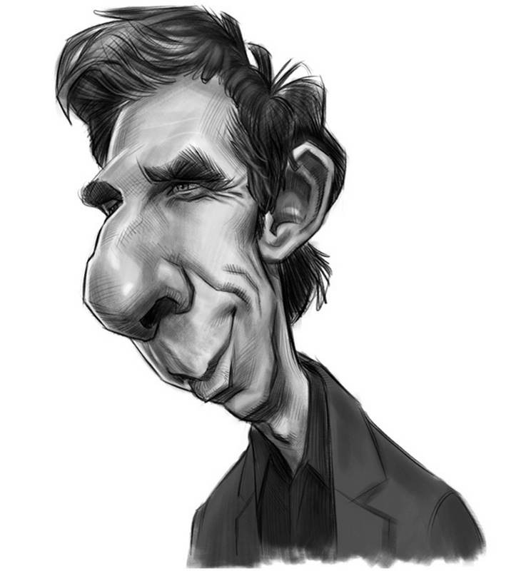
Now, I'm going to try and do a Geoffroy style caricature of actor Ben Stiller. These are the two reference photos I'm looking at while I draw. Both photos are informative about the structure of Ben Stiller's head. But I'm using the one on the right as my primary reference for the angle I'm going to draw. Photos courtesy of Eva Rinaldi.

I start by blocking in the head and features pretty quickly. In just about two or three minutes. My main concerns are with creating a strong exaggeration and angular construction using lots of straight lines. I’m also trying to pinch, twist and bloat the features wherever possible, like Anthony does in his work. So, with those concepts in mind, I feel very focused in this sketch, knowing what I have to do and hoping that I can actually accomplish it.
Attempting to draw in the style of another artist is a difficult task – like trying to write in someone else’s handwriting. Once you get some momentum, it’s very natural to revert back to your own normal habits and ways of constructing shapes. Remember, it’s not important to actually end up with a caricature that would fool anyone into thinking that it’s by another artist. The value in this exercise is in analyzing the caricatures of others that you like and figuring out why you like them. That understanding then translates to the focus that you bring into the exercise when drawing or own original caricatures. When you sketch with a clear set of intentions, rather than just how you are used to, you are more engaged in the process. More of your brainpower is allocated towards the task at hand. At least that’s how I feel when doing these exercises of drawing original caricatures in the style of another artist.
Ben Stiller’s head in this reference photo is usually called a 3/4 view. Or sometimes a ½ view. It’s in between straight on and true profile. And it’s my favorite angle to draw caricatures. The 3/4 view will generally give you the best understanding of a person’s facial proportions. You can more easily see if a person, such as Ben here, has a large nose and small chin, for instance. In a front view, that’s not always so obvious. Plus, this just looks more dynamic and interesting than a full frontal view. There are more opportunities for diagonal lines and overlapping of forms. Remember that when selecting your own reference photos. Whenever you have the freedom to choose your head angles, it’s almost always best to go 3/4.
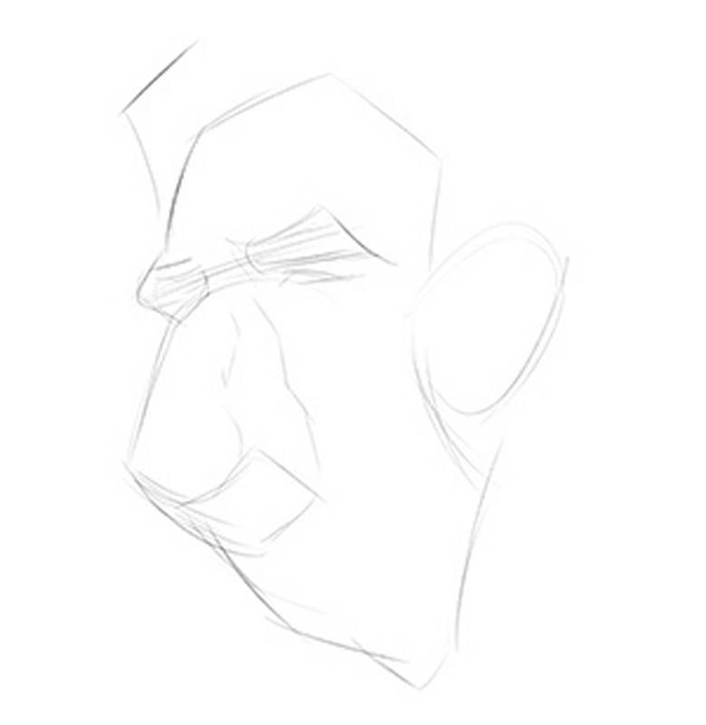
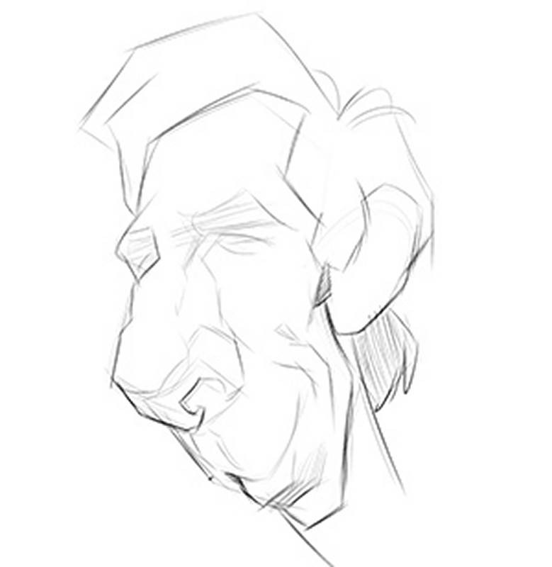
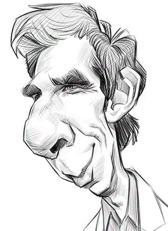
The drawing portion is nearly done. But before moving on, I want to see where I can pinch and bloat the shapes further using Photoshop’s Liquify Tool. I watched Anthony himself do this in a live demo, so it’s part of his normal workflow. Think of it as another chance to add some more interest to the shapes. I use it sparingly though as I don’t want to create an obvious “Liquified” look.
After using the Liquify tool, I redraw some of the features since they became a little wavy and soft-looking. But now Ben’s face feels even more exaggerated and full of dynamic energy, more like Geoffroy’s work.
And now, finally, it’s time for the shading and values. In case you’re wondering, I’m using Kyle Webster’s Animator Pencil for the lines and Kyle’s Shady Graphite Brush for the shading. The Shady Graphite brush is very subtle and will allow you to build up your darks slowly in stages.
From here on out, this is just basically an exercise in adding values to a drawing. One of the things I really like about Geoffroy’s caricature illustrations are how he paints and shades his values and colors. And while I may not shade and paint the same way here as Anthony would, that’s not the point of this particular exercise. You may one day want to try and do a painted copy of a master to learn their rendering style. But this here is a caricature drawing exercise. What I want to learn from is Anthony’s construction of shapes and how he exaggerates.
As I said earlier, try not to worry about whether you get a perfect copy or achieve a style of rendering that would fool anyone to think this is someone else’s work. The benefit of this exercise is in the process and the effort you put forth in the attempt itself. Just be sure to stay critical of yourself from start to finish. Refer back to the master artist’s work for inspiration when you need it, then figure out what makes their drawings and paintings so good so that you can learn what you need to do to adopt their strengths into your own.
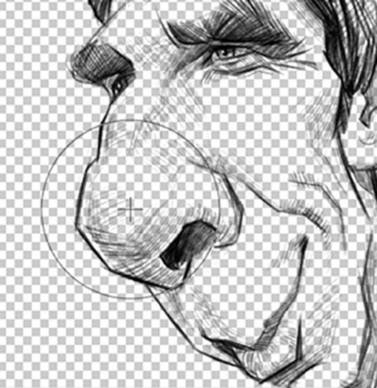

I think that I learned a lot with this one about how to be more bold with my exaggeration choices and how to continue to squash and stretch the drawing with digital tools, like the Liquify brush, which is not something I normally would do. Like any other tool, it can be abused and used in a way that hurts the final result or it can be used with good judgement and dexterity. Just as with a pencil or paint brush, it just takes a little practice.
