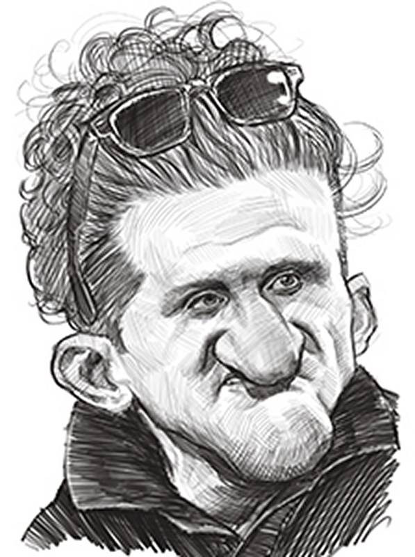
YouTube personality Casey Neistat has a really interesting and distinctive look. His features are very robust and masculine, sort of like a classic cave man. Nothing personal against Casey. His YouTube videos are awesome and a lot of fun. You should definitely check them out. But now let’s examine his most outstanding deviations from the average.
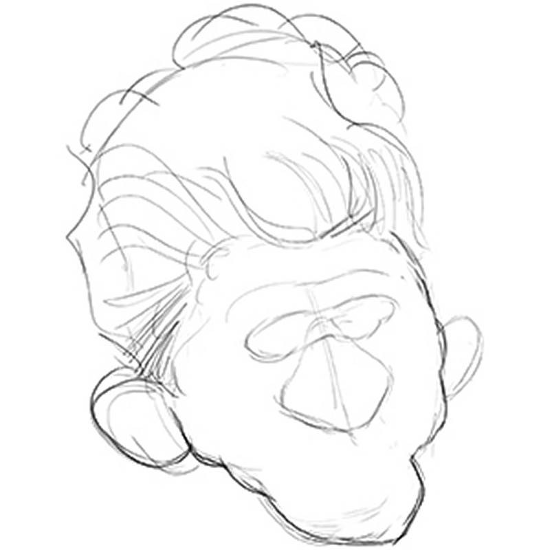
The first item I want to take care of is the head. I make it short and wide, sort of like a classic shield shape, widest at the top, with the hair making up almost half the total height of the head. The large ears are next. They sit low on his head.
I'll work on his large wide triangular shaped nose next. The ball of his nose has an extreme downward thrust. Even though the nose is large, it looks like it's very flat against his face and not sticking out or protruding.
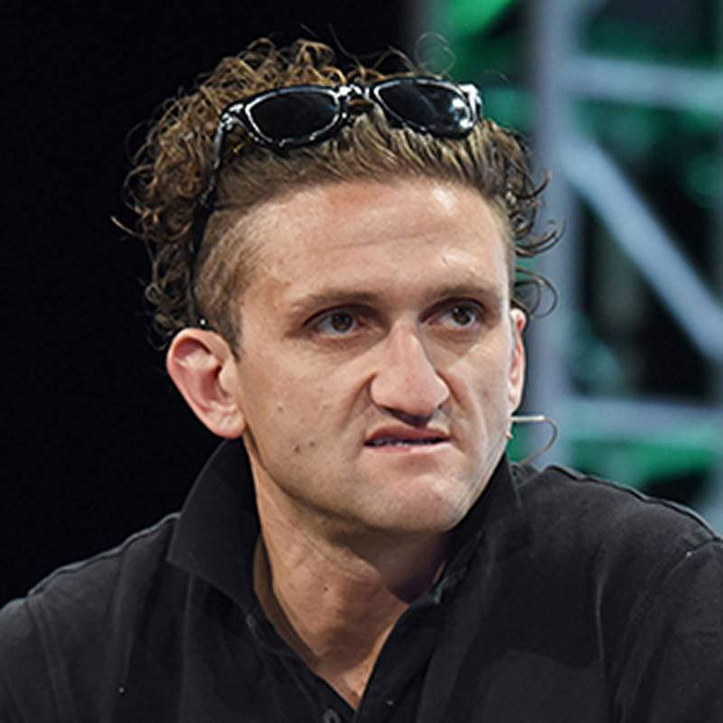
Time to tackle the mouth. Even though it's small and mostly covered by the tip of the nose, I wanted to still show a bit of it to include the slight snarl to the upper lip that I see in this photo. His chin is huge and round. I feel like the chin and the nose are the two most dominant, almost aggressive features on his face, fighting for attention. On faces like Casey's, which are very distinct, it helps to think in terms of what will dominate and what will recede.
Because the nose and chin are so big on his face, I decided to make his eyes very small. Making the eyes small helps make the chin and nose appear much larger than if I had drawn average or oversized eyes. Remember, caricature is all about relativity. You must always be exploiting how the features relate to one another. Some things have to shrink in order for other things to appear large. Relativity is probably one of the most important concepts to remember in this art form. Don't just always make features big. It's not like inflating a balloon. It's like sculpting with a limited amount of clay. To make the chin and nose larger you have to take the clay away from somewhere else.
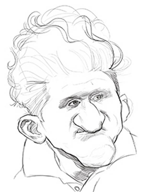
His eyes are also very deeply set and close together under a heavy brow ridge. If I darken the eye sockets, or raccoon mask area of his face, it will visually bring his brows forward while simultaneously sinking in his eyes into his head more.
I should also mention the nasolabial folds. Because of the slight snarling expression in his mouth, his nasolabial folds become more deeply creased and slightly bent.
I’m now at the point where I’m refining the outlines of the shapes, committing to them with darker lines.
And now, I’m pretty much finished with the outlines around the head and features. So I begin shading the forms with small cross hatched pencil strokes. Cross hatched lines generally should follow the forms they are describing, wrapping around the individual planes. So be mindful of which direction you pull your strokes. Every stroke should have a purpose.
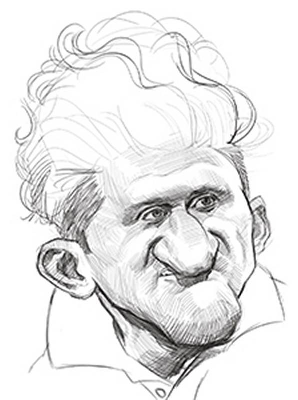
One unusual feature that I mention in my checklist is his sunglasses. Normally I wouldn't consider a fashion accessory a feature important to the likeness unless the subject is really closely associated with it. And one thing Casey is known for as part of his public persona are his customized Wayfarer sunglasses. He wears them in pretty much all of his videos. In fact, it's rare to see his eyes. This was a photo taken at a talk he was giving on a stage and not one of his videos, so we actually get to see his eyes.The sunglasses are perched atop a thick wavy and curly mane of hair. This is just a rough sketch, so I'm being really loose and sloppy with how I'm drawing the hair. If I were doing a finished rendering using charcoal or painting this caricature, I would slow down and first block in the volumes and masses of the hair, and then later adding individual locks and curls. But in this first rough sketch, I'm just going for a quick sketchy suggestion of the hair shapes.
Now, I go about darkening in the rest of the sketch, trying to add more punch to the shapes by increasing the contrast between lights and darks. Whatever medium you work in, be sure you are able to achieve a wide range of values. A drawing that’s too light everywhere is very boring to look at. Plus values of light and dark are critical in showing the illusion of three dimensional forms.So be sure your pencils or digital tools are capable of light strokes and dark strokes. And you may have to make a couple passes over the drawing to achieve the full range of values.
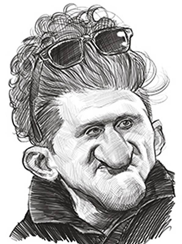
I thought I was done with the sketch at this point. But then I realized there were a couple problems I wanted to fix. First, the eye on the left was too close to the nose. I move it farther away and then blend the shapes back together. It feels a lot more balanced now. I didn't need to do an abstraction trace over to notice that problem. The second major thing I noticed was the crooked hairline. So I erase part of it to look more even and to widen the forehead. I don't want to make the forehead too tall though, as making a small forehead with a low hairline was the last item on my list I try to include in my sketch. Learning when a drawing is truly complete is something that will come in time. As your skills develop, you'll get a better sense of when to fix things and when to quit.
