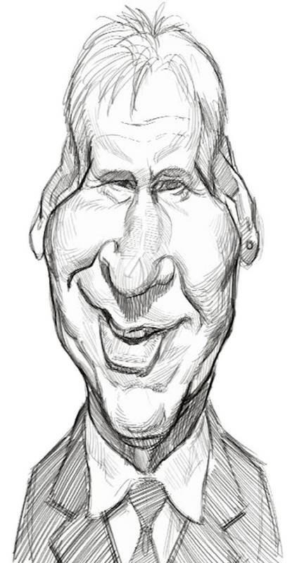
The Thumbnail Sketch
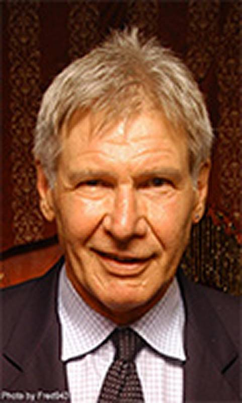
Since we never published my thumbnail sketch process for Harrison Ford, we’re including them here.
So just to review, the main goal in a thumbnail sketch is to simply figure out what direction I want the caricature to take – what the concept of the exaggeration will be. It’s kind of synonymous to a writer’s outline for a novel or screenplay. It is quick and only contains the major plot points, but is enough to give an idea of the direction that the story will take from the beginning to the end.
I’ve decided that the main theme of this caricature will be his crooked nose and mouth. In fact, even his eyes are asymmetrical. One is much smaller and squinty than the other. So that will be the common thread in all of my thumbnail sketches. I try several different head shapes, to see what is funniest, but I know that in each one, I need to retain those crooked facial features, or I’ll lose the likeness.
By my third sketch, I feel like I’m finally loosening up and being more creative with the head shapes. With Mr. Ford, I think a wide variety of head shapes could be successful, just as long as I stay true to those crooked features that are so dominant and distinctive on him. With other people, the head shape is more important to get right, but with others, like Indiana Jones here, the facial features are what tell the story.

On this, my final thumbnail sketch, I decide to go with a head shape that’s not really based on what I’m seeing in the photo.
His cheeks and jaw are not that wide. But stereotypically, the thing that distinguishes an older man from women or children are a long, wide lower face.
So I’m really exaggerating the head shape of his character type here, rather than his individual head shape. I felt like I could get away with it, as long as the features are represented accurately.
Light and shadow play a huge part in revealing the forms of any likeness, so my thumbnail sketch, quick and sloppy as it is, still has some indications of shadow. Just enough to get the point across.
The Rough Sketch
For my rough sketch, I decide to trace over my original thumbnail. Sometimes I set the thumbnail sketch to the side and try to copy it freehand.
But whenever the thumbnail sketch is resolved well enough, I usually do a tracing where I try to improve the structure and likeness.
So to improve the structure, I use a centerline to help guide the placement of the features, and I slow down, overall, compared to how I drew the thumbnail.
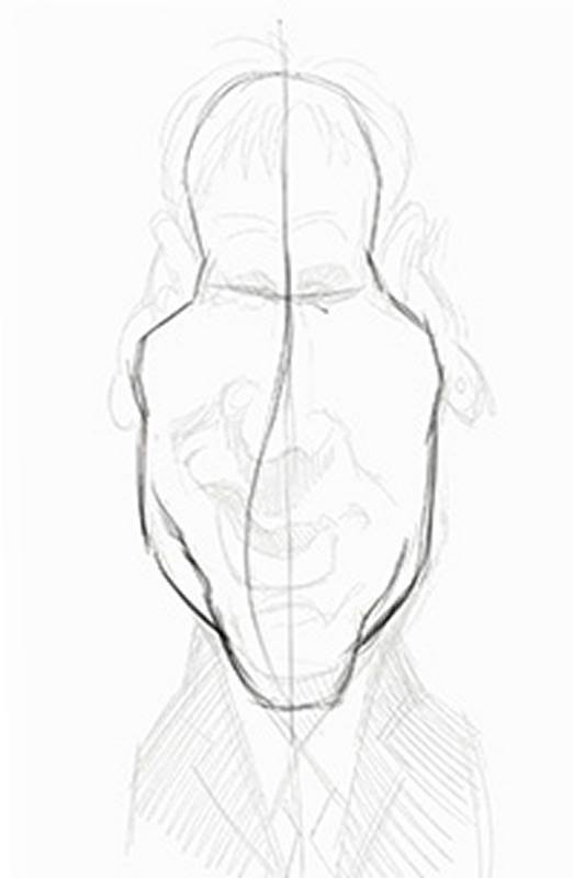
Also, when drawing the features, I’m much more deliberate and careful. In this sketch, the quality of the shapes matter a lot more than they did in the previous sketch.
In the thumbnail sketch, I drew the features in a kind of shorthand, like how I might scribble notes for the outline of a story. But now, I’m writing the actual story, from my scribbled notes. The head and features need to be more fleshed out and resolved, just like the story’s characters should be. But if they’re not fully resolved and extremely detailed yet, that’s okay.
I’ll polish them up in the next draft, which we’ll get to in the next lesson on the Abstraction
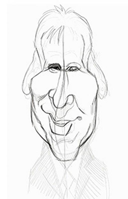
I hope my writer’s analogy isn’t becoming over labored. I do see a lot of parallels in the creative process between the writer and the artist.
Now, I’m fairly happy with the shapes and am using some simple cross hatch shading to fill in the shadows and define the halftones. In order to make a judgment call on the success of this rough sketch, I like to have a bit more definition of the forms.
I don’t want to leave just the outlines, because it would feel too cartoony and simplistic. Since my finished drawing or painting will be realistically painted or shaded, sculpting the forms with halftones and shadows helps lay the groundwork for what I’ll be doing later.
And sometimes, those indications of plane changes help clarify the likeness even more.
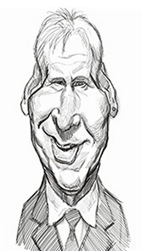
But now, I do something I don’t always do with a rough sketch, I flip it in reverse to check for structural problems.
And then instead of erasing and redrawing the lines, I take the sketch intoPhotoshop’s Liquify window, to make subtle changes to the existing shapes. I’m not normally a fan of the Liquify tool, because it can be abused to create an unstructured blob.
So I’m careful about not overdoing it. In this reverse view, I see all of my unintentional asymmetries. The only thing I really wanted to be crooked where his fleshy features. Not the structure of his skull.

So I do my best to push and pull the shapes of the head until they feel right. The technique of reversing your drawing to find problems is an extremely helpful one, and you should whenever you can. It’s amazing to discover how many skewed shapes and unintended distortions were hiding in plain sight.
When drawing, many of us tend to not see those things until we view the sketch with fresh eyes. Taking a break and coming back to it after a while is also helpful, as is standing back and viewing the drawing from a distance.
Here, I’m using the Liquify tool to change the facial expression. I’m making the smile more extreme. I even used it earlier to make the nose more crooked and the eye on the left more squinty.
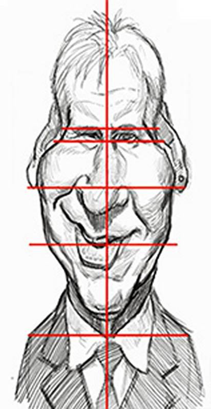
As long as I keep the Liquify cursor large, and I don’t push the features too far, it won’t have a liquified look. If you have to push the features really far to correct them, you should probably just redraw the lines or move them with the selection tool. The Liquify tool is only good for small nudges.
And now, because this caricature featured so many crooked and asymmetrical features, I draw some vertical and horizontal guidelines to help me better judge the structure of the rest of the head.
Satisfied, that the structure is reasonably even, I can now move on to the next step.
