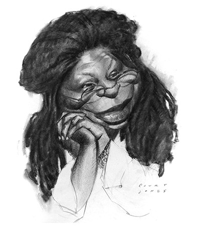
I recommend watching the lessons on thumbnail sketching, rough sketching, and abstraction before watching this final sketch. If you want another example of a final sketch you can also find my caricature of Christopher Walken.

For this drawing, I’m working with Conte charcoal pencil on smooth newsprint. And I drew the abstraction sketch very lightly directly on this surface rather than underneath, because newsprint isn’t very easy to see through. So for this final drawing, I’m drawing over those rhythm lines, but adding more natural contours of the anatomy and even a bit of variation in my line weight. I really like working with charcoal pencil because I can use it on its tip, like a traditional pencil, or on its side, like a charcoal stick when I have the tip sharpened to a long taper with about two inches of charcoal exposed. To sharpen a charcoal pencil like this, you need to use a razor blade and sandpaper, rather than a traditional pencil sharpener. After drawing with it for a while like this, it begins to feel very natural to switch between an underhand and overhand grip to achieve different effects with the charcoal pencil.
My strategy, after getting most of the line drawing in place, is to shade in the darkest areas using broad strokes with the side of the pencil. The dark values I do here in the beginning are going to eventually be darker. I don’t want to jump ahead in the process and risk going too dark too soon. After blocking in the dark shadow areas on the head and face, I begin to work on the halftones of the skin. I try to work in large broad strokes and not get too caught up rendering details yet. I’m just thinking about sculpting the forms as simply as possible. Often you may see me outline a shape lightly and then fill that shape with tone. Other times, I just add the tone with no outlining. For some shapes, especially those with hard edges, drawing a light outline around an area that you want to shade helps you control exactly where the dark tones will go. Ultimately it’s an artist’s use of hard vs. soft edges that will give his or her drawings their distinctive style. Also of importance to an artist’s style is how much an artist uses straight lines vs. curved ones. Your drawings can be highly realistic or highly stylized by using lots of straights or lots of overly curved lines. It all depends on how you want to express your ideas and how you interpret forms.
Looking back now, one of the things I should have done at the beginning is block in an overall tone across the whole face. Since Whoopi has a darker complexion, it might help save time, and help unify the shading of the head. At this stage of the drawing, there are a lot of small areas of light and dark on the face that create an uneven patchwork of values. And I think it is causing me to get bogged down shading in one small area and then moving to another small area – which in the end, will cost me a little more time than I needed to spend than if I had shaded in all of the head and hands first, with an average halftone. To pull highlights out of the halftone, a light pass with a kneaded eraser usually does the trick. And as long as the charcoal halftones aren’t too dark, erasing them doesn’t cause smudging or flatten out the natural grain of the paper. That only happens when you try to erase an area that has been shaded very darkly with the charcoal.
Now, for the next few minutes, sit back and watch the drawing take shape. Make note of how I’m holding the pencil to achieve different types of strokes.
This caricature provides a bit more challenge because I’m including the hands. And on top of that, they are clasped together with fingers interlocking, which can get a little confusing when drawing them. But I’ve developed the hands and fingers over a few different steps, taking my time to first get the big shapes right and then moving on to the details and individual fingers. Now is the point where I add shading and realistic contours. The thing to remember about drawing hands and fingers is to try and indicate strong plane changes from knuckle to knuckle. When the finger bends at each knuckle, there will be a change in value. You don’t have to add a lot of detail to hands to make them look convincing. Just think about the forms as if they were flattened out cubes and cylinders. And if they are drawn accurately with proper shading, they will help convey the personality or emotions of the subject.
The last few things I do in this drawing is even out the tones by adding more shading over large areas as well as smudging some spots with my finger to blend and soften some edges between shapes.


