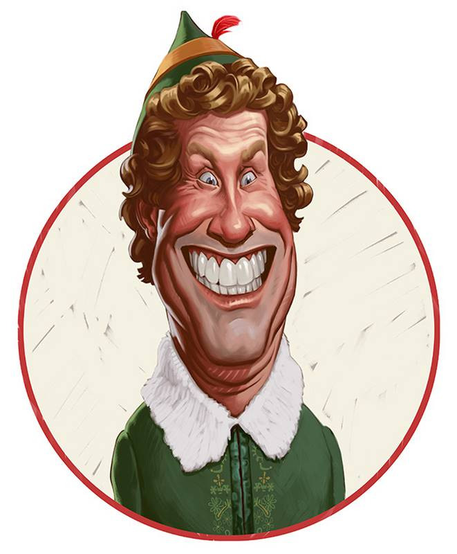
Once I decided to caricature Will Ferrell from his classic Christmas movie Elf I had to find the right photo reference with the expression and pose that best captured his character’s pathological levels of Christmas spirit. And this still frame seemed to do that with the huge grin and wide open eyes. Buddy the Elf’s whole personality seemed to be represented by this single shot. Even though it’s a little fuzzy and low resolution, it’s a great image to work from.
The caricature starts off as a fairly standard thumbnail concept sketch to figure out the direction I want the exaggeration to go. I like the concept and immediately transition it into a rough sketch by continuing to draw on top of it. Since it’s just a rough sketch, I’m not worried yet about any unintentional distortions or about making sure all the features are aligned. For now, my main goal is just to refine the likeness. And I like how it’s coming so far. The likeness is working and the expression is good. Although it doesn’t seem to quite capture the energy of his personality. He appears a little too relaxed, despite the excited expression on his face. I think it’s his body language. We can’t see much of the body. Just the neck and shoulders.
But as I begin the next step of the Abstraction, I make a choice to alter his pose slightly so that his chin is pushed down into his neck to make him look more tense like he’s trying to contain his energy.

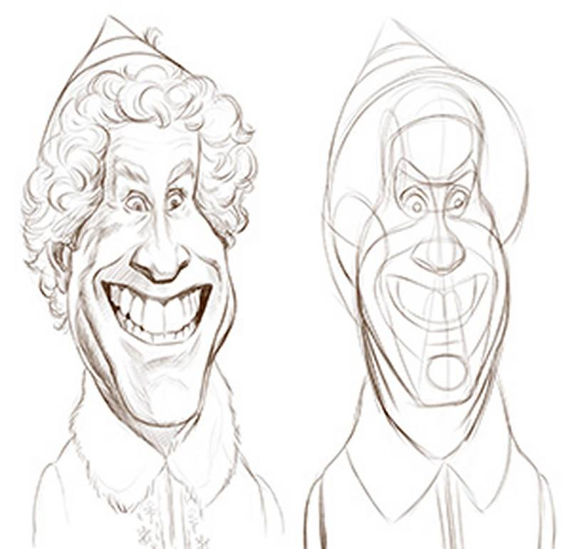
He’ll have more folds of flesh on the front of his neck and the angle of the torso will change slightly, as if he’s leaning back getting ready to explode. So, I’m not only exaggerating his likeness but also his expression and pose. Now I’m tracing over the Abstraction lines to create my final line drawing. I want this line drawing to be simple and clean because it’s intended to be my guide for my final painting. All of my decisions about the contours and wrinkles are clearly indicated here so that there won’t be any question about the facial construction later on. I even do some basic cross hatch shading to help inform where to add my darker values later on.
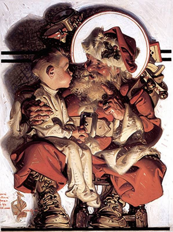

Trying to draw and paint in the style of another artist is pretty challenging. It’s like trying to write in someone else’s handwriting. So I’ll consider this more of an homage to the master, rather than a style imitation. So I’m re-drawing my final sketch. Only this time I’m designing my pencil strokes more carefully. I try to simplify and idealize the contours and the anatomy. Straights become straighter and curves become more graceful and flowing. I also take more care in mapping out the edges of the shadows – so that when I paint, it will be more like a paint-by-numbers exercise. If the shadows and other color shapes are not clear in the reference photo, it’s my job to re-design them in a more specific way in my line drawing. And that calls for some artistic license. If a shadow shape is nebulous or can be improved, I’ll take it upon myself to make it better, based on my knowledge of anatomy and design.
I first cover my canvas with a middle grey value to knock out the white of the canvas. Starting on a middle grey background helps me judge my skin tones and other colors more accurately. I next create some swatches of color that I sampled from a few different Leyendecker paintings to help start me off on the right track. It’s like picking from his own palette. When doing a study of an artist’s work, I always try to find out their favorite color palette. Sampling colors from a finished painting is not the same as starting with the same palette of raw colors. But it’s the next best thing. I just sample a few key colors for the skin, hair and clothing – making sure to get not only the halftones, but also the shadow colors.
Now I begin the painting by working on a layer underneath the line drawing. In studying Leyendecker’s work, I think my best chance to replicate his look is to first do a layer of smoothly blended colors before adding the hard-edged shapes and color tiles. In oil painting, this would be similar to the underpainting phase, where Leyendecker would use thinned down washes of color before applying the thick, opaque tiles of color that are his trademark.
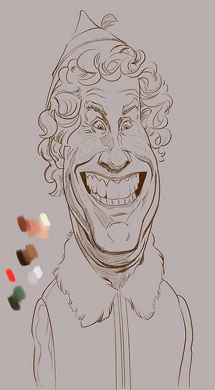
And now, I start to add definitive shadow shapes to the face. I try my best to stay within the lines I established in my drawing and not over-blend. But as I said before, it’s really difficult to paint in another artist’s style because we are all subject to our own personal experience and training. Once I start getting some momentum, I end up making painting decisions like Court Jones, not J.C. Leyendecker. So I find myself fighting my own natural instincts throughout the whole process in order to achieve the look that I’m after. But the challenge of it is what’s so great about it. This exercise is compelling me to analyze the reference and think about my procedure in ways I normally wouldn’t while painting. To get that cleanly designed, idealized visual style, I’m more conscious about each single stroke I lay down and end up painting more efficiently than I normally would. When I’m painting freely on my own, I tend to poke around the canvas, just doing what feels right in the moment. And there’s nothing wrong with that. But I often over-work paintings, or spend precious time fixing badly designed or messy shapes that I painted in the early stages. By keeping within the borders established in the line drawing, I end up saving myself a lot of hassle, even if it does go against my typical working methods.
So, the lessons I learned during this exercise are lessons that may end up sticking with me and influencing my own procedures in my personal work. That’s what’s valuable about studying other artists and doing copies or homages, like this. You’ll end up taking from them what works and hopefully raise the level of your own skills.
Now that the painting is almost finished, I decide to frame it in a way reminiscent of the old Saturday Evening Post covers, with a circular border. There’s a bit of Photoshop trickiness here which I won’t go into because it’s a little technical and not really that important. The main thing I worry about here is making sure the figure pops off the background and has a clearly defined silhouette. So I choose an off-white color with some of the background grey popping through between the strokes, much the way Leyendecker would do in his own work.
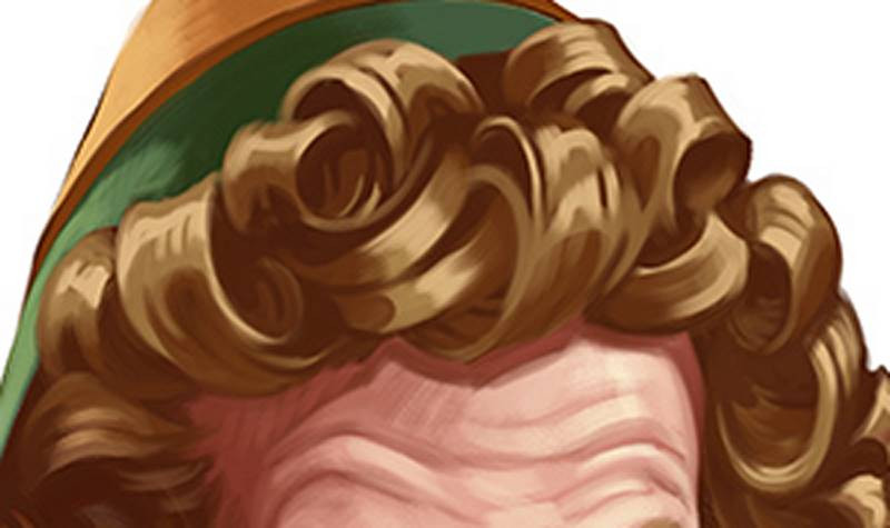
An area of the painting that I haven’t mentioned is his hair. As part of my task in replicating Leyendecker’s look, I had to totally re-design Will Ferrell’s hair. His curly blonde hair needed to become more sculpted-looking and solid. The mess of curls have been redrawn as individual and interlocking ribbons. I had to re-do those curly locks a few times before they felt right.
So, the in the last few moments of this painting, I clean up here and there. If an area feels too indistinct or messy, I either add a carefully designed hard stroke or blend the messy spot away. This was a pretty hard exercise for me because of all the re-designing of the forms I had to do. As I said earlier, it’s not normally something I do when painting caricatures. I usually stick really close to the shapes I see in the photo reference. But I think I learned a bit about the value of breaking away from the reference to design shapes in a more intentional way.
I want to thank you for watching and hope you enjoyed the process.
