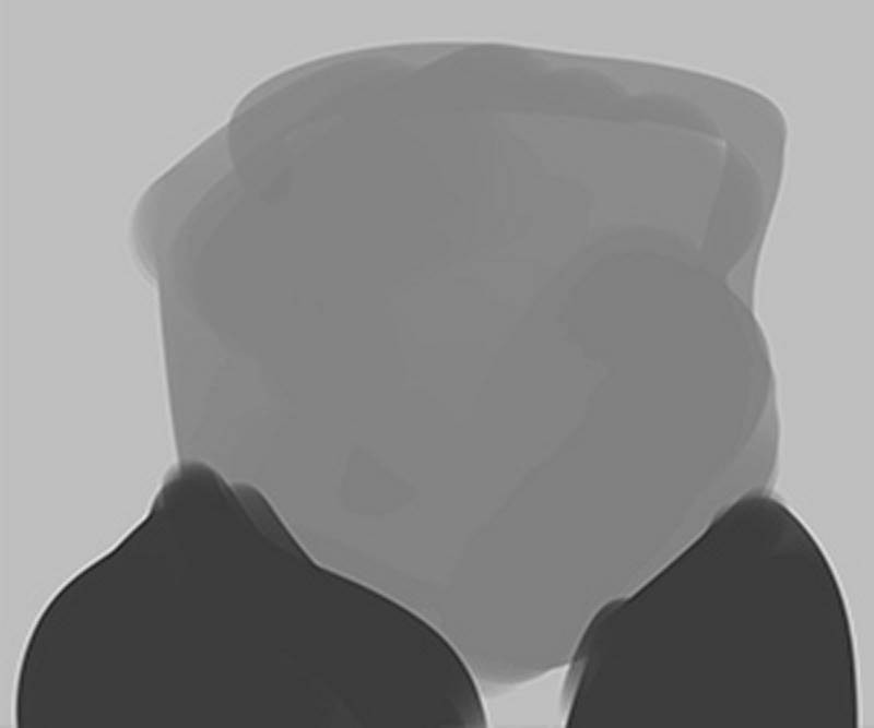
After I cover the canvas in a light-middle grey tone, the first thing I do is use the largest brush I can to create the head shape. With digital sketch painting, or speed painting, as some call it, I find it’s best to use the largest brush that you can at every stage. It helps keep me focused on the big picture. You don’t want to get bogged down in details too soon with this method. You should try and solve the biggest problems first and then work your way down to the smaller shapes and eventually the details.
If you create a head shape that is average-looking and close to portrait, you’ll end up with a portrait-y caricature. So make sure that this initial blank head shape is funny and bold. The first couple things you should ask yourself when blocking in a head shape is “Is the subject’s head tall and long or short and wide compared to the average?” And then, where is the head the widest; where is it the narrowest?” And then you need to make those differences more pronounced. For me, pretty much every caricature I do begins with those two questions.

If you follow the same practice it may help you create more decisive and exaggerated sketches. As you can see in the image below, there’s not much here yet. I’m simply dividing the lights and darks now. But even at this early stage, without any facial features, you can pretty much tell who it is supposed to be. North Korean leader Kim Jong Un has a very unique look, which means you don’t need to do much to get a good caricature. It’s not so easy with other, more average looking people. But I want you to remember that the very first shapes of the head that you paint in are really important in the success of the caricature. Everything you do afterwards is a result of these early decisions.

Now, I move inside the face and start sculpting the features. And that’s how I like to think of it when working with digital painting – I sculpt the forms, rather than draw them. Working with the largest brush possible will help you stay in the sculpting mindset. If you use a really small brush, you’ll end up just drawing lines. Eventually, you will need to use some smaller brushes, but hopefully not until after all the big shapes and features are resolved.
I use the large brush to carve away at the features with light and dark values. I go back and forth between values constantly. The way this is accomplished is that my other hand is always over the keyboard pressing the “Alt” key to toggle the paint brush into a color sampling tool. If your drawing tablet has express keys, like all Wacom devices, you can program one of them to be the Alt (or option) key. The toggling of the paint brush into a color sampler is what makes speed painting possible. Once you have a full range of colors or values in the painting you’re working on, you don’t really need to leave the painting area to go to the Color Picker palette anymore. And you can work really quickly.
Now, I don’t have a full range of values on the canvas yet. I’m staying within the middle range of values for as long as possible. Sometimes on a painting, I add my darkest dark and lightest lights very early on. Doing so can help me be a better judge of the full range of values. But I like to also mix up my procedure from time to time and try different strategies. I’ll add my darks very soon in this piece. But I never follow just one process every single time when I paint. I’m still learning and developing and trying to find the ways that work best for me.I’m now doing more blending of the halftones. But I’m not using a soft edged brush to do it.

It’s still a hard round standard brush. I’m merely sampling adjacent tones and then using light pressure with the stylus to create a transition value between a light and a dark. If you do this enough times, with smaller and smaller shapes, you’ll eventually get a very realistic effect with the forms, but an effect that is still painterly, with visible hard-edged brush strokes.
I hate seeing paintings that are overly blended or done with a soft-edged airbrush type tool. Those paintings have no personality or style, and are often so softened that the head loses all feeling of solidity and structure. So I warn you to stay away from soft-edged airbrushes in digital painting, unless it’s done in a very limited way for a particular effect. And even then, I highly recommend using a brush with some texture applied to it. Digital painting makes it really easy for anyone to render smooth soft shapes. But the result is usually very bland and has a decidedly digital and artificial look.

I think digital paintings look best when they mimic the look of natural paints on rough surfaces. And most painting apps today are really good about giving you the tools to create rough and natural paint textures and effects. Play around with them as much as you can and experiment.
When I first started teaching digital painting classes at the Watts Atelier, I encouraged my students at times to work with brushes that were almost too textured or messy looking. I felt it was helpful to experiment with brushes and textures that added so much noise into the process that they would have to develop skills to work around that noise. Plus, all that extra texture would add a gritty element that made the painting feel less digital and perfect and more like a painting on a canvas.
There’s something to be said for giving yourself obstacles in digital painting that you have to work your way around. If everything’s too easy, it can make you a lazy painter and you’ll stop being critical of yourself during the painting process. So when you start new digital paintings on your own, try different texture brushes each time. Just watch out for those brushes with soft, fuzzy edges. You can use them a little bit here and there, but I find that they usually take the painting down the wrong path.
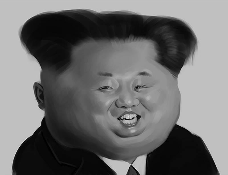
As you can see, I’ve done quite a bit of detail work now. But I’ve kept the small detailed shapes as simple as possible. Remember that these exercises are supposed to be rough sketches. They don’t need to be rendered realistically or have every detail resolved. In fact, there’s an art in doing an unfinished rough sketch. When I do these quick monochromatic studies, I still try to make them beautiful – but beautiful in their roughness. So I try to design the shapes and the brush strokes and not just have random scribbles and jarring swatches of value all over the place.

I’m consciously trying to figure out where to put my hard edges vs. my soft edges. But most of all, I want the values themselves to read correctly. If the values are done correctly, the forms will look convincingly three-dimensional. If I were to shrink down the canvas and view it really small, I want the effect of the values to appear more or less photographic. But then when it’s viewed large, it’s clear that it’s a quick rough painted sketch.
Having a full range of values is essential to that photographic effect. Sometimes it’s okay to not use a full range of values in a painting. It can create moody or atmospheric look, as if there’s a haze in the air. But you need to be conscious of when you’re doing that. Remember that this exercise of creating a caricature using digital paint is mostly an exercise in observing and working with value. It’s basically your first step towards your training as a painter. If you can master the use of value in a monochromatic paint sketch, it will be a lot easier to work with color later on.


